kage
kage
grimoai.com
Design analysis
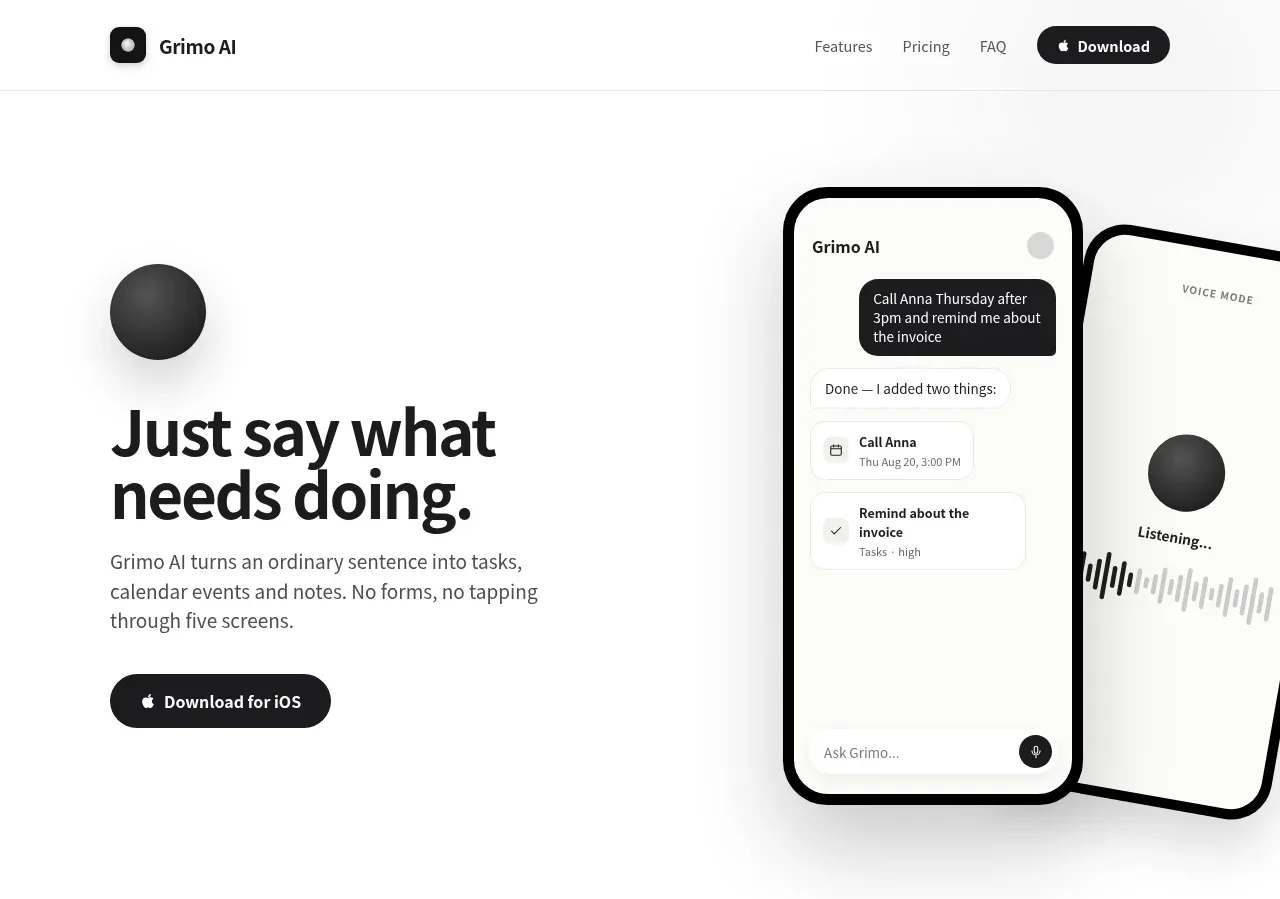
The hero pairs a bold, highly legible promise and short explanatory paragraph with a single iOS download CTA and a large phone/voice-mode visual.
Prompt preview
## Reference images

Study these alongside the description below: hierarchy, rhythm, spacing, colour. Build for the product you are asked about, using this design language.

- Component: https://kage-design-assets.t3.tigrisfiles.io/components/grimo-ai/49d17de6-ec9e-4ad1-a407-f0ba9cfffa22-1789538765-1.webp
- Full page it was cut from: https://kage-design-assets.t3.tigrisfiles.io/screenshots/grimo-ai/49d17de6-ec9e-4ad1-a407-f0ba9cfffa22-1789538658825-full.webp
- Component on Kage: https://kage.design/component/grimo-hero

## Before you start
Ask me what my product does, who benefits from it, and what action the hero should drive. Then design this hero around my product and brand, not the reference.

Create a spacious split hero directly below the navigation. Use a warm white background (`#ffffff`) and a max-width content region of about 744px, with the text occupying roughly the left half and an original product visual occupying the right half. Vertically center the content with generous whitespace. Use a large, tight headline around 46–52px, 0.95 line-height, heavy sans-serif weight, and a short supporting paragraph around 16px with 1.45 line-height in muted gray (`#5f5f5f`). Add one pill-shaped dark CTA (`#171717`) with white text and an optional platform icon. The visual should communicate the product through abstract, newly created UI surfaces or device frames; use soft gray-black accents and avoid visual clutter. Keep rounded device corners around 28–36px, strong black outlines only where useful, and subtle shadows. Add restrained hover/focus feedback to the CTA.

Never: use logos, product names, copy, illustrations or imagery from the reference.