 kage
kage
grimoai.com
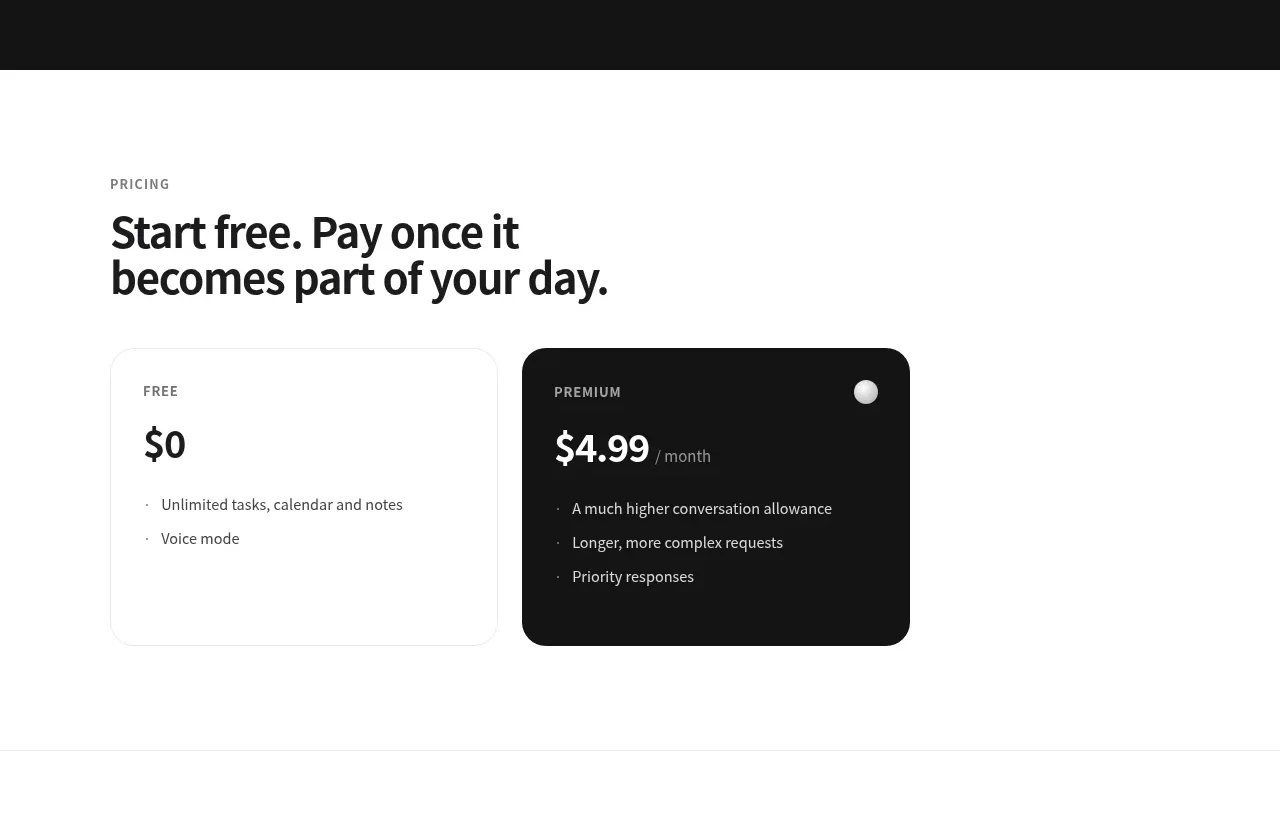
Design analysis
A concise pricing section presents a free plan and a visually emphasized premium plan with simple feature bullets and clear price hierarchy.
Prompt preview
## Reference images

Study these alongside the description below: hierarchy, rhythm, spacing, colour. Build for the product you are asked about, using this design language.

- Component: https://kage-design-assets.t3.tigrisfiles.io/components/grimo-ai/49d17de6-ec9e-4ad1-a407-f0ba9cfffa22-1789538766-4.webp
- Full page it was cut from: https://kage-design-assets.t3.tigrisfiles.io/screenshots/grimo-ai/49d17de6-ec9e-4ad1-a407-f0ba9cfffa22-1789538658825-full.webp
- Component on Kage: https://kage.design/component/grimo-pricing-table

## Before you start
Ask me about my pricing model, plan names, billing terms, and the conversion action I want. Then apply this structure to my product without copying the reference.

Build a simple two-plan pricing section on a white background. Use a max-width container around 744px, an uppercase eyebrow, and a bold 32–38px heading above the cards. Set the cards in a two-column grid with equal widths, 20px radius, 24–28px padding, and a very subtle gray border. Make the premium/recommended card near-black (`#171717`) with white text, while the free card remains white with near-black text. Display plan label in 11–12px uppercase, price in 28–34px bold, billing suffix in 12–14px muted text, and feature bullets in 13–14px with comfortable vertical spacing. Include a clear CTA per plan if relevant; use 999px buttons or compact text links. Ensure strong contrast and stack cards on mobile.

Never: use logos, product names, copy, illustrations or imagery from the reference.
More components
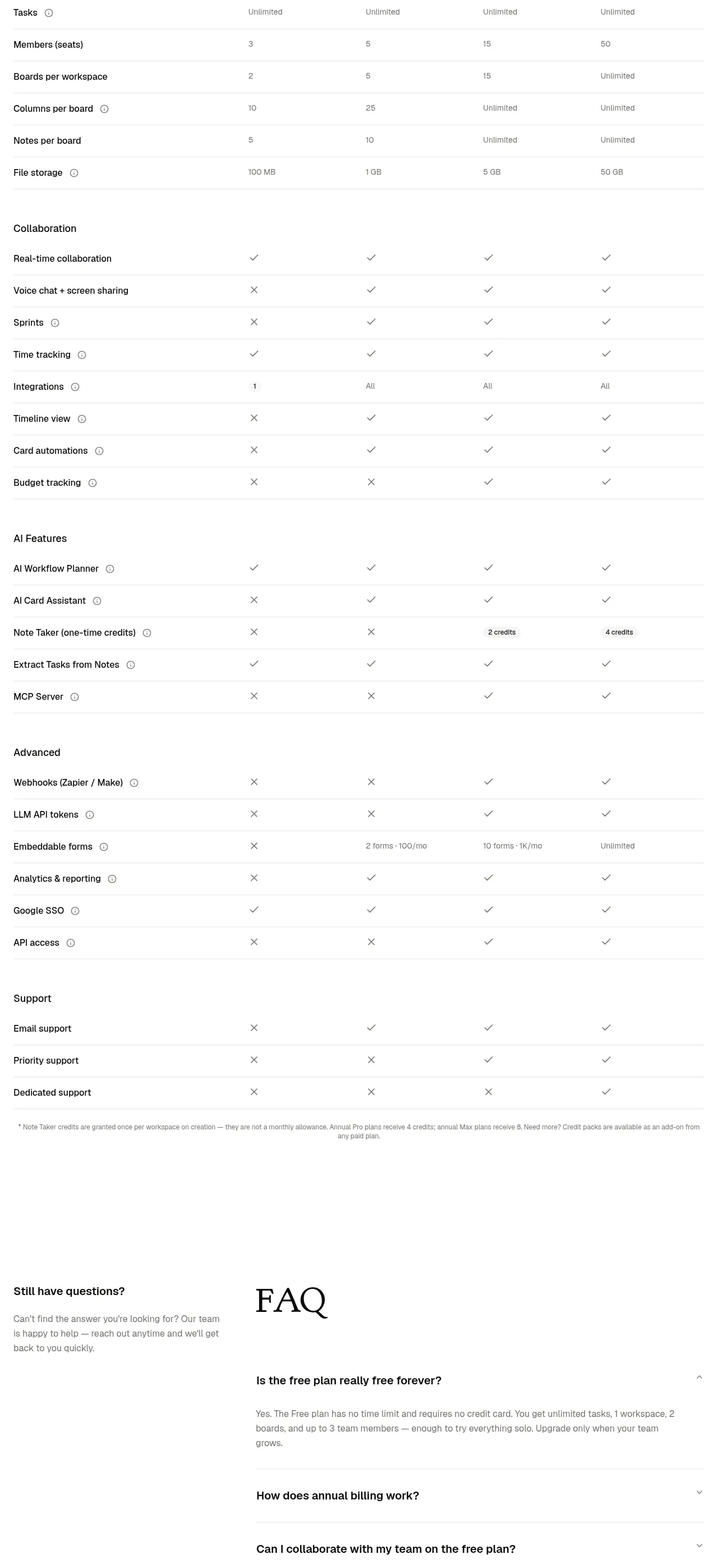
 Transparent pricing comparison
is.team · Pricing table
Transparent pricing comparison
is.team · Pricing table
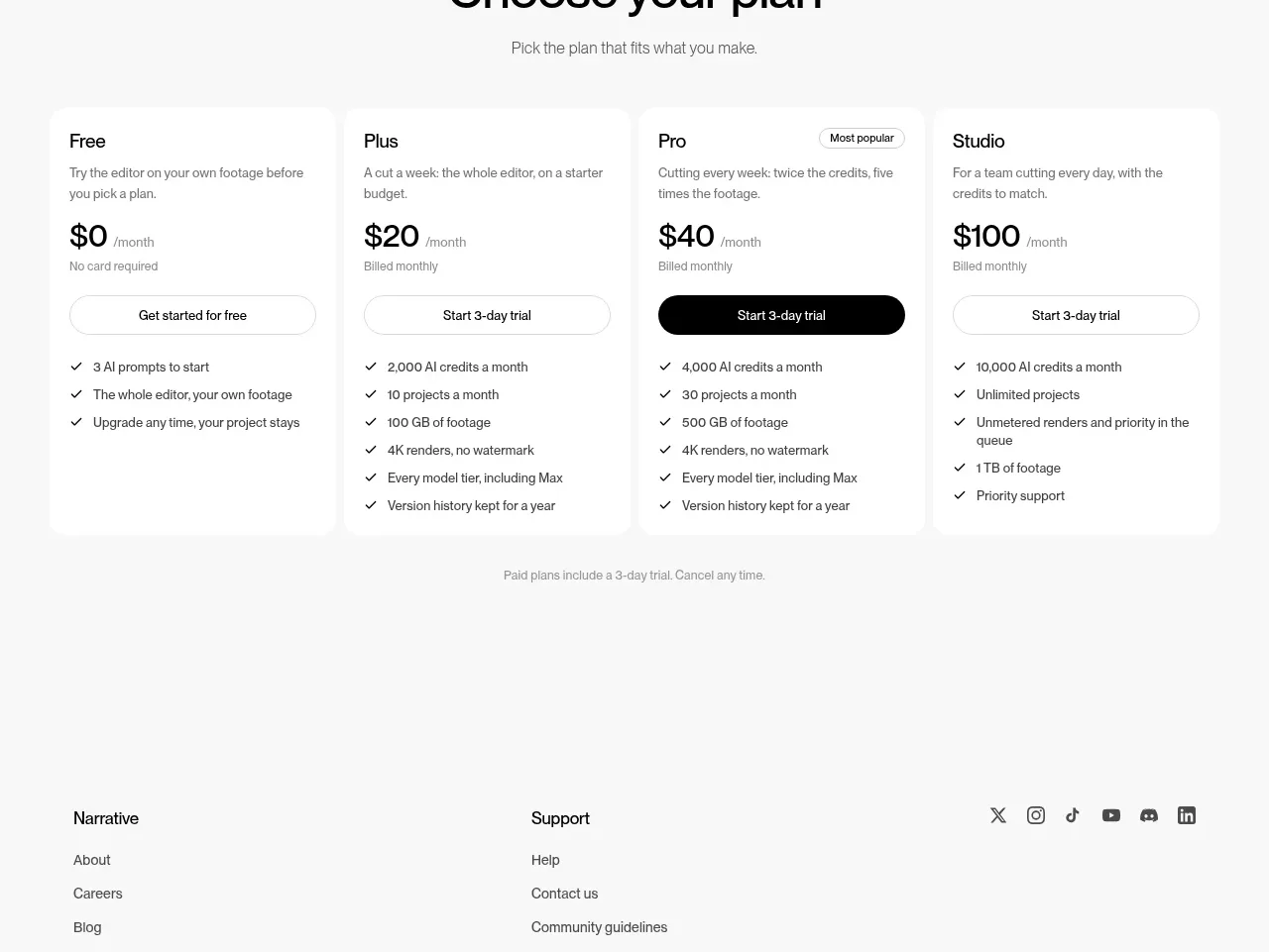
 Four-tier pricing table
Narrative · Pricing table
Four-tier pricing table
Narrative · Pricing table
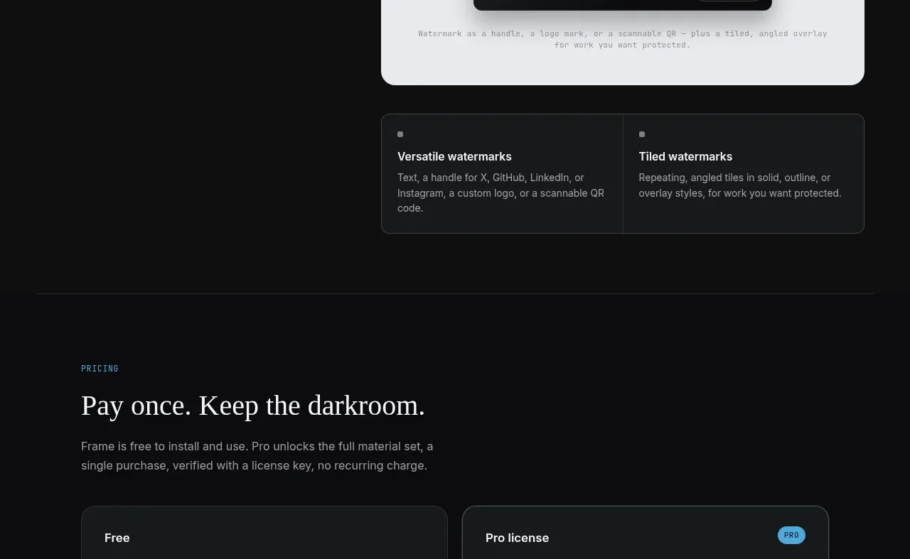
 Free and paid license pricing
Portfolio Frame · Pricing table
Free and paid license pricing
Portfolio Frame · Pricing table
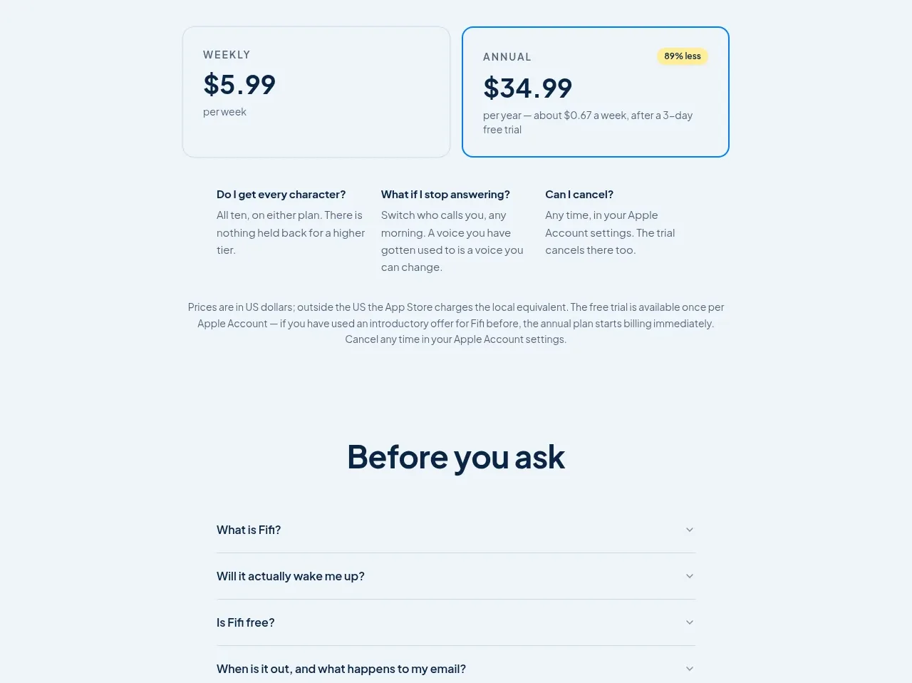
 Simple subscription pricing
Fifi · Pricing table
Simple subscription pricing
Fifi · Pricing table
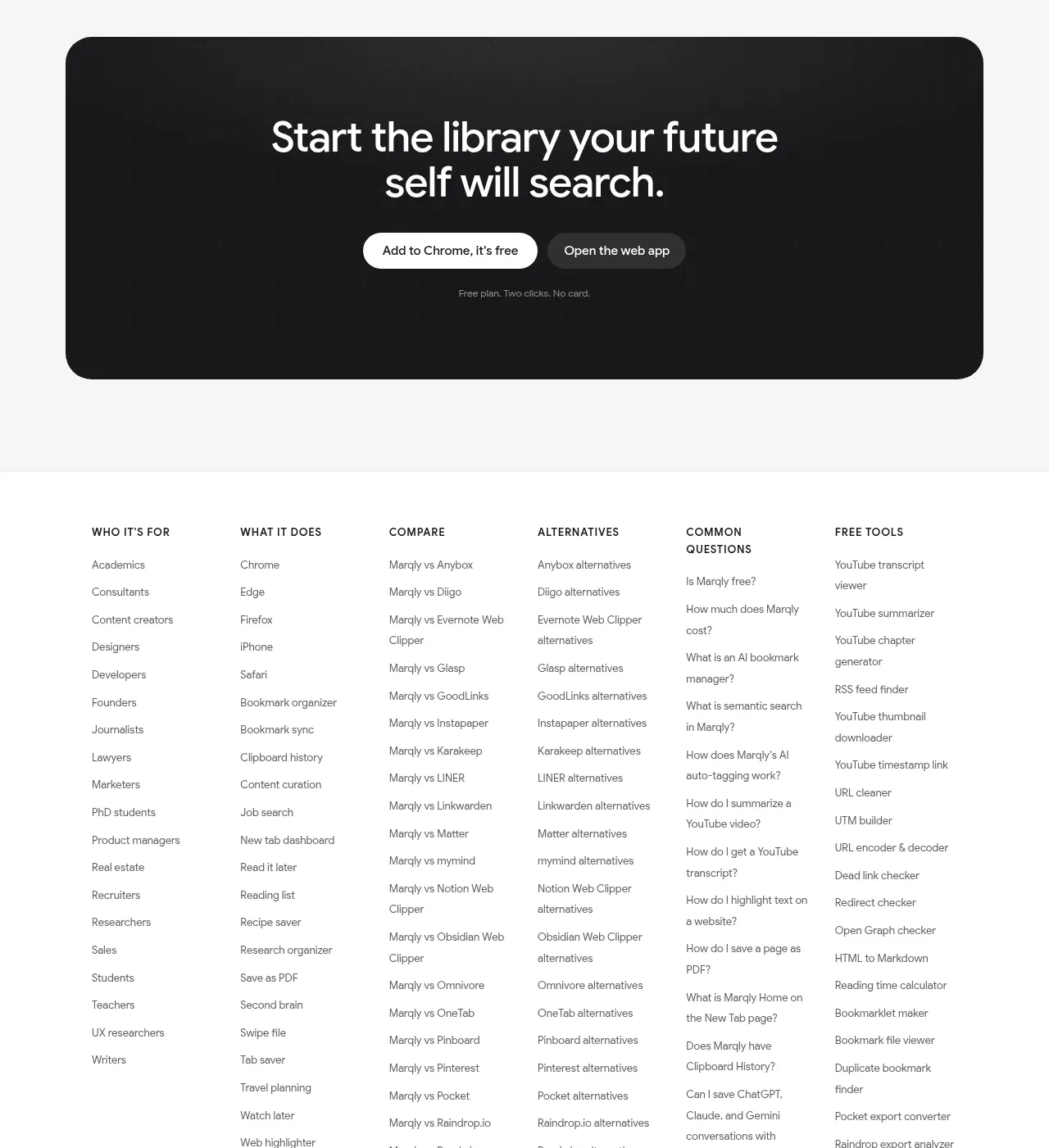
 Free and pro pricing
Marqly 6.0 · Pricing table
Free and pro pricing
Marqly 6.0 · Pricing table
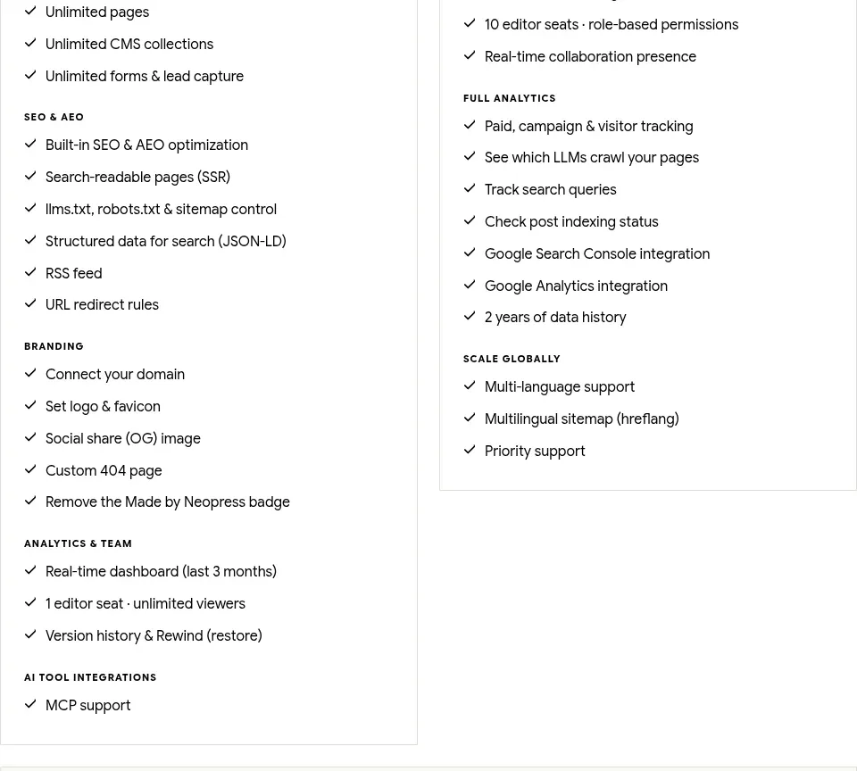
 Traffic-scaled pricing
Neopress · Pricing table
Traffic-scaled pricing
Neopress · Pricing table