 kage
kage
hanomi.ai
Design analysis
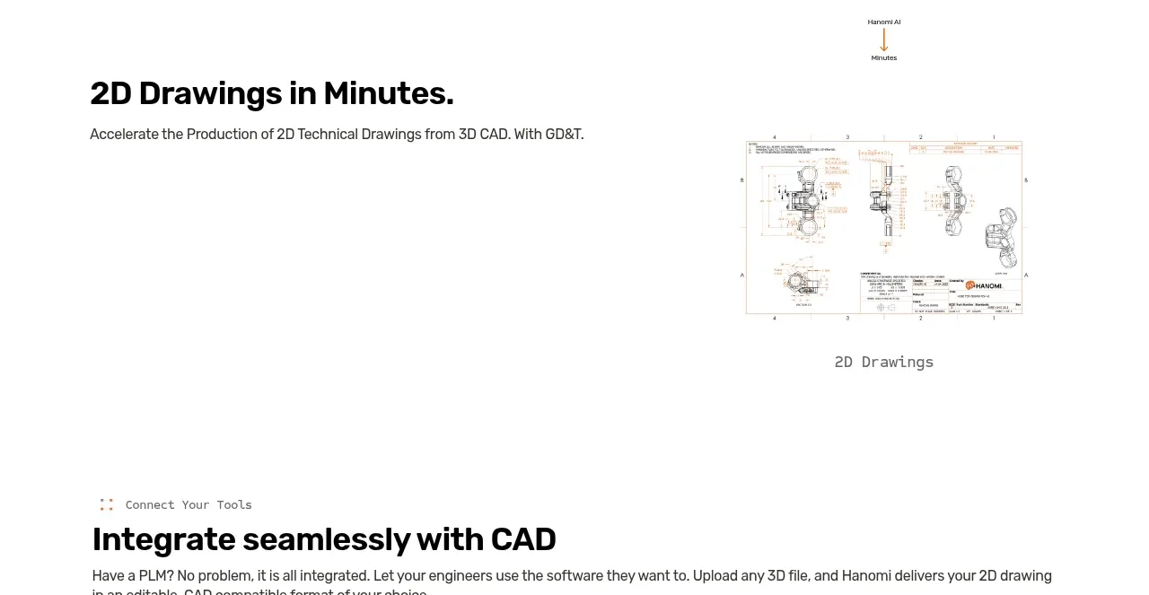
A short feature section pairs a bold benefit heading and supporting sentence on the left with a technical drawing preview on the right, using whitespace as a major compositional element.
Prompt preview
## Reference images

Study these alongside the description below: hierarchy, rhythm, spacing, colour. Build for the product you are asked about, using this design language.

- Component: https://kage-design-assets.t3.tigrisfiles.io/components/hanomi-ai/e6570335-e597-4dea-b51d-b53895fecbf1-1790500614-2.webp
- Full page it was cut from: https://kage-design-assets.t3.tigrisfiles.io/screenshots/hanomi-ai/e6570335-e597-4dea-b51d-b53895fecbf1-1790500563313-full.webp
- Component on Kage: https://kage.design/component/hanomi-feature-grid

## Before you start
Ask what the user's product is, who it serves, and what its brand personality and visual identity are. Apply the following principles to that product rather than reproducing this reference.

Build a split feature section for a product capability. Place a strong benefit-led heading and one supporting sentence in the left half, vertically centered, and a framed product screenshot, document preview, or visual artifact in the right half. Let the visual be smaller than the section width so the surrounding whitespace feels intentional. Use a 50/50 or 45/55 grid, approximately 120–180px vertical padding, black text, warm accent details, and a very subtle border or shadow around the preview. Keep the image corners modestly rounded (8–12px) and ensure the feature remains legible when stacked on mobile.

Never: use logos, product names, copy, illustrations, or imagery from the reference.
More components

 Three-step process cards
godaylight.com · Feature grid
Three-step process cards
godaylight.com · Feature grid

 Use-case selector with vertical video preview
Spira Maxima · Feature grid
Use-case selector with vertical video preview
Spira Maxima · Feature grid

 Insights and enterprise model access
FastRouter.ai · Feature grid
Insights and enterprise model access
FastRouter.ai · Feature grid
 Solutions by organizational role
FastRouter.ai · Feature grid
Solutions by organizational role
FastRouter.ai · Feature grid
 Routing reliability and model collaboration
FastRouter.ai · Feature grid
Routing reliability and model collaboration
FastRouter.ai · Feature grid
 Goal-oriented product capabilities
FastRouter.ai · Feature grid
Goal-oriented product capabilities
FastRouter.ai · Feature grid