 kage
kage
hanomi.ai
Design analysis
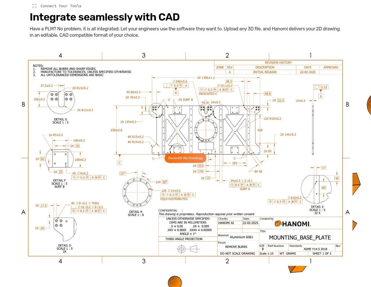
This section introduces seamless tool integration with a heading and explanatory paragraph, then gives a large technical drawing visual prominence across the lower area.
Prompt preview
## Reference images

Study these alongside the description below: hierarchy, rhythm, spacing, colour. Build for the product you are asked about, using this design language.

- Component: https://kage-design-assets.t3.tigrisfiles.io/components/hanomi-ai/e6570335-e597-4dea-b51d-b53895fecbf1-1790500614-3.webp
- Full page it was cut from: https://kage-design-assets.t3.tigrisfiles.io/screenshots/hanomi-ai/e6570335-e597-4dea-b51d-b53895fecbf1-1790500563313-full.webp
- Component on Kage: https://kage.design/component/hanomi-feature-grid-2

## Before you start
Ask what the user's product is, who it serves, and what its brand personality and visual identity are. Apply the following principles to that product rather than reproducing this reference.

Create a broad integration feature section with a small eyebrow, a bold heading, and a readable explanatory paragraph aligned to the main content grid. Below the copy, show a large document, dashboard, or workflow artifact spanning most of the available width. Treat the artifact as the proof point: preserve its aspect ratio, use a thin warm-gray border, and provide enough padding around it that the page does not feel crowded. Use an off-white or white background, 12–16px body text, 40–52px heading text, and a copper/orange accent for small highlights or actions. Support a responsive layout where the visual scales fluidly without cropping important details.

Never: use logos, product names, copy, illustrations, or imagery from the reference.
More components

 Three-step process cards
godaylight.com · Feature grid
Three-step process cards
godaylight.com · Feature grid

 Use-case selector with vertical video preview
Spira Maxima · Feature grid
Use-case selector with vertical video preview
Spira Maxima · Feature grid

 Insights and enterprise model access
FastRouter.ai · Feature grid
Insights and enterprise model access
FastRouter.ai · Feature grid
 Solutions by organizational role
FastRouter.ai · Feature grid
Solutions by organizational role
FastRouter.ai · Feature grid
 Routing reliability and model collaboration
FastRouter.ai · Feature grid
Routing reliability and model collaboration
FastRouter.ai · Feature grid
 Goal-oriented product capabilities
FastRouter.ai · Feature grid
Goal-oriented product capabilities
FastRouter.ai · Feature grid