 kage
kage
hanomi.ai
Design analysis
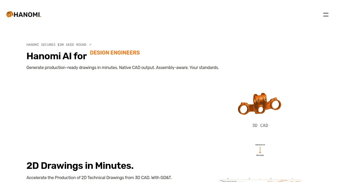
The hero uses a compact eyebrow, bold two-tone headline, and concise value proposition above a large open visual field containing a floating 3D mechanical object and process labels.
Prompt preview
## Reference images

Study these alongside the description below: hierarchy, rhythm, spacing, colour. Build for the product you are asked about, using this design language.

- Component: https://kage-design-assets.t3.tigrisfiles.io/components/hanomi-ai/e6570335-e597-4dea-b51d-b53895fecbf1-1790500614-1.webp
- Full page it was cut from: https://kage-design-assets.t3.tigrisfiles.io/screenshots/hanomi-ai/e6570335-e597-4dea-b51d-b53895fecbf1-1790500563313-full.webp
- Component on Kage: https://kage.design/component/hanomi-hero

## Before you start
Ask what the user's product is, who it serves, and what its brand personality and visual identity are. Apply the following principles to that product rather than reproducing this reference.

Create a wide hero directly below the navigation. Use a restrained two-line or single-line headline with one highlighted phrase in the product's accent colour, a small uppercase or tracked eyebrow above it, and one concise sentence explaining the outcome. Align the text to a narrow left content column with a generous top offset. Reserve the right and lower portion for a lightweight product visual or abstract technical object with small annotations, rather than filling the entire canvas. Use near-black typography, white background, an orange/copper-like accent only as an example (#e87922), 48–64px desktop headline typography, 14–16px body copy, and large vertical whitespace. Make the hero responsive by stacking the visual beneath the text on mobile.

Never: use logos, product names, copy, illustrations, or imagery from the reference.
More components

 AI workflow hero
Incredible · Hero
AI workflow hero
Incredible · Hero

 Photographic power-home hero
godaylight.com · Hero
Photographic power-home hero
godaylight.com · Hero
 Warm mission statement panel
godaylight.com · Hero
Warm mission statement panel
godaylight.com · Hero
 Grid problem statement
godaylight.com · Hero
Grid problem statement
godaylight.com · Hero
 Decentralized energy statement
godaylight.com · Hero
Decentralized energy statement
godaylight.com · Hero

 Product hero with download action and video
HyperFrames Studio (Desktop) · Hero
Product hero with download action and video
HyperFrames Studio (Desktop) · Hero