kage
kage
harbor.my
Design analysis
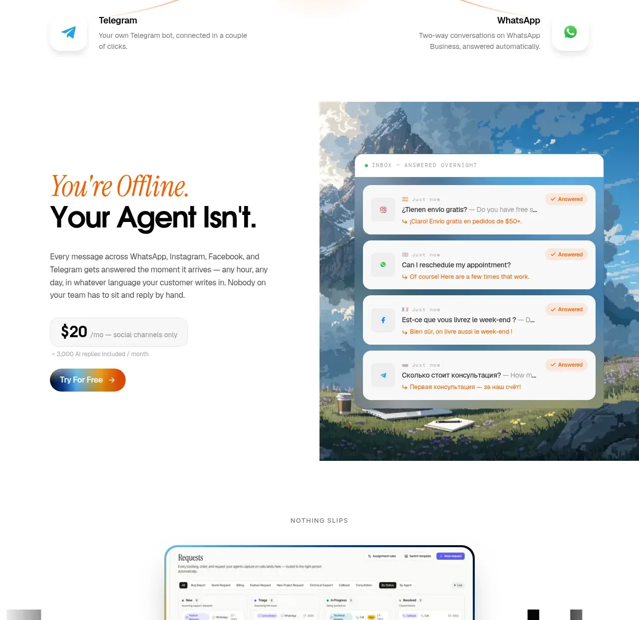
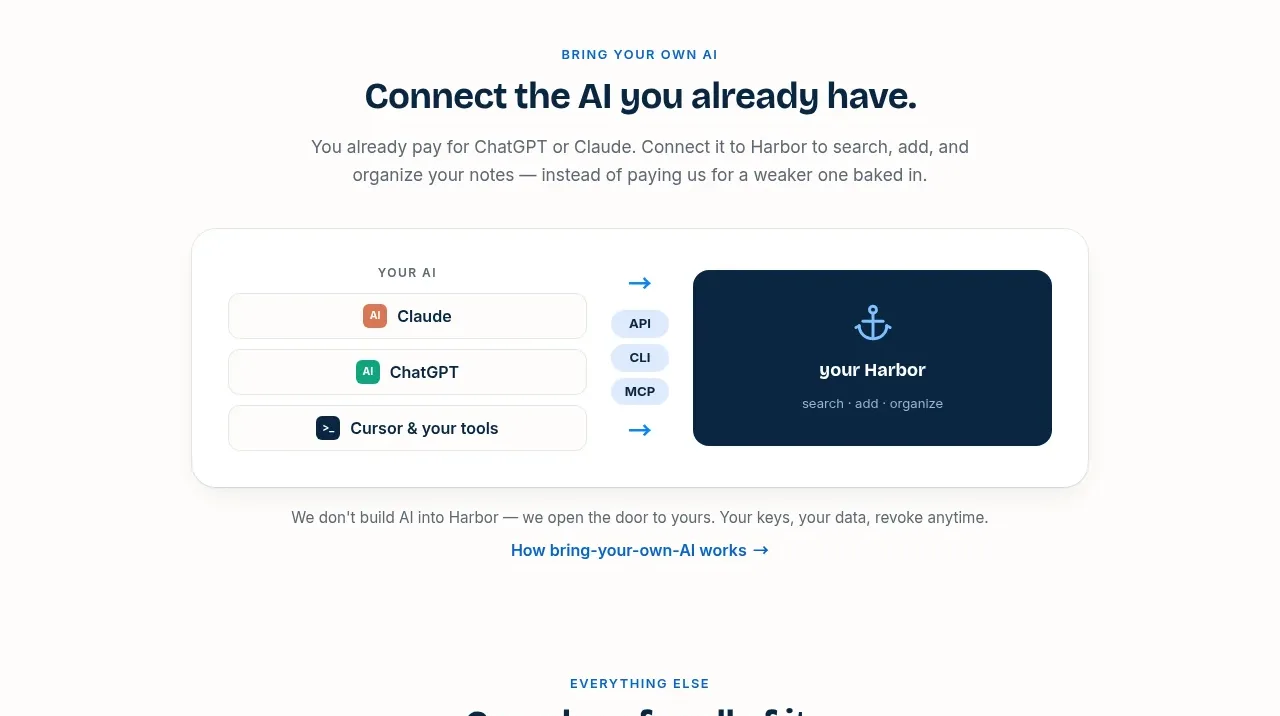
This section explains how existing AI tools connect to the product through a simple source-to-destination diagram and supporting reassurance copy.
Prompt preview
## Reference images

Study these alongside the description below: hierarchy, rhythm, spacing, colour. Build for the product you are asked about, using this design language.

- Component: https://kage-design-assets.t3.tigrisfiles.io/components/harbor/210c2f1c-cc35-4a7c-ab88-9680504ac3f6-1789970605-5.webp
- Full page it was cut from: https://kage-design-assets.t3.tigrisfiles.io/screenshots/harbor/210c2f1c-cc35-4a7c-ab88-9680504ac3f6-1789970506977-full.webp
- Component on Kage: https://kage.design/component/harbor-card

## Before you start
Ask what the user's product, audience, and brand are, then apply the principles below to that product rather than reproducing the reference.

Design an integration section with a centered eyebrow, headline, short explanation, and a large white rounded diagram card. Inside the card, show several neutral AI/tool sources on the left, directional arrows and compact protocol badges in the middle, and the user's product destination on the right. Add a short privacy/control reassurance and one explanatory link below. Use a white card on warm white background, 1px border `#E2E7E9`, 20px radius, soft shadow, dark navy `#09243A`, blue arrows `#168BE3`, and small colored source icons without relying on recognizable third-party logos. Make the diagram responsive by turning columns into rows on small screens.

Never use logos, product names, copy, illustrations, or imagery from the reference.