 kage
kage
harbor.my
Design analysis
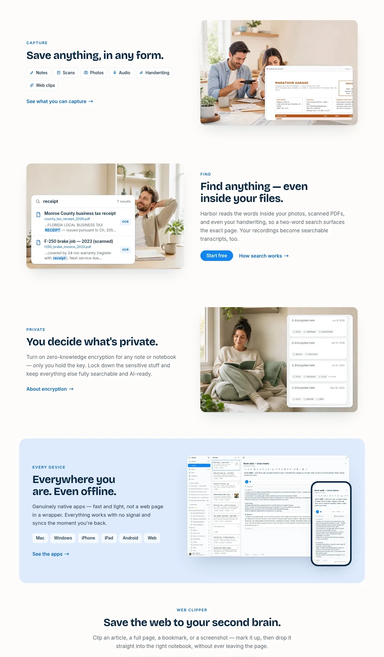
Four alternating capability bands show capture, search, privacy, and cross-device use, pairing concise copy and pills or links with warm lifestyle/product visuals.
Prompt preview
## Reference images

Study these alongside the description below: hierarchy, rhythm, spacing, colour. Build for the product you are asked about, using this design language.

- Component: https://kage-design-assets.t3.tigrisfiles.io/components/harbor/210c2f1c-cc35-4a7c-ab88-9680504ac3f6-1789970604-3.webp
- Full page it was cut from: https://kage-design-assets.t3.tigrisfiles.io/screenshots/harbor/210c2f1c-cc35-4a7c-ab88-9680504ac3f6-1789970506977-full.webp
- Component on Kage: https://kage.design/component/harbor-feature-grid

## Before you start
Ask what the user's product, audience, and brand are, then apply the principles below to that product rather than reproducing the reference.

Build a sequence of alternating feature rows inside one coherent section. Each row should have a small uppercase category label, a strong benefit-led heading, a short paragraph, optional capability chips, and one contextual link. Alternate text and media sides so the page has a natural zig-zag rhythm; on mobile, stack text above media. Use product UI mockups layered over soft lifestyle imagery or abstract panels, but keep each visual subordinate to the message. Align all rows to a common max-width grid, use roughly 96–128px vertical spacing between rows, 14–24px image radii, and restrained shadows. Use warm white `#FCFBF9`, navy `#09243A`, gray `#687178`, blue accent `#168BE3`, and occasional pale blue/green surfaces such as `#DDEEFF` and `#E1F3EA`. Chips should be small, lightly bordered, and rounded.

Never use logos, product names, copy, illustrations, or imagery from the reference.
More components

 Spend visibility and daily-cost breakdown
Subscrr · Feature grid
Spend visibility and daily-cost breakdown
Subscrr · Feature grid
 Reminders and simple setup flow
Subscrr · Feature grid
Reminders and simple setup flow
Subscrr · Feature grid

 Security and permissions cards
NotchPop · Feature grid
Security and permissions cards
NotchPop · Feature grid
 Focused feature cards
NotchPop · Feature grid
Focused feature cards
NotchPop · Feature grid
 Interactive product demonstration
NotchPop · Feature grid
Interactive product demonstration
NotchPop · Feature grid
 Quiet information cards
NotchPop · Feature grid
Quiet information cards
NotchPop · Feature grid