 kage
kage
harbor.my
Design analysis
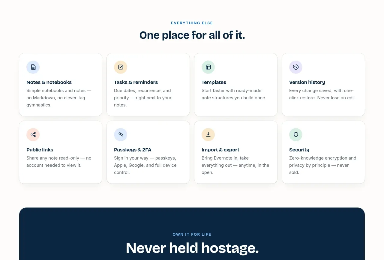
An eight-card grid rapidly communicates breadth, with each card using a colored icon bubble, short title, and concise supporting text.
Prompt preview
## Reference images

Study these alongside the description below: hierarchy, rhythm, spacing, colour. Build for the product you are asked about, using this design language.

- Component: https://kage-design-assets.t3.tigrisfiles.io/components/harbor/210c2f1c-cc35-4a7c-ab88-9680504ac3f6-1789970605-6.webp
- Full page it was cut from: https://kage-design-assets.t3.tigrisfiles.io/screenshots/harbor/210c2f1c-cc35-4a7c-ab88-9680504ac3f6-1789970506977-full.webp
- Component on Kage: https://kage.design/component/harbor-feature-grid-2

## Before you start
Ask what the user's product, audience, and brand are, then apply the principles below to that product rather than reproducing the reference.

Build a responsive capability grid with a centered eyebrow and heading above it. Use four columns on desktop and two or one on smaller screens. Each white card should have a small pastel circular icon container, a compact bold title, and two or three lines of muted explanatory text. Keep cards equal height, with 18–22px padding, 14px radius, a 1px border `#E5E9EA`, and a barely visible shadow. Use a warm white page background `#FCFBF9`, navy text `#09243A`, gray body copy `#687178`, and rotate soft icon backgrounds across pale blue, yellow, green, lavender, and peach. Preserve consistent gaps and avoid dense feature-card decoration.

Never use logos, product names, copy, illustrations, or imagery from the reference.
More components

 Spend visibility and daily-cost breakdown
Subscrr · Feature grid
Spend visibility and daily-cost breakdown
Subscrr · Feature grid
 Reminders and simple setup flow
Subscrr · Feature grid
Reminders and simple setup flow
Subscrr · Feature grid

 Security and permissions cards
NotchPop · Feature grid
Security and permissions cards
NotchPop · Feature grid
 Focused feature cards
NotchPop · Feature grid
Focused feature cards
NotchPop · Feature grid
 Interactive product demonstration
NotchPop · Feature grid
Interactive product demonstration
NotchPop · Feature grid
 Quiet information cards
NotchPop · Feature grid
Quiet information cards
NotchPop · Feature grid