kage
kage
harbor.my
Design analysis
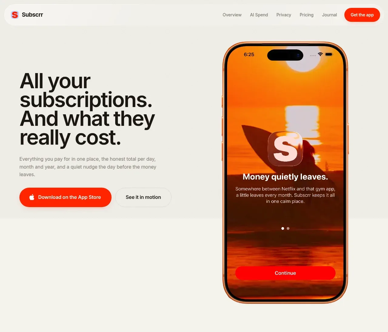
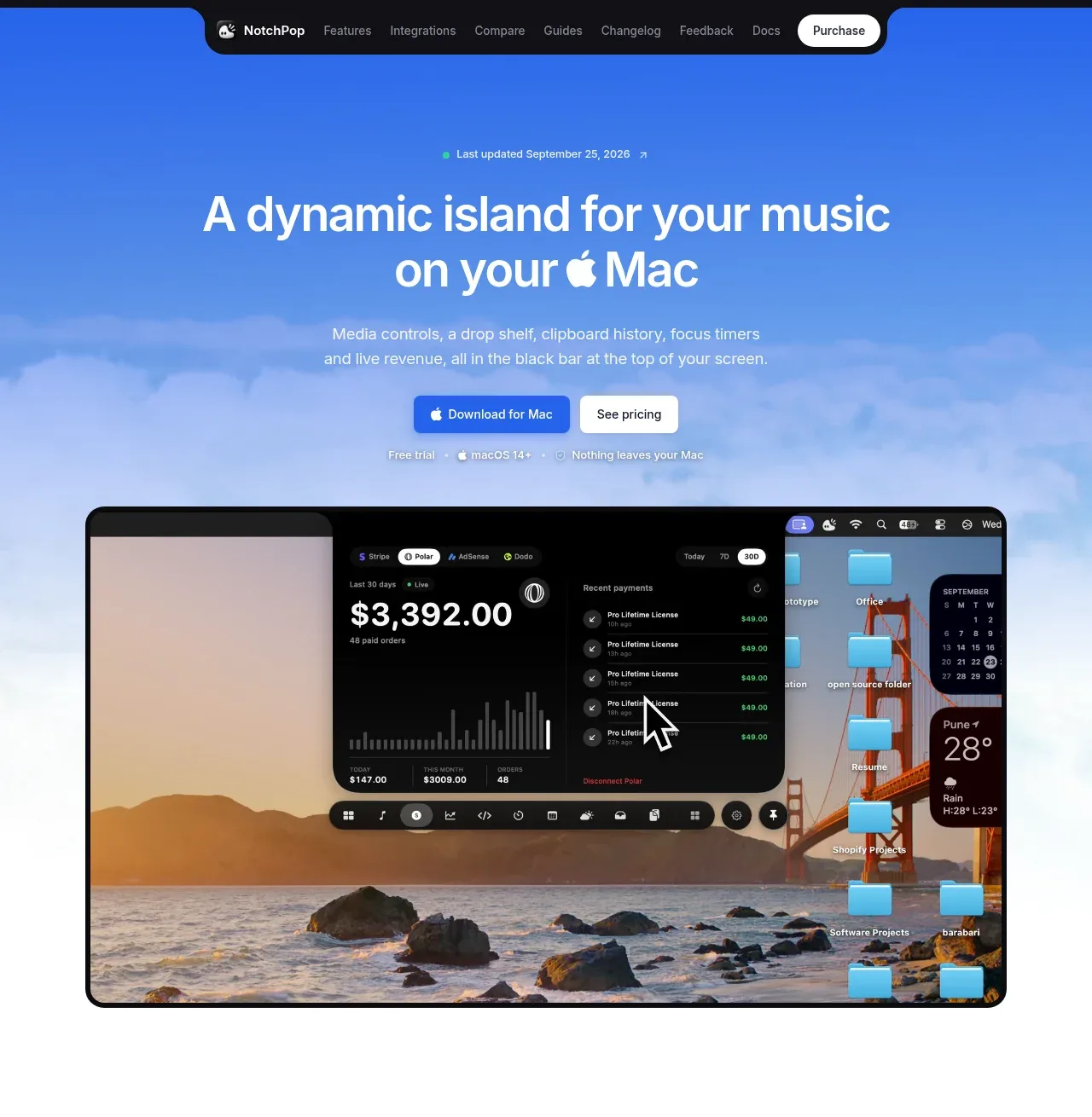
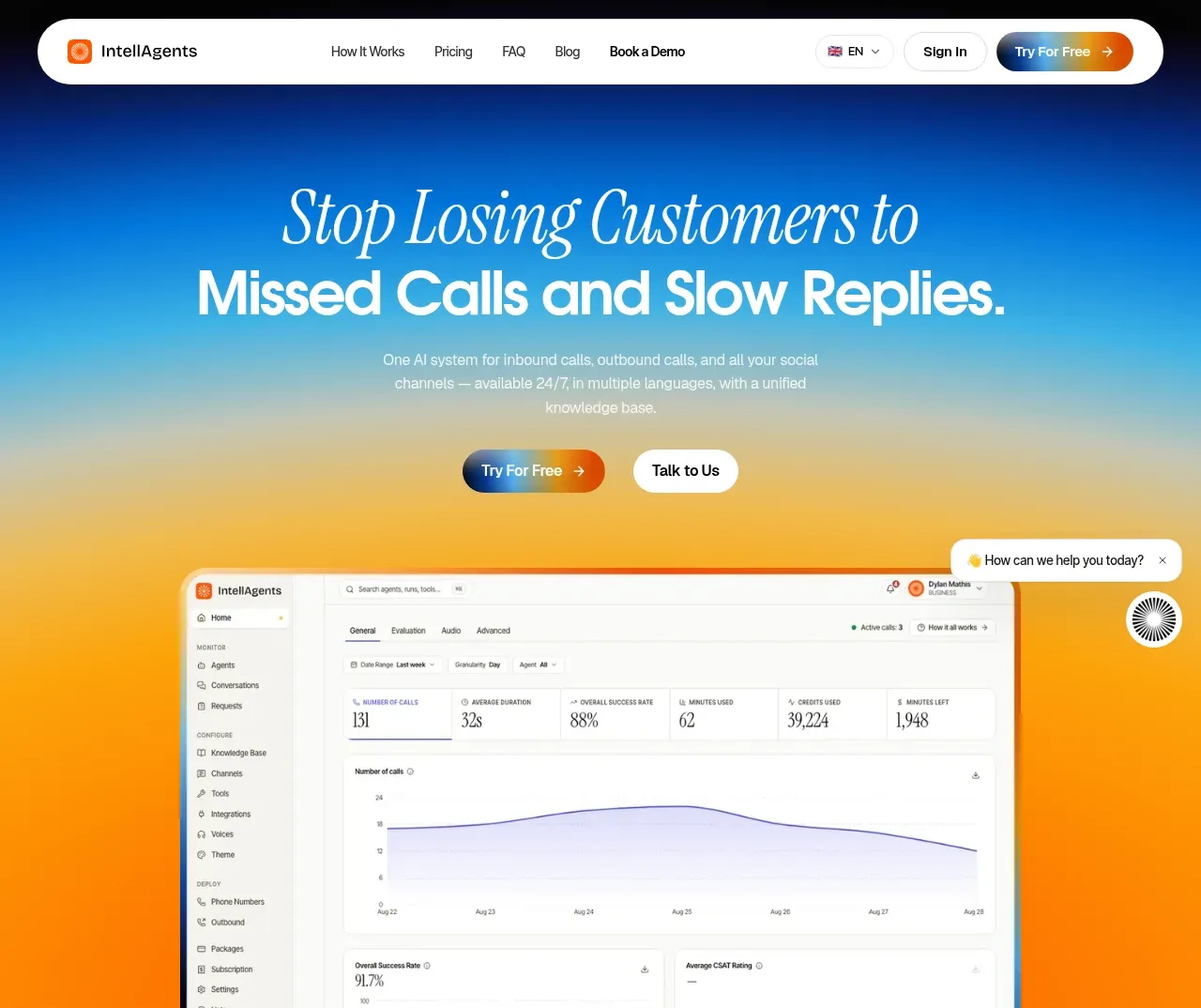
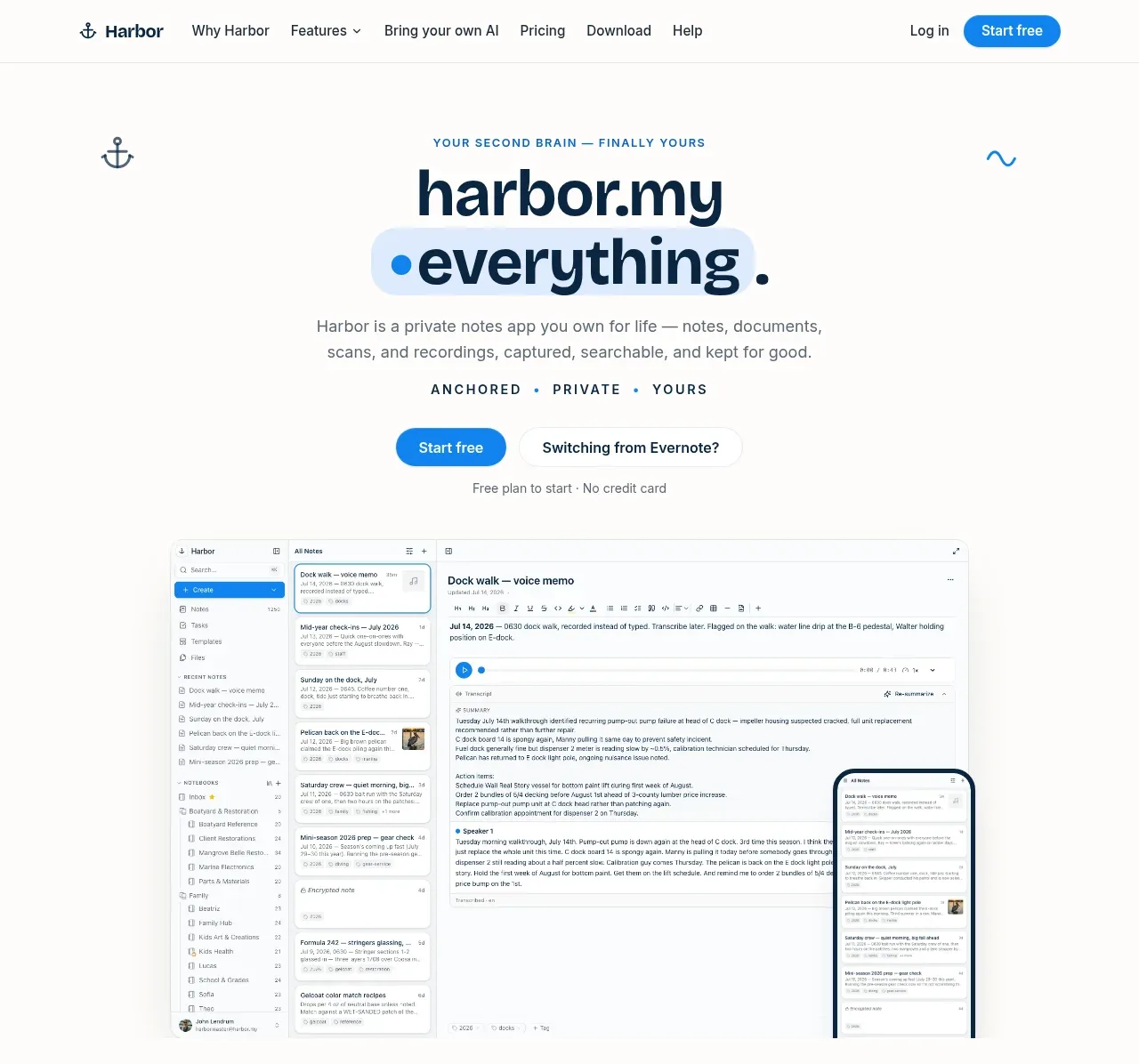
The hero combines a small eyebrow, oversized product promise, explanatory copy, dual CTAs, reassurance text, and a large desktop/mobile app preview that demonstrates the product immediately.
Prompt preview
## Reference images

Study these alongside the description below: hierarchy, rhythm, spacing, colour. Build for the product you are asked about, using this design language.

- Component: https://kage-design-assets.t3.tigrisfiles.io/components/harbor/210c2f1c-cc35-4a7c-ab88-9680504ac3f6-1789970603-1.webp
- Full page it was cut from: https://kage-design-assets.t3.tigrisfiles.io/screenshots/harbor/210c2f1c-cc35-4a7c-ab88-9680504ac3f6-1789970506977-full.webp
- Component on Kage: https://kage.design/component/harbor-hero

## Before you start
Ask what the user's product, audience, and brand are, then apply the principles below to that product rather than reproducing the reference.

Create a spacious centered hero directly below the navigation. Start with a small uppercase eyebrow, then a large two-line headline with a subtle soft-blue highlight or glow behind one phrase, followed by concise supporting copy. Add a prominent blue pill CTA beside a quieter outlined or text alternative, then a small reassurance line. Below the copy, place a wide product interface preview with a desktop frame and an overlapping phone frame; let the visual extend toward the bottom of the section while preserving generous whitespace. Use a warm near-white background `#FCFBF9`, dark navy `#09243A`, blue accent `#168BE3`, pale blue highlight `#DCEEFF`, rounded frames around 16–24px, and very soft shadows. Center all copy, use a bold display hierarchy, and keep the visual readable at mobile widths by stacking or cropping it carefully.

Never use logos, product names, copy, illustrations, or imagery from the reference.