 kage
kage
harbor.my
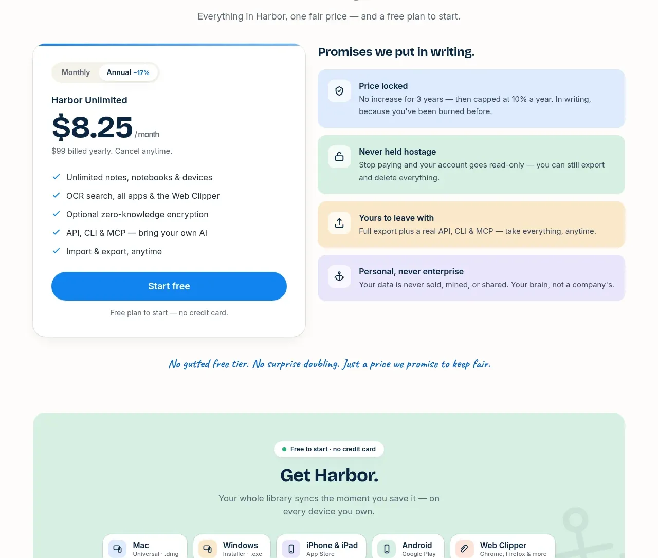
Design analysis
A simple-pricing heading leads into a two-column layout: a single plan card and a stack of colorful promise cards that make the guarantee tangible.
Prompt preview
## Reference images

Study these alongside the description below: hierarchy, rhythm, spacing, colour. Build for the product you are asked about, using this design language.

- Component: https://kage-design-assets.t3.tigrisfiles.io/components/harbor/210c2f1c-cc35-4a7c-ab88-9680504ac3f6-1789970606-9.webp
- Full page it was cut from: https://kage-design-assets.t3.tigrisfiles.io/screenshots/harbor/210c2f1c-cc35-4a7c-ab88-9680504ac3f6-1789970506977-full.webp
- Component on Kage: https://kage.design/component/harbor-pricing-table

## Before you start
Ask what the user's product, audience, and brand are, then apply the principles below to that product rather than reproducing the reference.

Create a pricing section with a centered eyebrow, headline, and short subheading. Below, use a two-column desktop layout: a prominent single-plan card on the left with billing toggle, plan name, large price, feature checklist, primary CTA, and small billing note; on the right, show a heading and four stacked promise cards. Give the plan card a white surface, 18px radius, thin border, and blue top accent. Use soft promise backgrounds in pale blue `#DDEBFF`, mint `#DDF3E8`, cream `#FFF0CF`, and lavender `#EEE9FF`; use navy `#09243A`, gray `#687178`, and blue `#168BE3`. Make the billing toggle visibly interactive, keep the CTA full-width, and stack the columns on mobile.

Never use logos, product names, copy, illustrations, or imagery from the reference.
More components
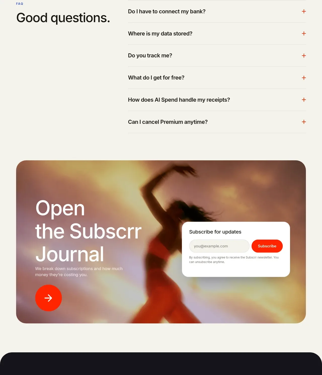
 Free and premium pricing comparison
Subscrr · Pricing table
Free and premium pricing comparison
Subscrr · Pricing table
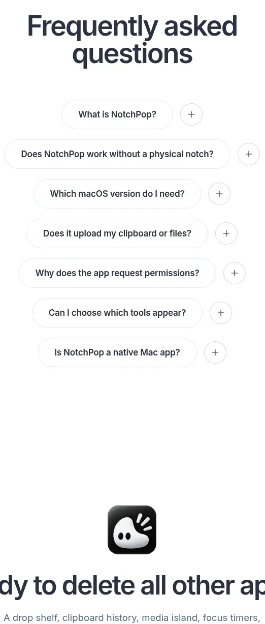
 One-time purchase pricing
NotchPop · Pricing table
One-time purchase pricing
NotchPop · Pricing table
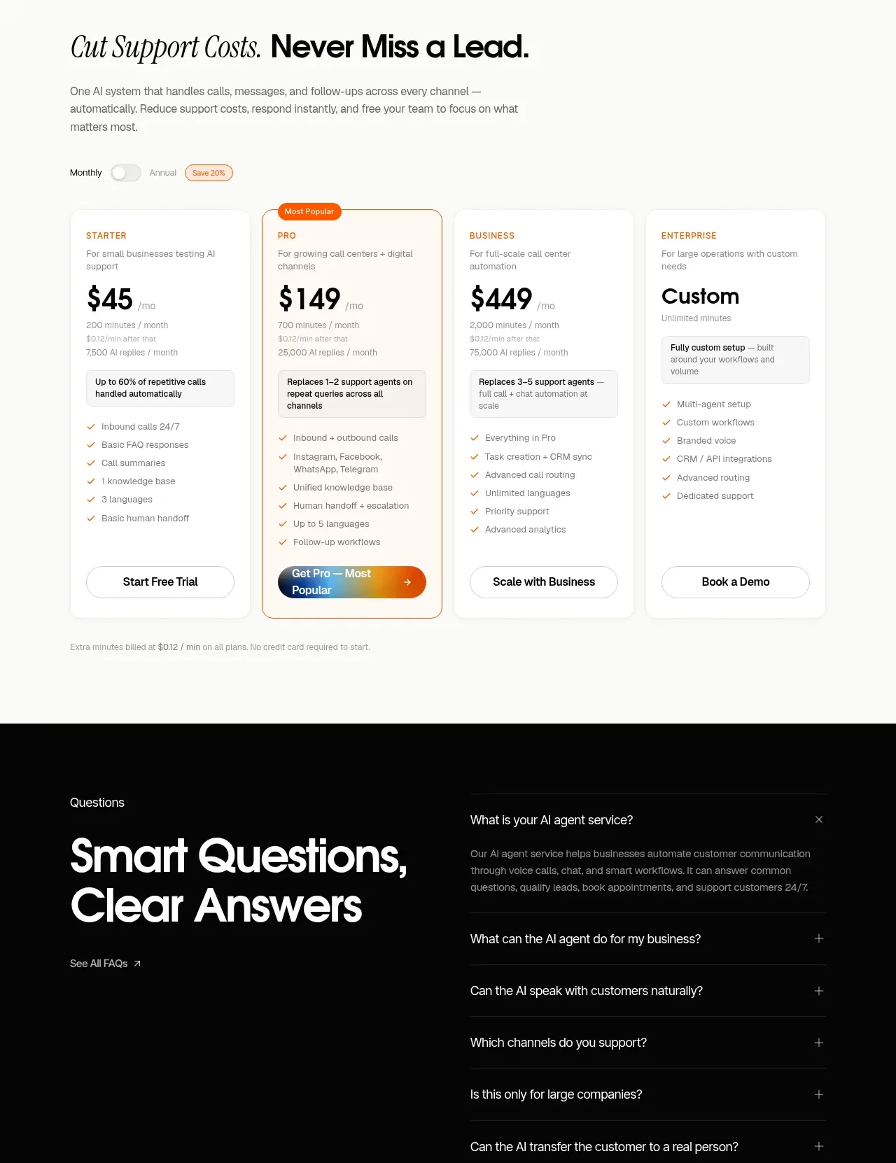
 Support plan pricing
IntellAgents.io · Pricing table
Support plan pricing
IntellAgents.io · Pricing table
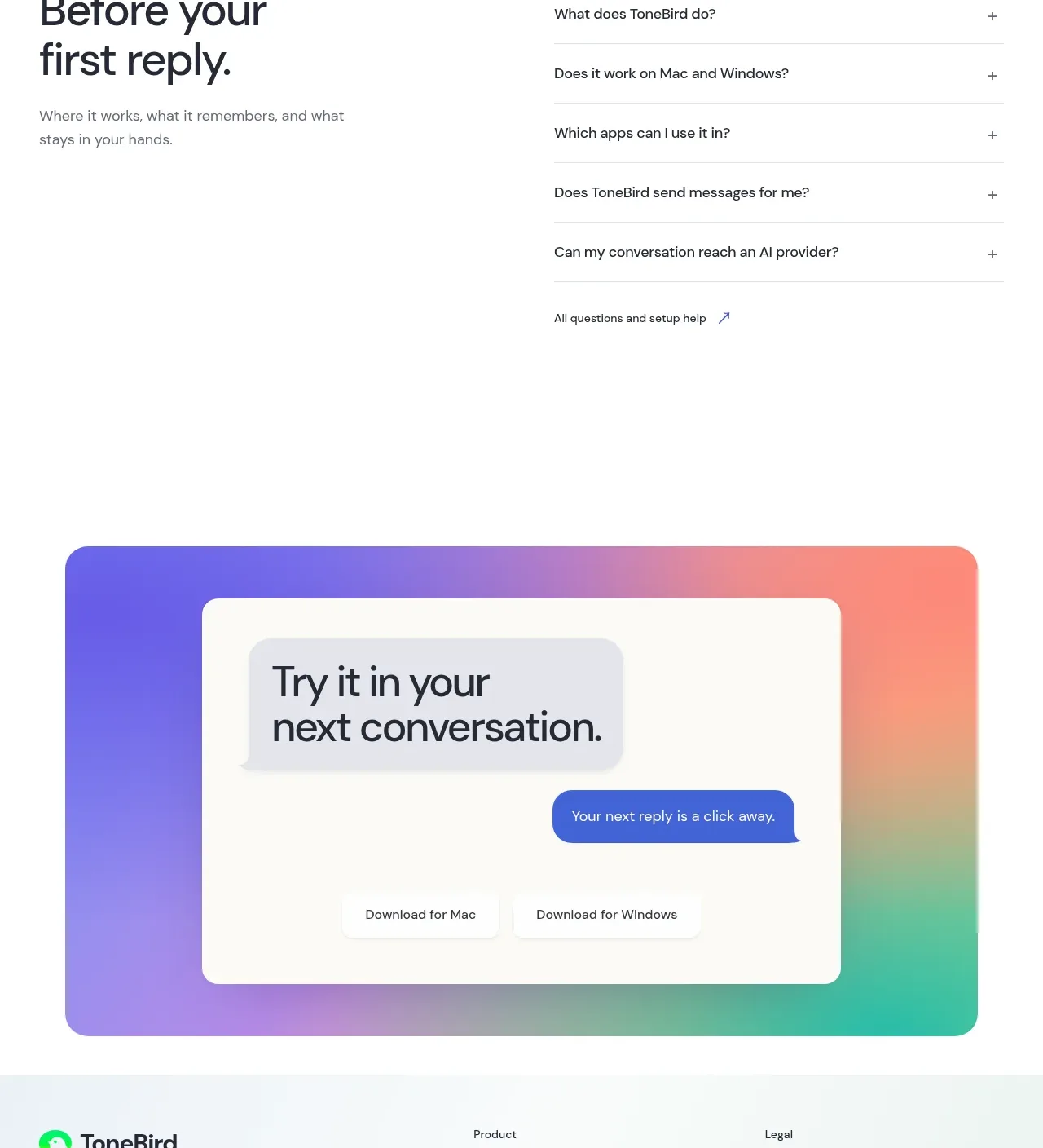
 Four-tier pricing table
ToneBird · Pricing table
Four-tier pricing table
ToneBird · Pricing table
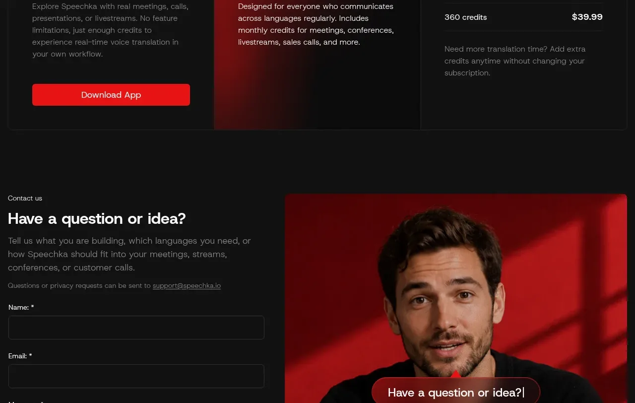
 Trial and subscription plans
Speechka · Pricing table
Trial and subscription plans
Speechka · Pricing table
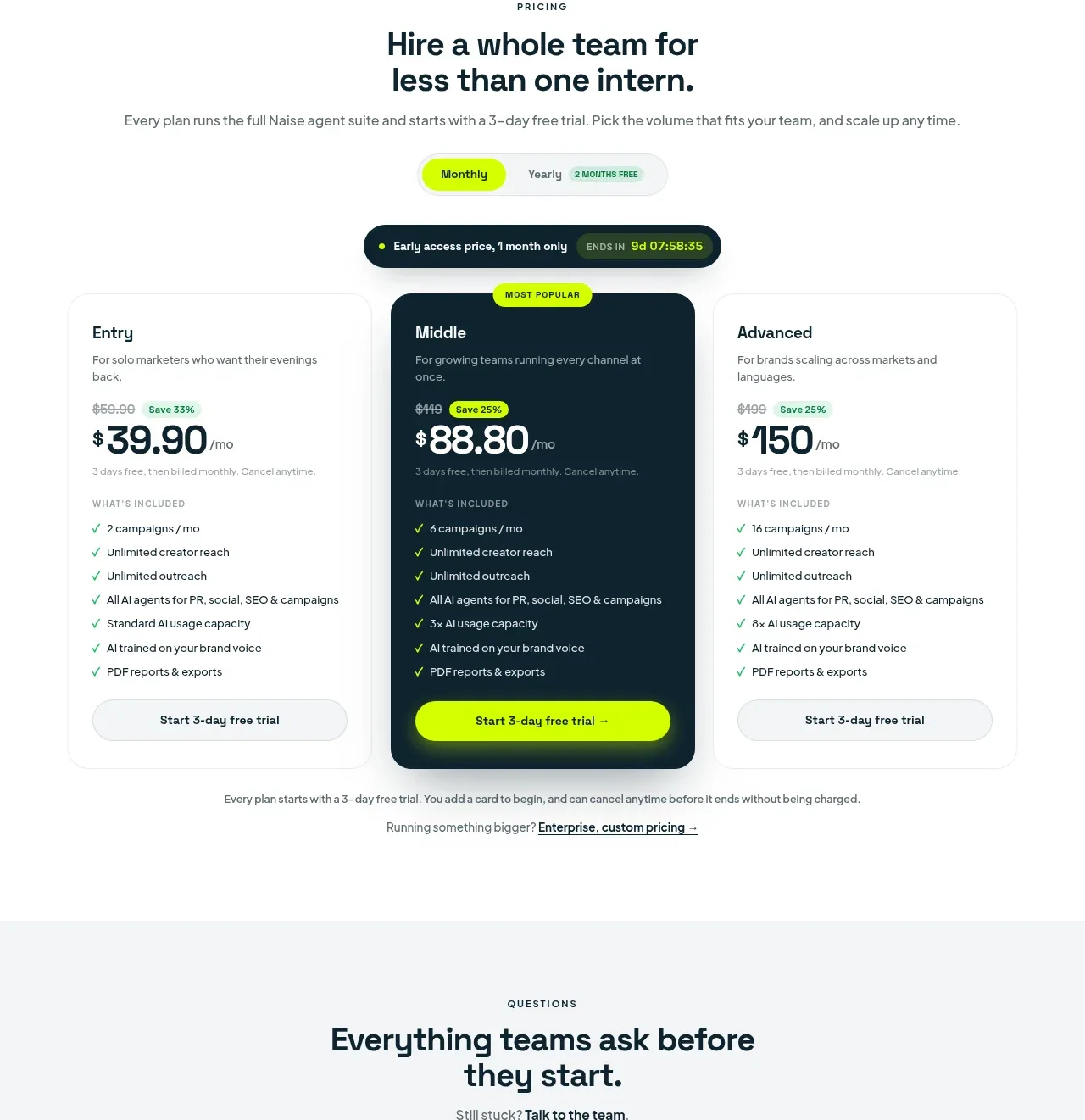
 Three-tier pricing plans
Naise AI · Pricing table
Three-tier pricing plans
Naise AI · Pricing table