 kage
kage
hark.com
Design analysis
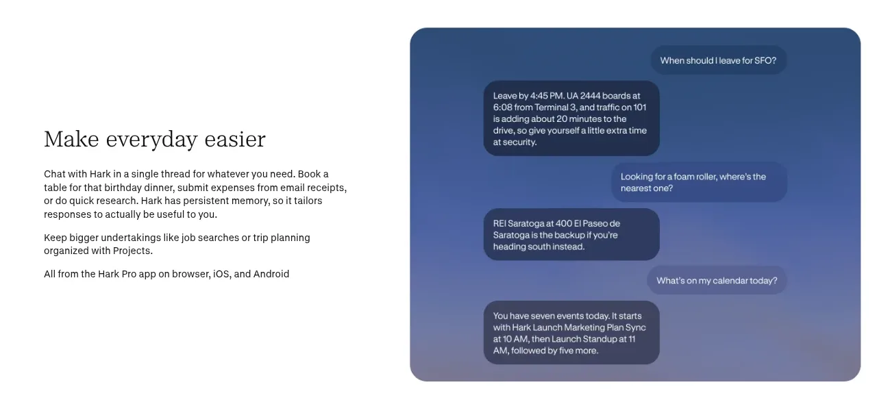
The first alternating feature band combines a concise editorial explanation with a rounded conversation visual, making an abstract assistant feel concrete.
Prompt preview
## Reference images

Study these alongside the description below: hierarchy, rhythm, spacing, colour. Build for the product you are asked about, using this design language.

- Component: https://kage-design-assets.t3.tigrisfiles.io/components/hark/c0ab7f75-9849-4088-b995-f4bab40ea0a8-1791525719-2.webp
- Full page it was cut from: https://kage-design-assets.t3.tigrisfiles.io/screenshots/hark/c0ab7f75-9849-4088-b995-f4bab40ea0a8-1791525672611-full.webp
- Component on Kage: https://kage.design/component/hark-feature-grid

## Before you start
Ask what the user's product, audience, and brand are, then apply the principles below to create an original version for that product.

Build an alternating split feature section explaining how the product helps with everyday tasks, pairing editorial copy with a single illustrative product surface.

### Design language
- Use a 48/52 two-column layout with the text vertically centered and the visual occupying the opposite side.
- Keep the text column narrow: serif heading, two or three short paragraphs, and no more than one small supporting line.
- Use a large rounded visual panel with a calm blue or brand-tinted background (`#456b9e` or an appropriate brand equivalent).
- Represent the product interaction with a few floating conversation cards, using translucent dark surfaces, white text, and subtle shadows.
- Maintain 80–120px vertical padding, 36–48px side gutters, and 20–24px radii.
- On mobile, place copy before the visual and keep the message cards readable.

### Never
- Never reuse logos, product names, copy, illustrations, or imagery from the reference.
- Never overfill the panel with chat bubbles or use generic “AI magic” claims without a concrete task.
More components

 Privacy and optional intelligence
Mailwell · Feature grid
Privacy and optional intelligence
Mailwell · Feature grid
 Reliable, recoverable actions
Mailwell · Feature grid
Reliable, recoverable actions
Mailwell · Feature grid
 Unified account setup
Mailwell · Feature grid
Unified account setup
Mailwell · Feature grid
 Fast local workflow and calm reading
Mailwell · Feature grid
Fast local workflow and calm reading
Mailwell · Feature grid

 Cloud layer workflows
ProcBoss · Feature grid
Cloud layer workflows
ProcBoss · Feature grid
 Operational blind spots
ProcBoss · Feature grid
Operational blind spots
ProcBoss · Feature grid