 kage
kage
hark.com
Design analysis
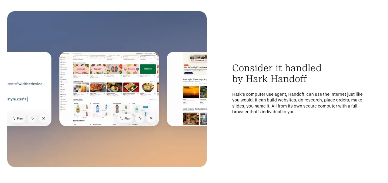
This reversed feature band makes delegated work tangible through a multi-surface visual beside a short explanation of the outcome.
Prompt preview
## Reference images

Study these alongside the description below: hierarchy, rhythm, spacing, colour. Build for the product you are asked about, using this design language.

- Component: https://kage-design-assets.t3.tigrisfiles.io/components/hark/c0ab7f75-9849-4088-b995-f4bab40ea0a8-1791525719-3.webp
- Full page it was cut from: https://kage-design-assets.t3.tigrisfiles.io/screenshots/hark/c0ab7f75-9849-4088-b995-f4bab40ea0a8-1791525672611-full.webp
- Component on Kage: https://kage.design/component/hark-feature-grid-2

## Before you start
Ask what the user's product, audience, and brand are, then apply the principles below to create an original version for that product.

Create a reversed split feature section about delegated or automated work. Show a believable product workflow on one side and explain its benefit on the other.

### Design language
- Reverse the previous section’s visual/text order to create an alternating scroll rhythm.
- Use a large rounded visual frame with a soft gradient background, such as blue into peach (`#456a9d` to `#efb18f`).
- Layer two or three simplified interface windows inside the frame, with one primary window and smaller supporting windows.
- Use a serif heading with compact sans-serif body copy; keep the body measure around 34–40 characters.
- Add depth through low-opacity shadows and overlapping cards, not heavy decoration.
- Preserve equal visual weight between the text and image columns and generous vertical padding.

### Never
- Never reuse logos, product names, copy, illustrations, or imagery from the reference.
- Never copy a specific browser layout or imply automation without showing what is being handled.
More components

 Privacy and optional intelligence
Mailwell · Feature grid
Privacy and optional intelligence
Mailwell · Feature grid
 Reliable, recoverable actions
Mailwell · Feature grid
Reliable, recoverable actions
Mailwell · Feature grid
 Unified account setup
Mailwell · Feature grid
Unified account setup
Mailwell · Feature grid
 Fast local workflow and calm reading
Mailwell · Feature grid
Fast local workflow and calm reading
Mailwell · Feature grid

 Cloud layer workflows
ProcBoss · Feature grid
Cloud layer workflows
ProcBoss · Feature grid
 Operational blind spots
ProcBoss · Feature grid
Operational blind spots
ProcBoss · Feature grid