 kage
kage
hark.com
Design analysis
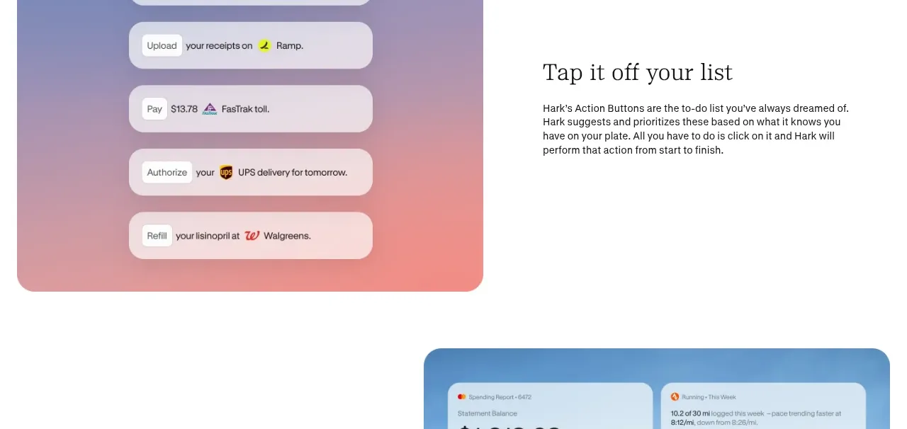
A colorful visual demonstrates one-tap actions as a vertical stack, while the adjacent copy explains the simplicity and control of completing tasks.
Prompt preview
## Reference images

Study these alongside the description below: hierarchy, rhythm, spacing, colour. Build for the product you are asked about, using this design language.

- Component: https://kage-design-assets.t3.tigrisfiles.io/components/hark/c0ab7f75-9849-4088-b995-f4bab40ea0a8-1791525720-5.webp
- Full page it was cut from: https://kage-design-assets.t3.tigrisfiles.io/screenshots/hark/c0ab7f75-9849-4088-b995-f4bab40ea0a8-1791525672611-full.webp
- Component on Kage: https://kage.design/component/hark-feature-grid-4

## Before you start
Ask what the user's product, audience, and brand are, then apply the principles below to create an original version for that product.

Create a feature section focused on fast, explicit actions. Use a tactile visual stack of action rows paired with concise explanatory copy.

### Design language
- Alternate the visual and text placement relative to the previous section.
- Put the action demonstration inside a rounded panel with a gentle lavender-to-coral gradient (`#8796c8` to `#ed9d91`).
- Stack four or five pill-like rows vertically; each row should have a verb, a short object, and a small status/icon area.
- Use high-contrast white cards with soft shadows, 14–18px radii, and clear spacing between rows.
- Keep the copy focused on user control, speed, and reversibility; use a serif heading and readable sans-serif body.
- Add pressed, hover, and completed states if the rows are interactive.

### Never
- Never reuse logos, product names, copy, illustrations, or imagery from the reference.
- Never make actions ambiguous, destructive by default, or dependent on unexplained brand icons.
More components

 Privacy and optional intelligence
Mailwell · Feature grid
Privacy and optional intelligence
Mailwell · Feature grid
 Reliable, recoverable actions
Mailwell · Feature grid
Reliable, recoverable actions
Mailwell · Feature grid
 Unified account setup
Mailwell · Feature grid
Unified account setup
Mailwell · Feature grid
 Fast local workflow and calm reading
Mailwell · Feature grid
Fast local workflow and calm reading
Mailwell · Feature grid

 Cloud layer workflows
ProcBoss · Feature grid
Cloud layer workflows
ProcBoss · Feature grid
 Operational blind spots
ProcBoss · Feature grid
Operational blind spots
ProcBoss · Feature grid