kage
kage
hark.com
Design analysis
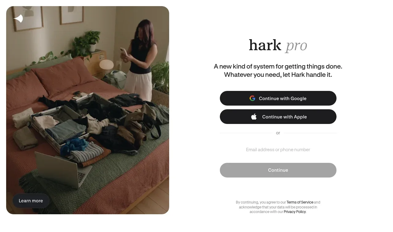
A large two-column introduction pairs an intimate lifestyle visual and learn-more affordance with a focused product proposition and low-friction social sign-up form.
Prompt preview
## Reference images

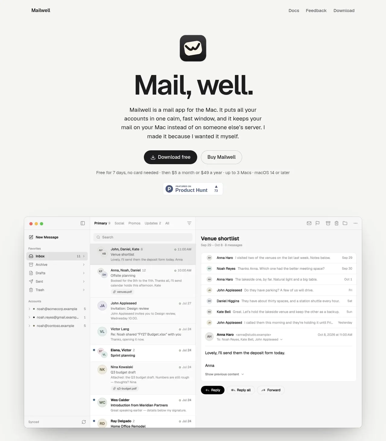
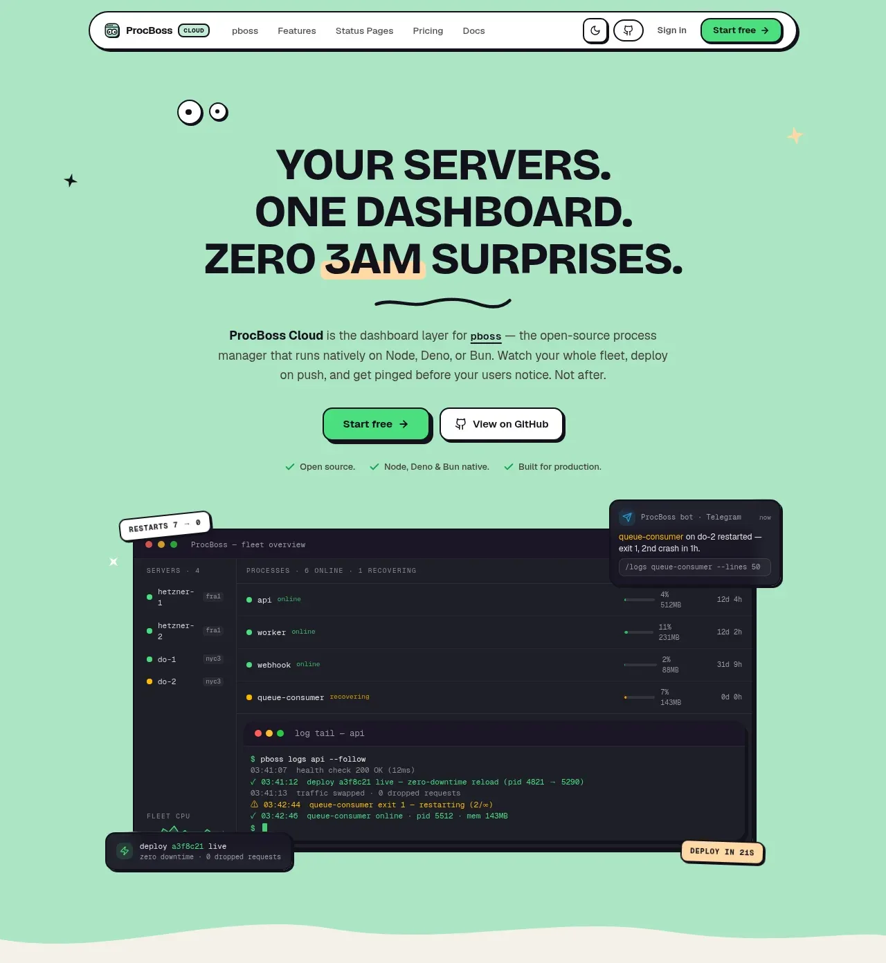
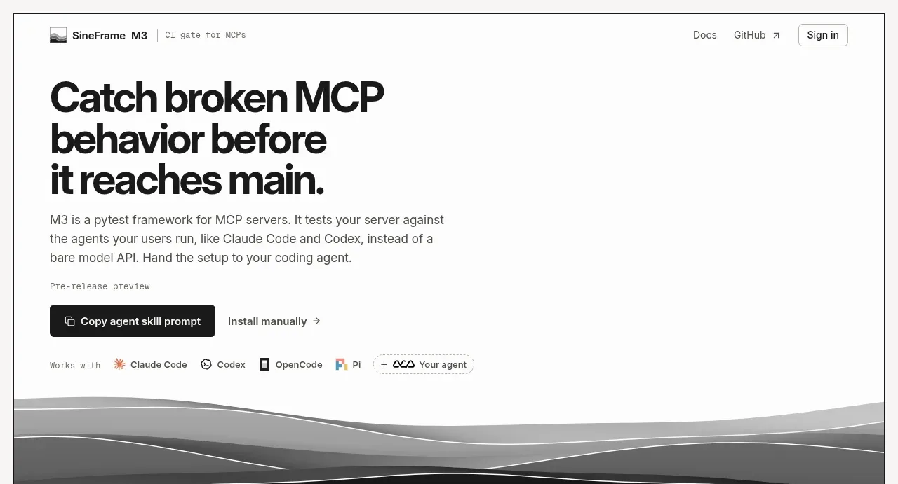
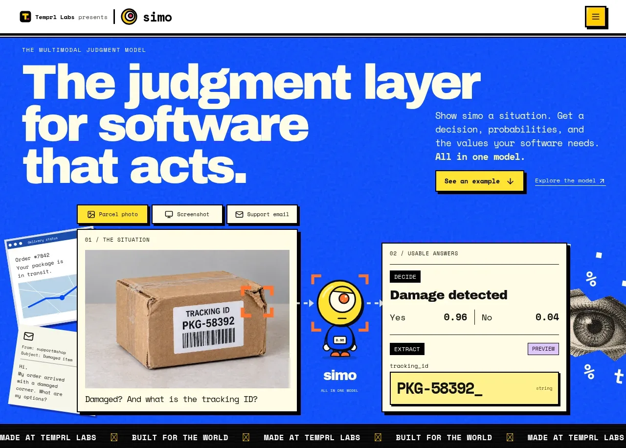
Study these alongside the description below: hierarchy, rhythm, spacing, colour. Build for the product you are asked about, using this design language.

- Component: https://kage-design-assets.t3.tigrisfiles.io/components/hark/c0ab7f75-9849-4088-b995-f4bab40ea0a8-1791525719-0.webp
- Full page it was cut from: https://kage-design-assets.t3.tigrisfiles.io/screenshots/hark/c0ab7f75-9849-4088-b995-f4bab40ea0a8-1791525672611-full.webp
- Component on Kage: https://kage.design/component/hark-hero

## Before you start
Ask what the user's product, audience, and brand are, then apply the principles below to create an original version for that product.

Build a full-width split hero with a rounded lifestyle or product visual on the left and a calm authentication panel on the right. Keep the composition editorial and spacious rather than dashboard-like.

### Design language
- Use a 46/54 or 45/55 two-column grid inside generous outer margins; align both columns to the same top edge.
- Give the visual a large radius around 20–24px and let a compact dark translucent “learn more” control sit inside its lower-left corner.
- Center the right-side content in a narrow 300–340px column.
- Use a refined serif display face for the product proposition and a neutral sans-serif for supporting copy and controls.
- Keep the palette warm white/off-white (`#fbfbfa`), near-black (`#171717`), soft gray (`#e7e7e7`), and charcoal for primary buttons (`#1d1d1d`).
- Stack social buttons, a subtle divider with “or”, an email/phone field, and a disabled-looking continuation button with 10–22px vertical rhythm.
- Use pill-shaped controls with 999px radius, faint borders, and understated hover/focus states.
- On small screens, stack the image above the form and preserve generous breathing room.

### Never
- Never reuse logos, product names, copy, illustrations, or imagery from the reference.
- Never make the form visually dense, add unrelated navigation, or copy the exact composition.