 kage
kage
harmony.io
Design analysis
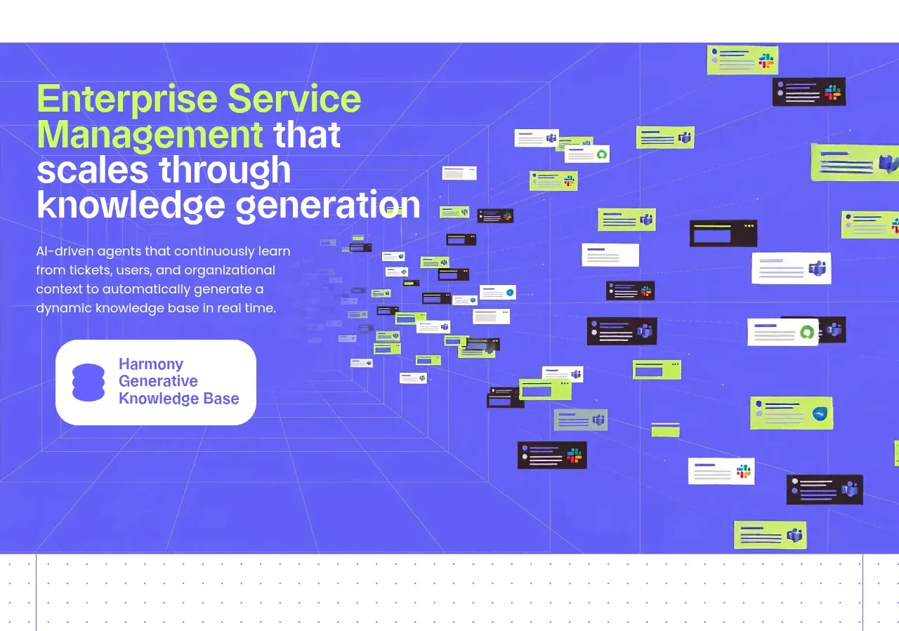
A saturated violet product story section pairs a concise explanatory column with a large network-like field of floating workflow cards.
Prompt preview
## Reference images

Study these alongside the description below: hierarchy, rhythm, spacing, colour. Build for the product you are asked about, using this design language.

- Component: https://kage-design-assets.t3.tigrisfiles.io/components/harmony/a96ec10f-a650-47bb-acaa-8bed3696d9f4-1790575328-2.webp
- Full page it was cut from: https://kage-design-assets.t3.tigrisfiles.io/screenshots/harmony/a96ec10f-a650-47bb-acaa-8bed3696d9f4-1790575269319-full.webp
- Component on Kage: https://kage.design/component/harmony-feature-grid

## Before you start
Ask what capability the user's product wants to highlight and what visual metaphor matches its brand. Apply the layout logic without copying the source.

Build a full-bleed feature section with a vivid violet-blue background (#5149ed) and subtle perspective grid lines. Place a strong headline and short explanatory paragraph in a left column, using white and bright lime (#c8ff45) for emphasis. On the right, create a deep field of small floating interface cards connected by faint lines, suggesting knowledge flowing through an organization. Include one larger rounded label or product capsule near the copy as an anchor. Use 56–80px section padding, a 10–12 column grid, bold 48–64px display type, and small 14–18px body copy. Keep decorative connections low contrast so the message remains readable. Let the visual crop naturally on mobile rather than forcing a dense miniature diagram.

Never: use logos, product names, copy, illustrations, or imagery from the reference.
More components

 Three-step process cards
godaylight.com · Feature grid
Three-step process cards
godaylight.com · Feature grid

 Use-case selector with vertical video preview
Spira Maxima · Feature grid
Use-case selector with vertical video preview
Spira Maxima · Feature grid

 Insights and enterprise model access
FastRouter.ai · Feature grid
Insights and enterprise model access
FastRouter.ai · Feature grid
 Solutions by organizational role
FastRouter.ai · Feature grid
Solutions by organizational role
FastRouter.ai · Feature grid
 Routing reliability and model collaboration
FastRouter.ai · Feature grid
Routing reliability and model collaboration
FastRouter.ai · Feature grid
 Goal-oriented product capabilities
FastRouter.ai · Feature grid
Goal-oriented product capabilities
FastRouter.ai · Feature grid