 kage
kage
harmony.io
Design analysis
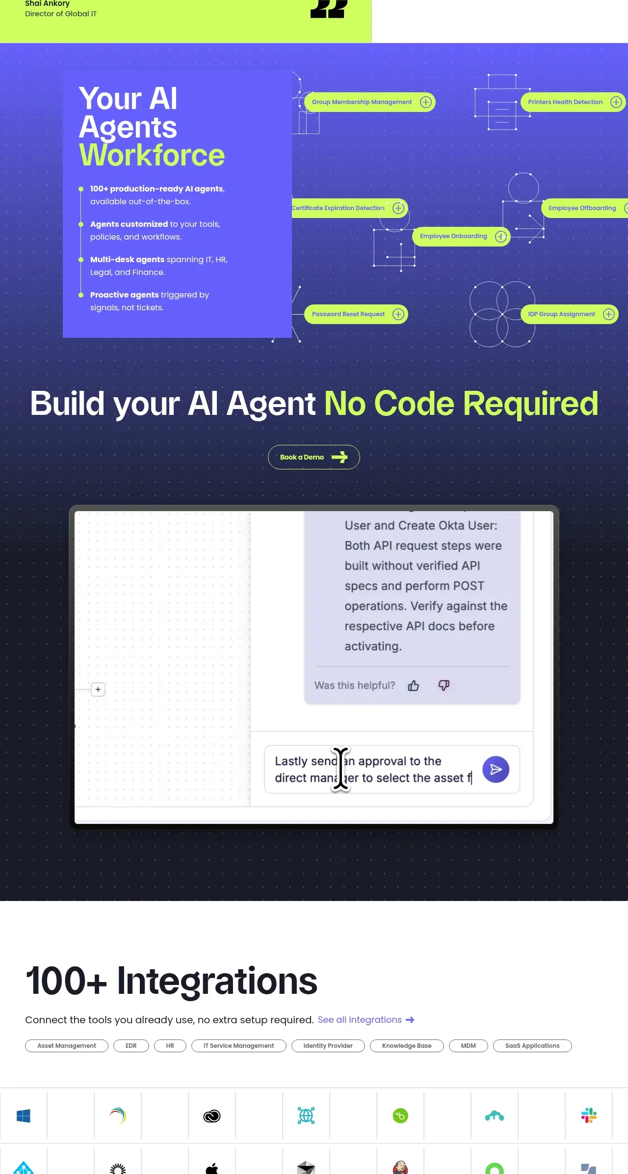
A dark, atmospheric section presents a workforce of specialized agents through a left information panel, connected task labels, and a large no-code call to action with product imagery.
Prompt preview
## Reference images

Study these alongside the description below: hierarchy, rhythm, spacing, colour. Build for the product you are asked about, using this design language.

- Component: https://kage-design-assets.t3.tigrisfiles.io/components/harmony/a96ec10f-a650-47bb-acaa-8bed3696d9f4-1790575329-5.webp
- Full page it was cut from: https://kage-design-assets.t3.tigrisfiles.io/screenshots/harmony/a96ec10f-a650-47bb-acaa-8bed3696d9f4-1790575269319-full.webp
- Component on Kage: https://kage.design/component/harmony-feature-grid-2

## Before you start
Ask what recurring jobs the user's product automates, who configures them, and what action should follow this section. Translate those answers into an original agent-workforce story.

Create a long dark feature section using a navy-to-indigo background (#20243f to #5149ed), faint dotted texture, thin schematic lines, and lime task pills. In the upper half, place a translucent or violet information card on the left with a large two-line heading, four short benefit bullets, and a vertical connecting rule. Surround it with floating pill-shaped automation labels on the right; each label can include a small plus or status control and should appear connected to simple geometric nodes. In the lower half, use a huge centered CTA headline with one lime phrase, a compact outlined pill button, and a framed product interaction preview beneath it. Use white text, lime #c9ff43, 40–64px heading sizes, 24–32px card padding, 16px radii, and ample vertical rhythm. Animate only subtle node movement and hover elevation; honor reduced-motion preferences.

Never: use logos, product names, copy, illustrations, or imagery from the reference.
More components

 Three-step process cards
godaylight.com · Feature grid
Three-step process cards
godaylight.com · Feature grid

 Use-case selector with vertical video preview
Spira Maxima · Feature grid
Use-case selector with vertical video preview
Spira Maxima · Feature grid

 Insights and enterprise model access
FastRouter.ai · Feature grid
Insights and enterprise model access
FastRouter.ai · Feature grid
 Solutions by organizational role
FastRouter.ai · Feature grid
Solutions by organizational role
FastRouter.ai · Feature grid
 Routing reliability and model collaboration
FastRouter.ai · Feature grid
Routing reliability and model collaboration
FastRouter.ai · Feature grid
 Goal-oriented product capabilities
FastRouter.ai · Feature grid
Goal-oriented product capabilities
FastRouter.ai · Feature grid