 kage
kage
harmony.io
Design analysis
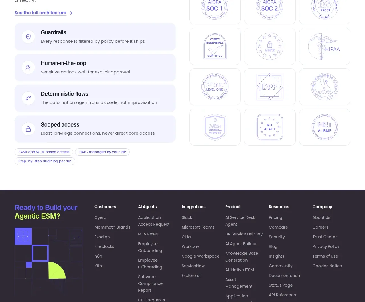
The security section balances a left-side explanation and layered safeguards with a right-side matrix of compliance badges.
Prompt preview
## Reference images

Study these alongside the description below: hierarchy, rhythm, spacing, colour. Build for the product you are asked about, using this design language.

- Component: https://kage-design-assets.t3.tigrisfiles.io/components/harmony/a96ec10f-a650-47bb-acaa-8bed3696d9f4-1790575330-7.webp
- Full page it was cut from: https://kage-design-assets.t3.tigrisfiles.io/screenshots/harmony/a96ec10f-a650-47bb-acaa-8bed3696d9f4-1790575269319-full.webp
- Component on Kage: https://kage.design/component/harmony-feature-grid-3

## Before you start
Ask what security promises the user's product can substantiate, which compliance standards apply, and what level of technical detail the audience needs. Use only truthful claims in the resulting design.

Create a light security section with a large two-color heading where the first phrase uses violet (#6257ef), a short explanatory paragraph, and a small architecture link. Below the copy, stack four rounded safeguard rows with a small line icon, bold title, and one-sentence explanation. On the right, show a neat 3-by-3 matrix of understated certification or trust cards; use abstract seal-like placeholders or real certifications only when the user supplies them. Use #fbfbfa background, pale lavender row fills (#f0efff), #e1e1e8 borders, 12–16px radii, 40–64px gaps, and 48–64px heading type. Ensure the badges do not imply certifications the product does not have, and stack the columns on narrow screens.

Never: use logos, product names, copy, illustrations, or imagery from the reference.
More components

 Three-step process cards
godaylight.com · Feature grid
Three-step process cards
godaylight.com · Feature grid

 Use-case selector with vertical video preview
Spira Maxima · Feature grid
Use-case selector with vertical video preview
Spira Maxima · Feature grid

 Insights and enterprise model access
FastRouter.ai · Feature grid
Insights and enterprise model access
FastRouter.ai · Feature grid
 Solutions by organizational role
FastRouter.ai · Feature grid
Solutions by organizational role
FastRouter.ai · Feature grid
 Routing reliability and model collaboration
FastRouter.ai · Feature grid
Routing reliability and model collaboration
FastRouter.ai · Feature grid
 Goal-oriented product capabilities
FastRouter.ai · Feature grid
Goal-oriented product capabilities
FastRouter.ai · Feature grid