 kage
kage
harmony.io
Design analysis
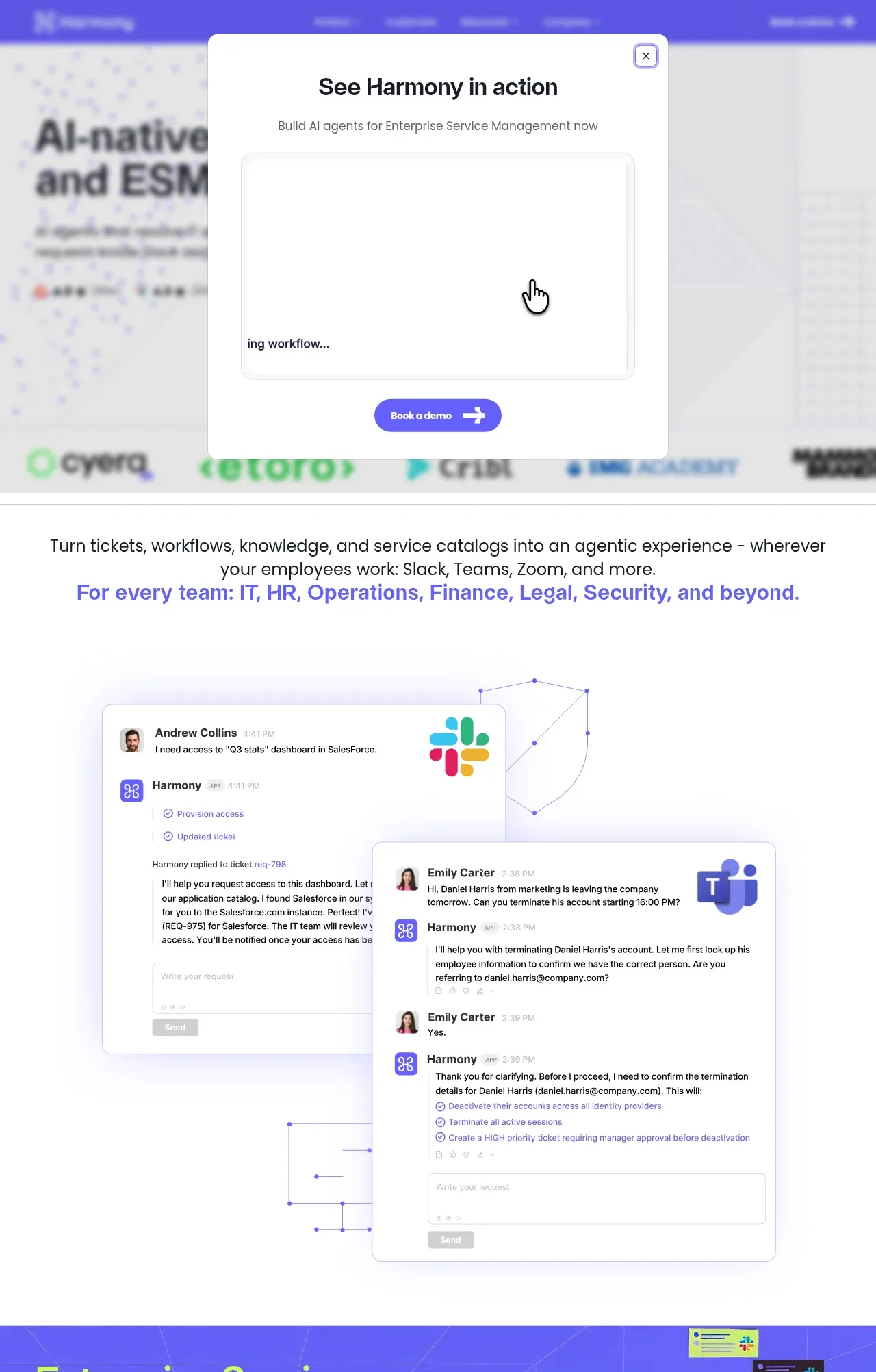
The opening section combines a bold value proposition, supporting statement, social proof, and layered support-conversation visuals to explain an AI service-management product.
Prompt preview
## Reference images

Study these alongside the description below: hierarchy, rhythm, spacing, colour. Build for the product you are asked about, using this design language.

- Component: https://kage-design-assets.t3.tigrisfiles.io/components/harmony/a96ec10f-a650-47bb-acaa-8bed3696d9f4-1790575328-1.webp
- Full page it was cut from: https://kage-design-assets.t3.tigrisfiles.io/screenshots/harmony/a96ec10f-a650-47bb-acaa-8bed3696d9f4-1790575269319-full.webp
- Component on Kage: https://kage.design/component/harmony-hero

## Before you start
Ask what the user's product does, its primary audience, and its brand personality. Then use this structure to create a distinct hero for that product.

Create a spacious, conversion-focused hero beneath the navigation. Start with a very large, tightly set headline on the left or centered, using near-black text and one accent color for an important phrase. Follow with one or two lines explaining the outcome in plain language, then a rounded primary CTA. Below or beside the copy, stage two overlapping customer-support conversation cards with avatars, timestamps, checklists, and a clear automation response; use the cards as proof of the workflow rather than decoration. Add a restrained row of customer or integration marks near the transition into the next section. Use an off-white background (#fbfbfa), black text (#171821), violet accent (#6257ef), and lime accent (#c9ff43). Use soft shadows, 1px #d9d9e3 borders, 12–18px radii, and generous 80–120px vertical spacing. Make the cards responsive and preserve the overlap only on large screens.

Never: use logos, product names, copy, illustrations, or imagery from the reference.
More components

 AI workflow hero
Incredible · Hero
AI workflow hero
Incredible · Hero

 Decentralized energy statement
godaylight.com · Hero
Decentralized energy statement
godaylight.com · Hero
 Photographic power-home hero
godaylight.com · Hero
Photographic power-home hero
godaylight.com · Hero
 Warm mission statement panel
godaylight.com · Hero
Warm mission statement panel
godaylight.com · Hero
 Grid problem statement
godaylight.com · Hero
Grid problem statement
godaylight.com · Hero

 Product hero with download action and video
HyperFrames Studio (Desktop) · Hero
Product hero with download action and video
HyperFrames Studio (Desktop) · Hero