 kage
kage
harmony.io
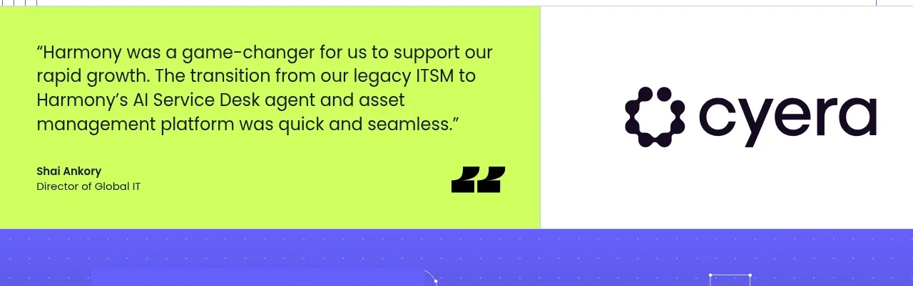
Design analysis
A high-contrast split testimonial turns a specific customer outcome into a visual pause between product sections.
Prompt preview
## Reference images

Study these alongside the description below: hierarchy, rhythm, spacing, colour. Build for the product you are asked about, using this design language.

- Component: https://kage-design-assets.t3.tigrisfiles.io/components/harmony/a96ec10f-a650-47bb-acaa-8bed3696d9f4-1790575329-4.webp
- Full page it was cut from: https://kage-design-assets.t3.tigrisfiles.io/screenshots/harmony/a96ec10f-a650-47bb-acaa-8bed3696d9f4-1790575269319-full.webp
- Component on Kage: https://kage.design/component/harmony-testimonials

## Before you start
Ask who the user's most credible customer type is and which measurable or emotional outcome matters most. Write original proof for that audience.

Build a compact split testimonial band. Give the quote side a saturated lime background (#c9ff43) with dark text, a large opening quote mark, a two-to-three-line statement, and a small attribution row. Give the opposite side a warm white background with a simple abstract customer identifier or text lockup, not a copied logo. Use a 50/50 grid, 36–48px quote typography, 15–16px attribution text, 48–64px padding, and a clean vertical seam between halves. On mobile, stack the quote above the attribution panel. Keep the quote specific and believable, with generous line height.

Never: use logos, product names, copy, illustrations, or imagery from the reference.
More components
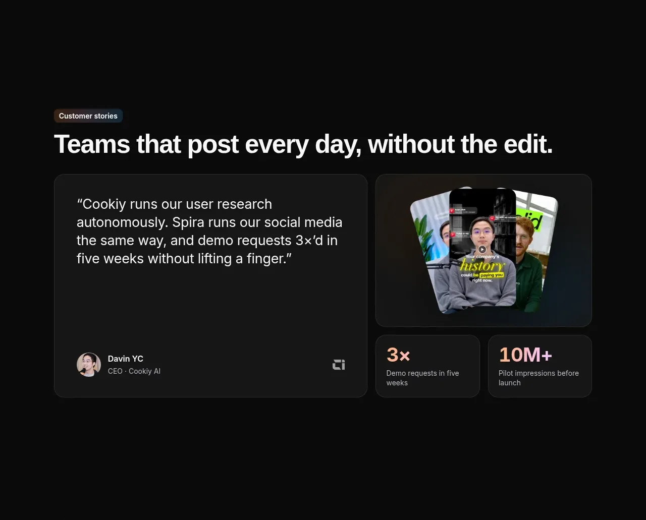
 Customer story and proof points
Spira Maxima · Testimonials
Customer story and proof points
Spira Maxima · Testimonials
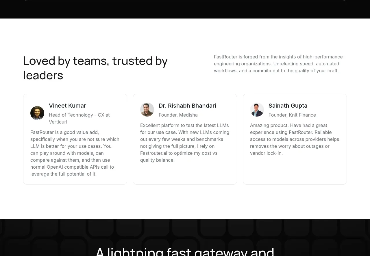
 Customer testimonial cards
FastRouter.ai · Testimonials
Customer testimonial cards
FastRouter.ai · Testimonials
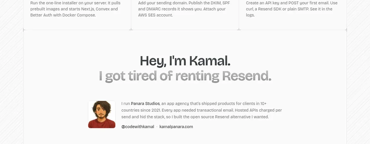
 Founder story
opensend.cc · Testimonials
Founder story
opensend.cc · Testimonials
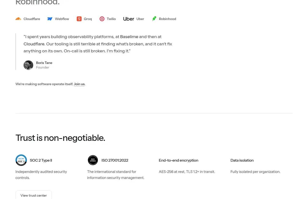
P
Founder testimonial
Polylane · Testimonials
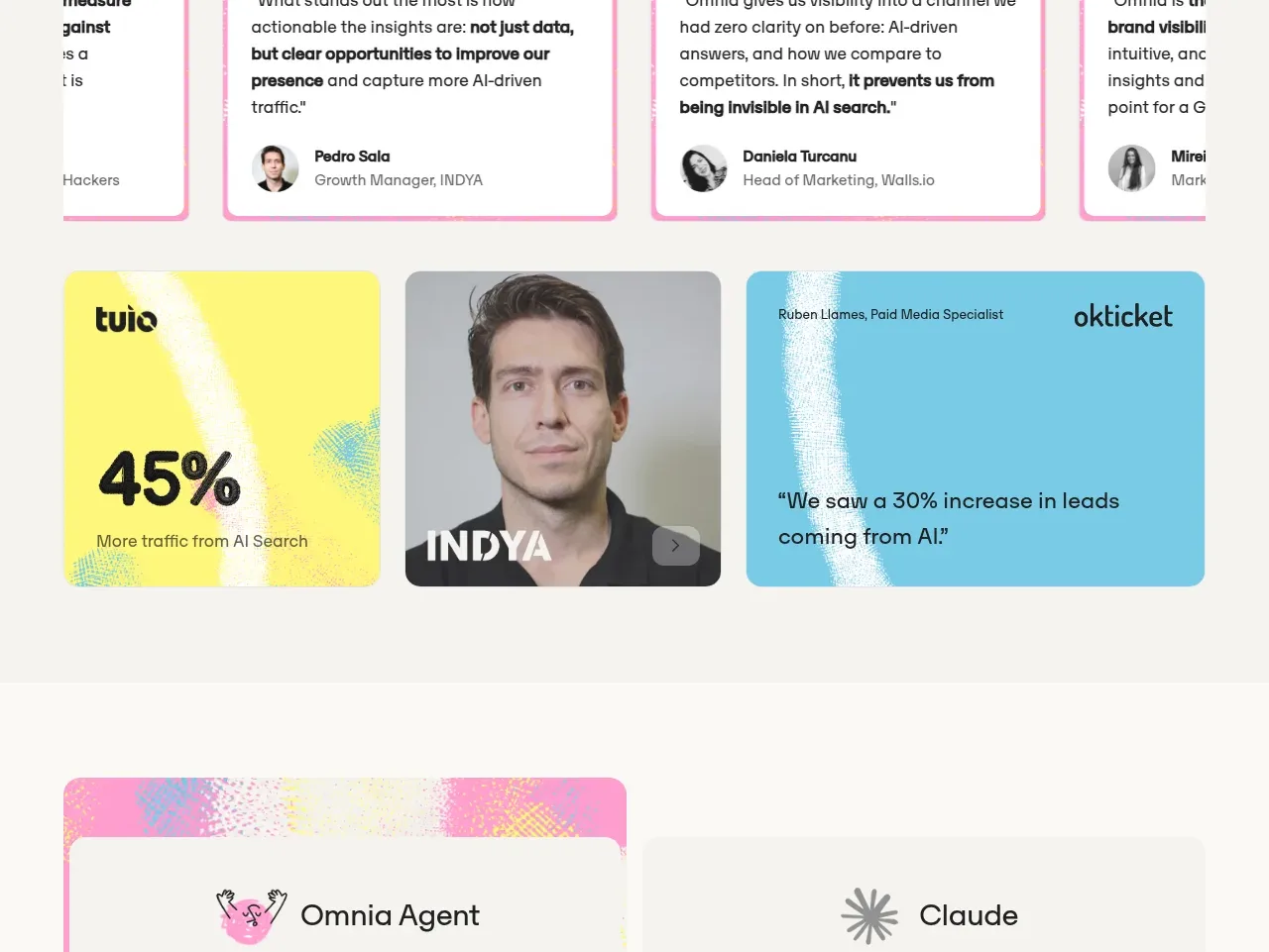
 Customer proof and outcomes
Omnia Agent · Testimonials
Customer proof and outcomes
Omnia Agent · Testimonials
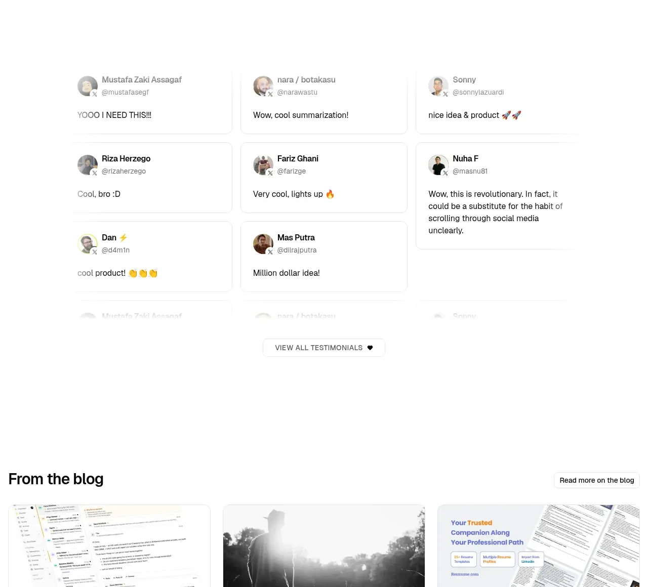
 Community testimonials
LaterOn v2: The agentic email plaftform · Testimonials
Community testimonials
LaterOn v2: The agentic email plaftform · Testimonials