 kage
kage
helohq.com
Design analysis
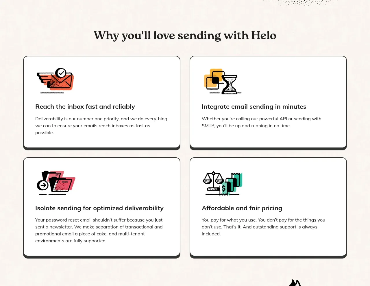
A centered section heading introduces four equal feature cards in a two-by-two grid. Each card uses a bold outline, heavy offset shadow, small illustration, and concise benefit copy.
Prompt preview
## Reference images

Study these alongside the description below: hierarchy, rhythm, spacing, colour. Build for the product you are asked about, using this design language.

- Component: https://kage-design-assets.t3.tigrisfiles.io/components/helo/c47b31ce-de8b-413b-ab53-bd3bf69ea219-1790921006-3.webp
- Full page it was cut from: https://kage-design-assets.t3.tigrisfiles.io/screenshots/helo/c47b31ce-de8b-413b-ab53-bd3bf69ea219-1790920903911-full.webp
- Component on Kage: https://kage.design/component/helo-feature-grid

## Before you start
Ask what the user's product's four most valuable benefits are and what visual style fits its brand. Then implement an original feature grid based on the following reusable structure.

Build a centered benefits section on a warm ivory background. Place a large serif heading above a two-column grid with two rows on desktop and one column on mobile. Each card should be a white-to-ivory surface with a 1–2px near-black border, 12–14px rounded corners, and a dark offset bottom shadow. Give every card a consistent internal layout: a compact original icon or abstract visual at top, a bold 17–19px title, and short body copy beneath.

Use approximately 24–30px card padding, 18–26px gaps, and equal card heights so the grid feels deliberate. Keep headings near-black, body text charcoal #343634, and use coral #f2674f, amber #f2b52e, teal #2cb6a3, and muted blue as accent colors. Add subtle lift or shadow change on hover and visible keyboard focus states. Ensure illustrations are decorative and do not compete with the text.

Never: copy logos, product names, copy, illustrations, or imagery from the reference.
More components

 Three-step process cards
godaylight.com · Feature grid
Three-step process cards
godaylight.com · Feature grid

 Use-case selector with vertical video preview
Spira Maxima · Feature grid
Use-case selector with vertical video preview
Spira Maxima · Feature grid

 Insights and enterprise model access
FastRouter.ai · Feature grid
Insights and enterprise model access
FastRouter.ai · Feature grid
 Solutions by organizational role
FastRouter.ai · Feature grid
Solutions by organizational role
FastRouter.ai · Feature grid
 Routing reliability and model collaboration
FastRouter.ai · Feature grid
Routing reliability and model collaboration
FastRouter.ai · Feature grid
 Goal-oriented product capabilities
FastRouter.ai · Feature grid
Goal-oriented product capabilities
FastRouter.ai · Feature grid