kage
kage
Design analysis
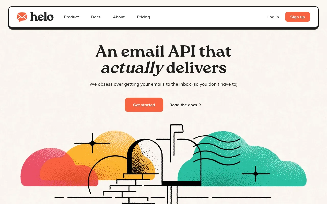
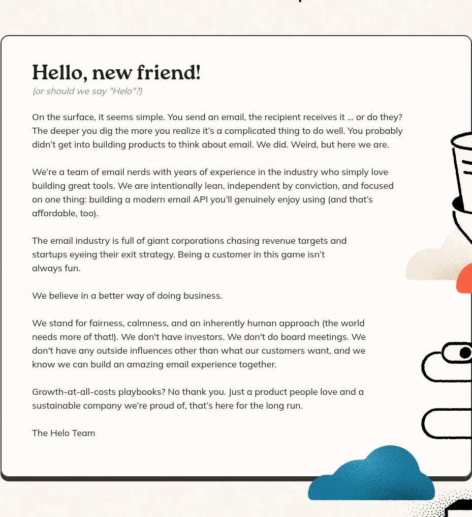
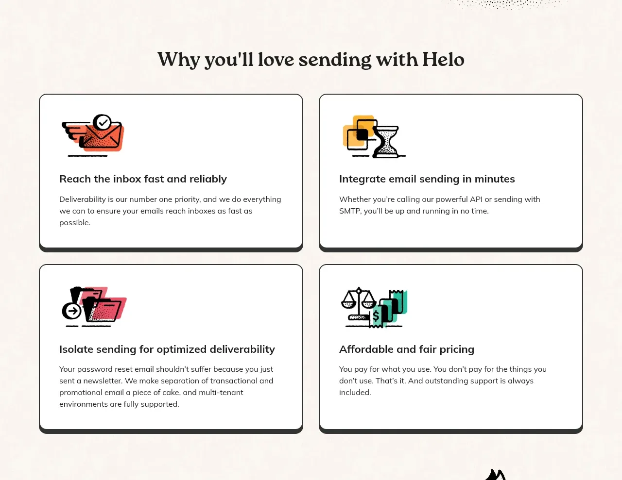
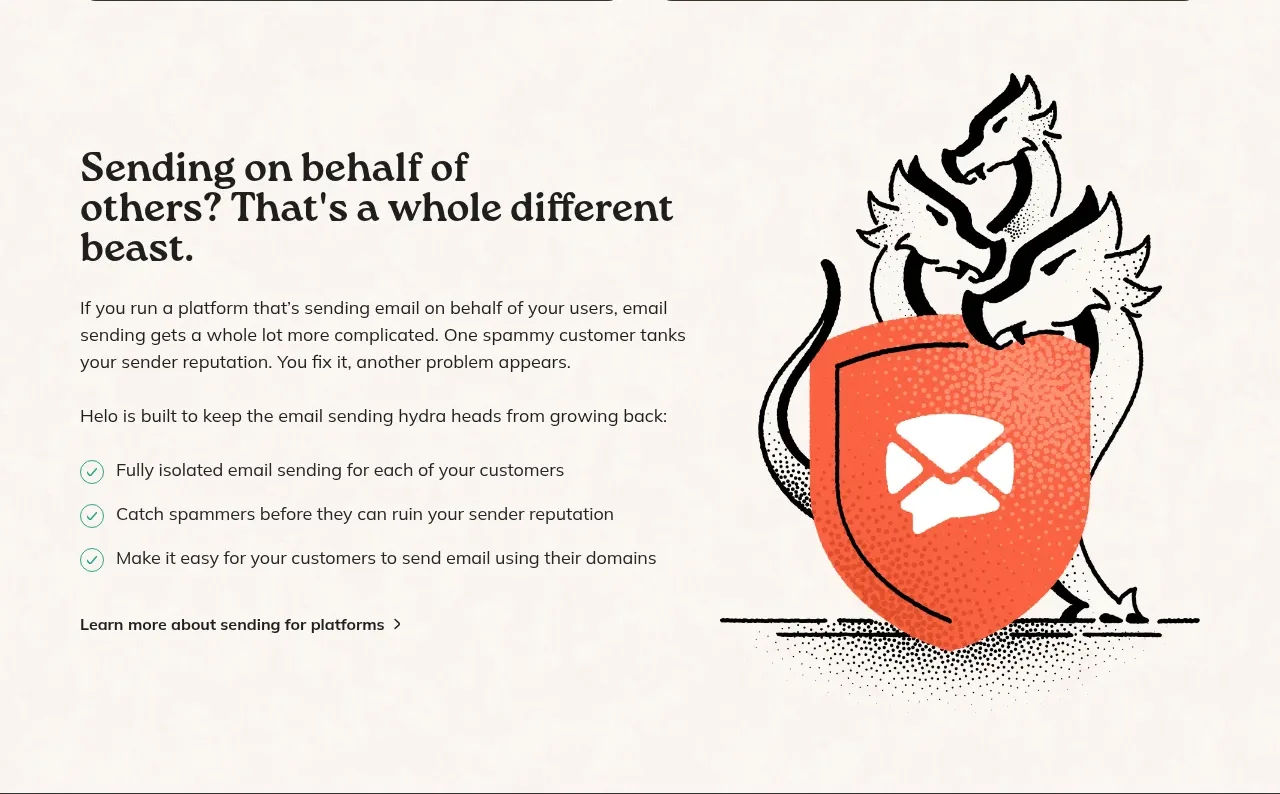
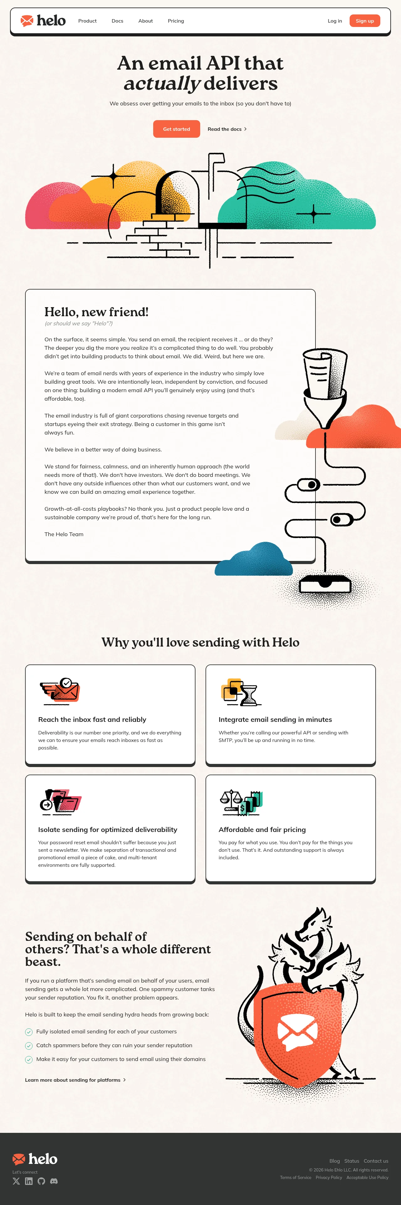
A warm cream canvas defines this indie email API landing page: expressive serif headlines with italic emphasis words sit over hand-drawn, stipple-shaded spot illustrations in coral, teal, pink and yellow, with thin dark borders and hard offset shadows giving a playful, hand-made structure. The rhythm shifts deliberately down the page — a centred hero with a full-width mailbox illustration, then a letter-styled manifesto card with a wobbly border and winding-pipe artwork hugging its right edge, a tight 2×2 grid of bordered feature cards with small two-colour icons, an asymmetric two-column platform section with a teal checklist and a hydra-over-shield illustration, and finally a flat charcoal footer. Accent colour lives almost entirely inside the illustrations and CTAs; UI chrome stays ink-on-cream, so density and layout change carry the rhythm instead of alternating background bands.
Prompt preview
## Reference images

Study these alongside the description below: hierarchy, rhythm, spacing, colour. Build for the product you are asked about, using this design language.

- Full page: https://kage-design-assets.t3.tigrisfiles.io/screenshots/helo/c47b31ce-de8b-413b-ab53-bd3bf69ea219-1790920903911-full.webp
- Above the fold: https://kage-design-assets.t3.tigrisfiles.io/screenshots/helo/c47b31ce-de8b-413b-ab53-bd3bf69ea219-1790920900617.webp
- Design on Kage: https://kage.design/designs/helo-landing-page

## Before you start
Ask the user what product they are building, who it is for, and what brand assets they already have (name, colours, typefaces, tone of voice). Wait for the answers before writing any code — everything below is applied to *their* product, not to the reference site.

## Page structure
1. **Floating pill navbar** — a white, rounded bar floating just below the top edge with a thin dark border and a hard offset shadow. Logo left, four text links beside it, "Log in" text link and one filled CTA button on the right.
2. **Hero** — centred serif headline (~60–70px) with one italic emphasis word, a single short line of supporting copy, then a filled primary button next to a quiet text link with a chevron. Below it, a full-width hand-drawn illustration sets the tone before any product claim.
3. **Manifesto letter card** — a large white card styled like a personal letter: irregular hand-drawn border, hard offset shadow, serif headline with an italic aside, six short first-person paragraphs, and a sign-off. A tall spot illustration (funnel, winding pipe, mailbox) runs along its right edge.
4. **Feature grid** — a centred serif heading, then a 2×2 grid of white cards with dark borders and offset shadows. Each card: small two-colour spot icon, bold ~18px title, 2–3 lines of body copy.
5. **Platform section** — asymmetric two-column split. Left: punchy serif headline, two short paragraphs, a three-item checklist with round teal check icons, and a bold text link. Right: one large metaphor illustration.
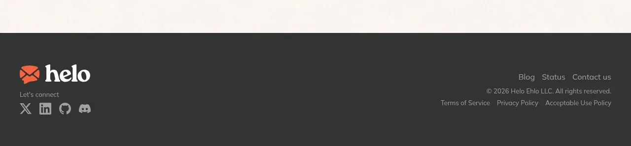
6. **Footer** — flat dark charcoal band: logo plus "Let's connect" social icons on the left, small link lists, copyright, and legal links on the right.

## Design language
- **Canvas**: one warm cream background (`#F6EFE5`) carries the entire page; the only dark surface is the footer (`#2B2723`). Do not alternate section background colours — rhythm comes from layout changes, not colour blocks.
- **Ink & accents**: near-black warm charcoal (`#221E1A`) for all text, borders, and illustration line work. One saturated primary (`#E85B3F` coral orange) reserved for CTAs and the logo. Secondary accents (`#2AA79E` teal, `#E8546A` pink, `#F2A93B` yellow) appear only inside illustrations and checklist icons — never on UI chrome.
- **Type pairing**: an expressive serif for every heading, using italics inside headlines as an emphasis device; a humanist sans for body, nav, and buttons. Scale contrast is large: hero ~60–70px, section headings ~36–44px, card titles ~18px, body 16px at 1.6 line height with a comfortable measure (~65ch).
- **Cards & borders**: white surfaces with 1.5–2px dark borders, 16–24px radii, and hard offset shadows (4–6px offset, zero blur) that read hand-drawn rather than glossy. The navbar reuses the same treatment in a fully rounded pill shape.
- **Buttons**: filled primary in the accent colour with ~10px radius and a medium-weight label; secondary actions are plain text links with a chevron, never ghost or outline buttons.
- **Illustration system**: one consistent engraved/woodcut line style with stipple shading, flat limited colour fills, and grounded everyday objects. Each illustration carries a metaphor from the adjacent copy. No photos, gradients, or 3D anywhere.
- **Rhythm down the page**: centred and airy (hero) → wide asymmetric long-form card (manifesto) → tight symmetric grid (features) → open two-column with a checklist (platform) → compressed dark footer. Keep vertical spacing generous (~100–140px between sections); change density through layout, not by squeezing space.
- **Copy voice**: warm, direct, slightly wry; short paragraphs, first-person plural, real sentences over feature bullets.
- **Interaction**: keep motion minimal and honest — a slight lift or shadow shift on hover for cards and buttons, standard focus rings; no parallax, no scroll-jacking.

## Never
- Do not reuse the reference product's name, logo, envelope mark, or any of its headlines, manifesto copy, or footer text.
- Do not reproduce its specific illustrations (mailbox, funnel-and-pipe, hydra-and-shield) — create equivalent metaphors from the user's own product story in the same engraved style.
- Do not present the result as the reference brand or imply any affiliation with it.