 kage
kage
helohq.com
Design analysis
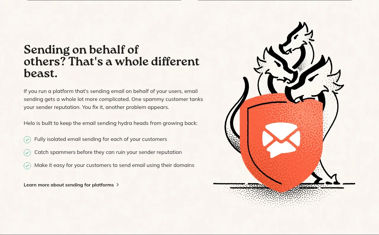
A split feature section explains a specialized use case with a left-aligned heading, paragraph, checklist, and link, balanced by a large protective illustration on the right.
Prompt preview
## Reference images

Study these alongside the description below: hierarchy, rhythm, spacing, colour. Build for the product you are asked about, using this design language.

- Component: https://kage-design-assets.t3.tigrisfiles.io/components/helo/c47b31ce-de8b-413b-ab53-bd3bf69ea219-1790921006-4.webp
- Full page it was cut from: https://kage-design-assets.t3.tigrisfiles.io/screenshots/helo/c47b31ce-de8b-413b-ab53-bd3bf69ea219-1790920903911-full.webp
- Component on Kage: https://kage.design/component/helo-feature-grid-2

## Before you start
Ask what specialized audience or use case the user's product serves and what proof points matter most. Then apply this split-section pattern with original content.

Create a spacious two-column feature section on an ivory background. On the left, place a large serif heading spanning two or three lines, a supporting paragraph, a second explanatory paragraph, and a three-item checklist. Render checklist markers as small outlined circles with a simple check, using teal or coral as the accent. Finish with a text link and right-pointing chevron. On the right, reserve a large illustration area for an original metaphor connected to the product's use case.

Use a 50/50 or 46/54 grid with a 48–72px column gap and align the text vertically around the middle of the visual. Set the heading at 34–44px with tight line-height, body copy at 15–17px and 1.5 line-height, and links in semibold near-black. Keep the visual language hand-drawn and editorial with black outlines and a few saturated accent colors, while ensuring the artwork is newly created. Stack the columns on mobile and move the illustration below the copy.

Never: copy logos, product names, copy, illustrations, or imagery from the reference.
More components

 Three-step process cards
godaylight.com · Feature grid
Three-step process cards
godaylight.com · Feature grid

 Use-case selector with vertical video preview
Spira Maxima · Feature grid
Use-case selector with vertical video preview
Spira Maxima · Feature grid

 Insights and enterprise model access
FastRouter.ai · Feature grid
Insights and enterprise model access
FastRouter.ai · Feature grid
 Solutions by organizational role
FastRouter.ai · Feature grid
Solutions by organizational role
FastRouter.ai · Feature grid
 Routing reliability and model collaboration
FastRouter.ai · Feature grid
Routing reliability and model collaboration
FastRouter.ai · Feature grid
 Goal-oriented product capabilities
FastRouter.ai · Feature grid
Goal-oriented product capabilities
FastRouter.ai · Feature grid