 kage
kage
heypi.xyz

Design analysis
A compact black navigation bar keeps the brand at left and concentrates utility links and a bordered sign-up action at right.
Prompt preview
## Reference images

Study these alongside the description below: hierarchy, rhythm, spacing, colour. Build for the product you are asked about, using this design language.

- Component: https://kage-design-assets.t3.tigrisfiles.io/components/heypi/9fccb756-63dd-4cec-9422-c066b077bc89-1791612275-0.webp
- Full page it was cut from: https://kage-design-assets.t3.tigrisfiles.io/screenshots/heypi/9fccb756-63dd-4cec-9422-c066b077bc89-1791612175185-full.webp
- Component on Kage: https://kage.design/component/heypi-navigation

## Before you start
Ask the user what their product is, who it serves, and what their brand voice and visual identity are. Apply the following principles to that product rather than reproducing the reference.

Build a compact full-width navigation bar with a near-black background, a small brand lockup on the left, and a sparse row of text links plus one outlined primary action on the right. Use a restrained horizontal layout with generous side padding, vertically centered controls, and a subtle bottom edge. Use a refined serif or display face for the brand and a clean sans-serif for navigation. Suggested palette: #050607 background, #F5F3EA text, #B8B5A8 muted text, #E9D878 accent; use 1px borders around the action, 999px radius, and 12–16px spacing between links. Make links keyboard-focusable and add a small hover colour transition; collapse to a menu on narrow screens.

Never use logos, product names, copy, illustrations, or imagery from the reference.
More components

 Minimal top navigation
Agibot · Navigation
Minimal top navigation
Agibot · Navigation

 Top navigation
Hypervibe · Navigation
Top navigation
Hypervibe · Navigation
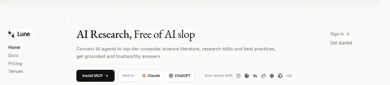
 Editorial research product navigation
Lune · Navigation
Editorial research product navigation
Lune · Navigation

 Minimal product navigation
Pine Computer · Navigation
Minimal product navigation
Pine Computer · Navigation

 Sticky section navigation
Playground by Google Labs · Navigation
Sticky section navigation
Playground by Google Labs · Navigation
 Top experiment navigation
Playground by Google Labs · Navigation
Top experiment navigation
Playground by Google Labs · Navigation