kage
kage
hireotto.com
Design analysis
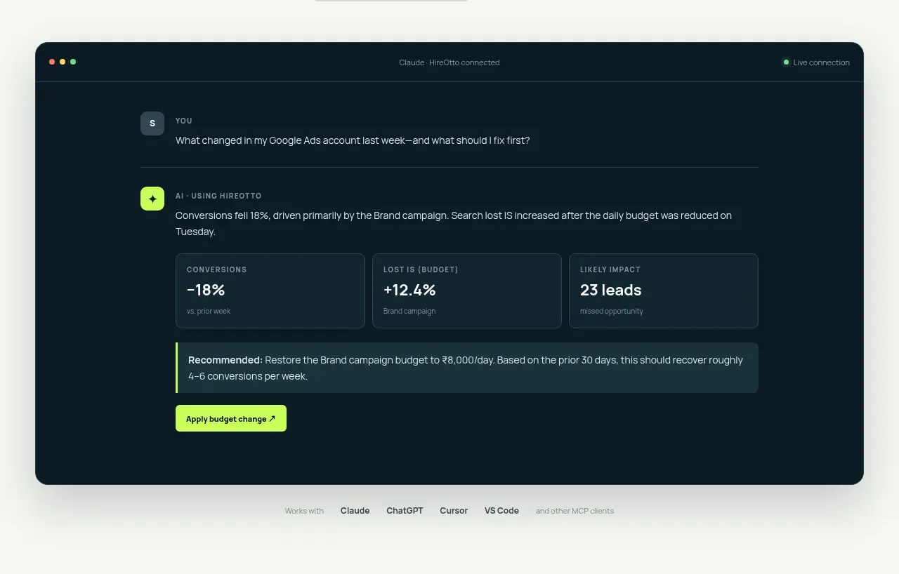
A large dark rounded product preview makes the abstract promise tangible through a question-and-answer exchange, metric cards, recommendation panel, and action.
Prompt preview
## Reference images

Study these alongside the description below: hierarchy, rhythm, spacing, colour. Build for the product you are asked about, using this design language.

- Component: https://kage-design-assets.t3.tigrisfiles.io/components/hireotto/8f3068d7-46ca-4868-8ee8-837dc9e1c249-1790488906-2.webp
- Full page it was cut from: https://kage-design-assets.t3.tigrisfiles.io/screenshots/hireotto/8f3068d7-46ca-4868-8ee8-837dc9e1c249-1790488876025-full.webp
- Component on Kage: https://kage.design/component/hireotto-card

## Before you start
Ask what the user's product, audience, and brand are, then apply the principles below to that product rather than reproducing this reference.

Build a large rounded product-preview card beneath the hero, centered in a max-width container. Use a deep blue-black surface (#071820), a thin muted border (#20353b), 14–16px radius, and a soft shadow. Include a slim browser-like top bar with three small status dots and a muted connection label. Inside, show a user query row, an assistant response row with a lime icon, a three-column metric strip, a tinted recommendation callout with a lime left border, and a compact lime action button. Use small uppercase labels, subdued blue-gray text, clear numerical emphasis, and generous internal padding. Add a tiny muted compatibility caption below the card if space allows; make the preview responsive by stacking metrics on small screens.

### Never
- Never use logos, product names, copy, illustrations, or imagery from the reference.
- Never present fake sensitive data or make the preview look like a real account without clear demo treatment.