kage
kage
hireotto.com
Design analysis
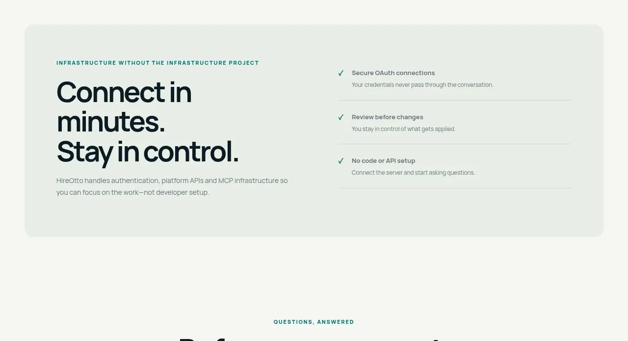
A pale inset panel pairs a strong promise about quick setup with a three-item trust checklist, reducing perceived implementation risk.
Prompt preview
## Reference images

Study these alongside the description below: hierarchy, rhythm, spacing, colour. Build for the product you are asked about, using this design language.

- Component: https://kage-design-assets.t3.tigrisfiles.io/components/hireotto/8f3068d7-46ca-4868-8ee8-837dc9e1c249-1790488908-7.webp
- Full page it was cut from: https://kage-design-assets.t3.tigrisfiles.io/screenshots/hireotto/8f3068d7-46ca-4868-8ee8-837dc9e1c249-1790488876025-full.webp
- Component on Kage: https://kage.design/component/hireotto-card-2

## Before you start
Ask what the user's product, audience, and brand are, then apply the principles below to that product rather than reproducing this reference.

Create a wide, softly elevated setup/trust card inside a light page section. Use a very pale sage surface (#eef4ee), a subtle shadow, and a 14px radius. Split the card into two columns: left has a tiny uppercase eyebrow, a large two- or three-line promise, and a short paragraph; right has three checklist rows with teal check icons, bold short labels, muted explanations, and hairline separators. Use dark navy text (#07151b), muted gray-green copy, teal checks (#087875), 32–48px internal padding, and a responsive single-column layout on mobile. The component should feel reassuring rather than sales-heavy.

### Never
- Never use logos, product names, copy, illustrations, or imagery from the reference.
- Never claim security or setup guarantees that the user's product cannot substantiate.