 kage
kage
hireotto.com
Design analysis
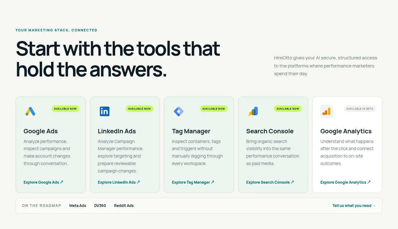
A short section heading introduces a five-card row of integrations, each with availability status, concise value proposition, and a clear exploration link.
Prompt preview
## Reference images

Study these alongside the description below: hierarchy, rhythm, spacing, colour. Build for the product you are asked about, using this design language.

- Component: https://kage-design-assets.t3.tigrisfiles.io/components/hireotto/8f3068d7-46ca-4868-8ee8-837dc9e1c249-1790488907-3.webp
- Full page it was cut from: https://kage-design-assets.t3.tigrisfiles.io/screenshots/hireotto/8f3068d7-46ca-4868-8ee8-837dc9e1c249-1790488876025-full.webp
- Component on Kage: https://kage.design/component/hireotto-feature-grid

## Before you start
Ask what the user's product, audience, and brand are, then apply the principles below to that product rather than reproducing this reference.

Create an integrations feature section on a warm off-white background. Use a two-column intro row: an uppercase eyebrow and large left-aligned heading on the left, with a narrow explanatory paragraph on the right. Below it, place a responsive grid of five equal cards. Each card should have a small abstract integration glyph, a tiny availability pill, a concise title, 3–4 lines of muted benefit copy, and a bottom-aligned text link with an arrow. Use pale mint card fills (#edf5ef), white or near-white borders (#d8e3dc), 10px radius, dark text (#07151b), teal links (#08736f), and a bright lime status pill. Keep card heights equal and make the grid horizontally scrollable or 2-column on smaller screens. Add a slim roadmap strip beneath only if it supports the product architecture.

### Never
- Never use logos, product names, copy, illustrations, or imagery from the reference.
- Never rely on brand logos as the only way to communicate integration value.
More components

 Three-step process cards
godaylight.com · Feature grid
Three-step process cards
godaylight.com · Feature grid

 Use-case selector with vertical video preview
Spira Maxima · Feature grid
Use-case selector with vertical video preview
Spira Maxima · Feature grid

 Insights and enterprise model access
FastRouter.ai · Feature grid
Insights and enterprise model access
FastRouter.ai · Feature grid
 Solutions by organizational role
FastRouter.ai · Feature grid
Solutions by organizational role
FastRouter.ai · Feature grid
 Routing reliability and model collaboration
FastRouter.ai · Feature grid
Routing reliability and model collaboration
FastRouter.ai · Feature grid
 Goal-oriented product capabilities
FastRouter.ai · Feature grid
Goal-oriented product capabilities
FastRouter.ai · Feature grid