 kage
kage
hireotto.com
Design analysis
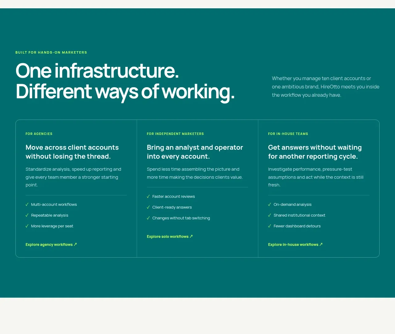
A saturated teal section reframes the same infrastructure for three audiences, using equal columns, audience labels, benefits, checklists, and bottom links.
Prompt preview
## Reference images

Study these alongside the description below: hierarchy, rhythm, spacing, colour. Build for the product you are asked about, using this design language.

- Component: https://kage-design-assets.t3.tigrisfiles.io/components/hireotto/8f3068d7-46ca-4868-8ee8-837dc9e1c249-1790488907-6.webp
- Full page it was cut from: https://kage-design-assets.t3.tigrisfiles.io/screenshots/hireotto/8f3068d7-46ca-4868-8ee8-837dc9e1c249-1790488876025-full.webp
- Component on Kage: https://kage.design/component/hireotto-feature-grid-4

## Before you start
Ask what the user's product, audience, and brand are, then apply the principles below to that product rather than reproducing this reference.

Build a full-width teal solutions section (#087875 or a similarly saturated deep teal). Use a max-width container with an uppercase lime eyebrow, a large white two-line heading on the left, and a short pale-teal paragraph on the right. Below, create a single rounded three-column panel with very subtle translucent borders and vertical dividers. Each column contains a small uppercase audience label, a strong white benefit heading, supporting copy, a short lime-check checklist, and a lime text link anchored near the bottom. Use bright lime (#b7ff32), white, and translucent white borders; keep the panel radius around 14px and use 40–56px padding. Stack columns on mobile while retaining clear separation.

### Never
- Never use logos, product names, copy, illustrations, or imagery from the reference.
- Never use the accent color as a large decorative gradient that reduces text contrast.
More components

 Three-step process cards
godaylight.com · Feature grid
Three-step process cards
godaylight.com · Feature grid

 Use-case selector with vertical video preview
Spira Maxima · Feature grid
Use-case selector with vertical video preview
Spira Maxima · Feature grid

 Insights and enterprise model access
FastRouter.ai · Feature grid
Insights and enterprise model access
FastRouter.ai · Feature grid
 Solutions by organizational role
FastRouter.ai · Feature grid
Solutions by organizational role
FastRouter.ai · Feature grid
 Routing reliability and model collaboration
FastRouter.ai · Feature grid
Routing reliability and model collaboration
FastRouter.ai · Feature grid
 Goal-oriented product capabilities
FastRouter.ai · Feature grid
Goal-oriented product capabilities
FastRouter.ai · Feature grid