kage
kage
holavoicemail.com
Design analysis
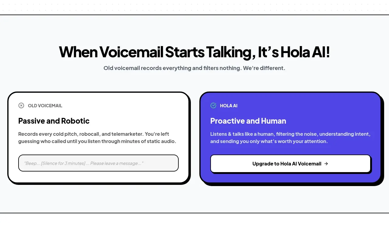
A pale section introduces a direct before/after comparison through two oversized bordered cards, making the product benefit immediately legible.
Prompt preview
## Reference images

Study these alongside the description below: hierarchy, rhythm, spacing, colour. Build for the product you are asked about, using this design language.

- Component: https://kage-design-assets.t3.tigrisfiles.io/components/hola-ai/6afc16ea-d4a5-4b10-89cd-47c92dad80e5-1790143387-3.webp
- Full page it was cut from: https://kage-design-assets.t3.tigrisfiles.io/screenshots/hola-ai/6afc16ea-d4a5-4b10-89cd-47c92dad80e5-1790143310582-full.webp
- Component on Kage: https://kage.design/component/hola-card

## Before you start
Ask what outdated behaviour your product replaces and what improved behaviour it enables. Use those answers to write an original before/after comparison.

Build a light off-white comparison section with a centered headline and short supporting sentence. Below it, place two equal-width cards in a responsive two-column grid: the left card should communicate the old passive experience using white, and the right should communicate the improved experience using a saturated brand colour such as #5146E5. Give both cards thick black borders around 3px, very rounded corners around 22px, and a pronounced offset black shadow of roughly 4–7px down/right. Use small eyebrow labels, strong 19–22px card titles, concise body copy, and a full-width inset action/control near the bottom. Make the positive card’s text high contrast and add a restrained success icon. Stack cards on mobile. Add hover elevation only if it does not reduce readability.

Never: use logos, product names, copy, illustrations, or imagery from the reference.