 kage
kage
holavoicemail.com
Design analysis
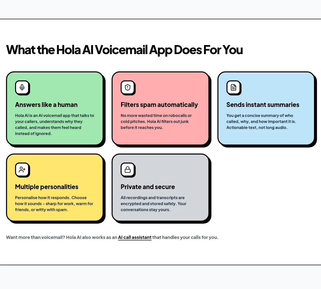
A bold section heading leads into five pastel feature cards with consistent icon containers, short benefit-led titles, and compact explanatory copy.
Prompt preview
## Reference images

Study these alongside the description below: hierarchy, rhythm, spacing, colour. Build for the product you are asked about, using this design language.

- Component: https://kage-design-assets.t3.tigrisfiles.io/components/hola-ai/6afc16ea-d4a5-4b10-89cd-47c92dad80e5-1790143388-4.webp
- Full page it was cut from: https://kage-design-assets.t3.tigrisfiles.io/screenshots/hola-ai/6afc16ea-d4a5-4b10-89cd-47c92dad80e5-1790143310582-full.webp
- Component on Kage: https://kage.design/component/hola-feature-grid

## Before you start
Ask what the user's product's 4–8 most valuable capabilities are and what tone its brand should use. Translate those answers into benefit-led cards.

Build a feature section on white with a large left-aligned heading and generous top spacing. Use a three-column grid on desktop and two or one columns at smaller widths. Each card should have a different soft pastel background—mint #A9E8B4, blush #FFA8B0, sky #B9E1F5, butter yellow #FFE66B, and cool gray #D9DDE3—plus a thick black 2–3px border, 20–24px radius, and a hard offset black shadow around 5px. Put a small white rounded icon tile at the top-left, followed by a bold 18px title and 14–15px body copy with comfortable line-height. Keep card heights visually consistent and use the final row naturally rather than forcing empty placeholders. End with a small inline cross-sell sentence/link beneath the grid. Add subtle lift on hover while retaining the graphic shadow language.

Never: use logos, product names, copy, illustrations, or imagery from the reference.
More components

 Spend visibility and daily-cost breakdown
Subscrr · Feature grid
Spend visibility and daily-cost breakdown
Subscrr · Feature grid
 Reminders and simple setup flow
Subscrr · Feature grid
Reminders and simple setup flow
Subscrr · Feature grid

 Security and permissions cards
NotchPop · Feature grid
Security and permissions cards
NotchPop · Feature grid
 Focused feature cards
NotchPop · Feature grid
Focused feature cards
NotchPop · Feature grid
 Interactive product demonstration
NotchPop · Feature grid
Interactive product demonstration
NotchPop · Feature grid
 Quiet information cards
NotchPop · Feature grid
Quiet information cards
NotchPop · Feature grid