kage
kage
holavoicemail.com
Design analysis
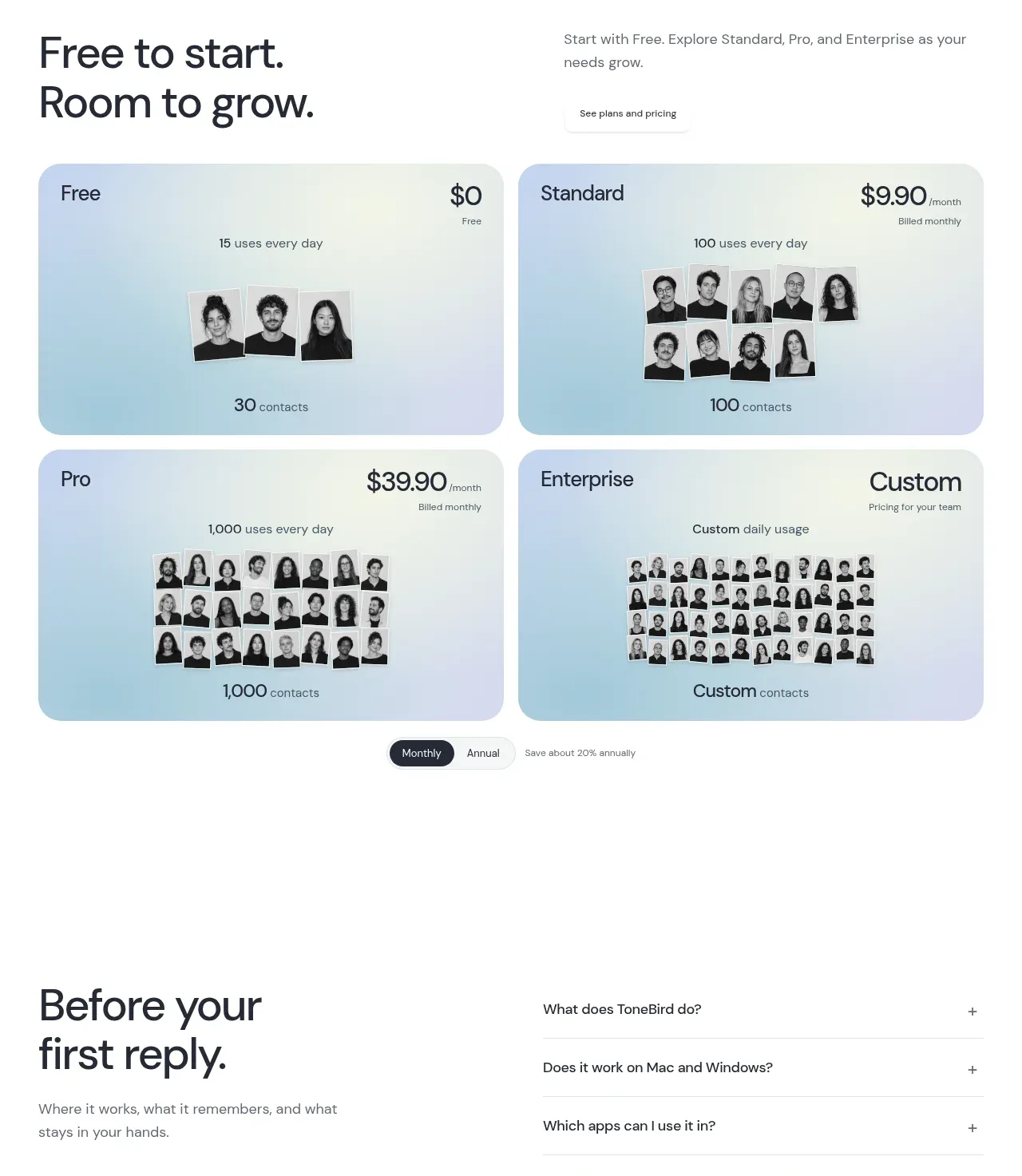
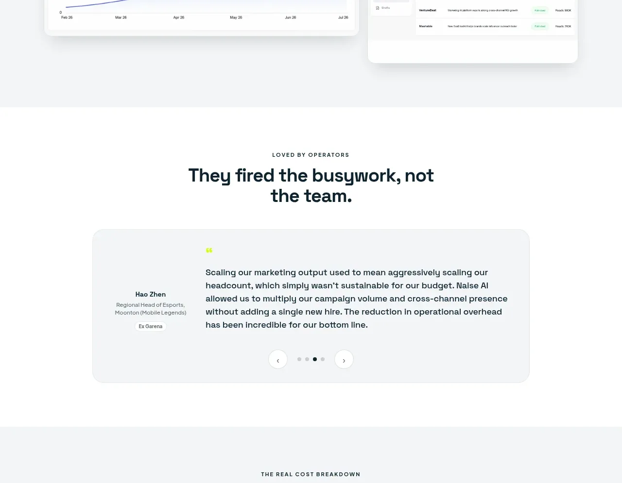
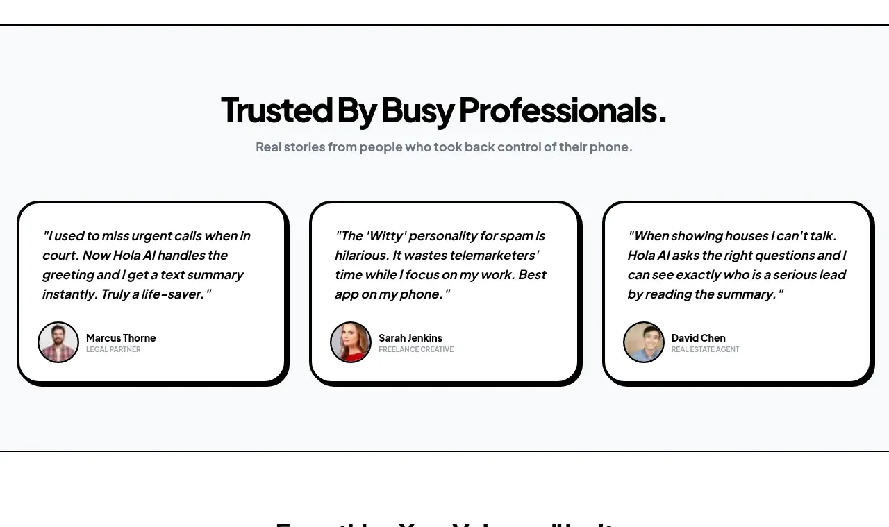
A restrained testimonial section uses three equal cards with italic quotations and compact customer identity rows to reinforce credibility without visual clutter.
Prompt preview
## Reference images

Study these alongside the description below: hierarchy, rhythm, spacing, colour. Build for the product you are asked about, using this design language.

- Component: https://kage-design-assets.t3.tigrisfiles.io/components/hola-ai/6afc16ea-d4a5-4b10-89cd-47c92dad80e5-1790143388-5.webp
- Full page it was cut from: https://kage-design-assets.t3.tigrisfiles.io/screenshots/hola-ai/6afc16ea-d4a5-4b10-89cd-47c92dad80e5-1790143310582-full.webp
- Component on Kage: https://kage.design/component/hola-testimonials

## Before you start
Ask who the user's customers are, what outcomes they achieved, and whether real permissions and headshots are available. Build authentic testimonial content rather than placeholder imitation.

Build a soft light-gray testimonial section with a centered heading and short subtitle. Place three equal-width white cards in a responsive grid. Use thick black borders, large rounded corners around 20–24px, and a hard offset black shadow around 4–6px. Each card should begin with a 15–17px italic quotation, use comfortable line-height, and end with a compact identity row containing a small circular avatar, name, and role in muted uppercase microtype. Keep the cards similar in height, align the identity rows toward the bottom, and stack or carousel them on mobile with visible pagination if needed. Make the section feel personal and credible through whitespace rather than decorative graphics.

Never: use logos, product names, copy, illustrations, or imagery from the reference.