 kage
kage
huly.io
Design analysis
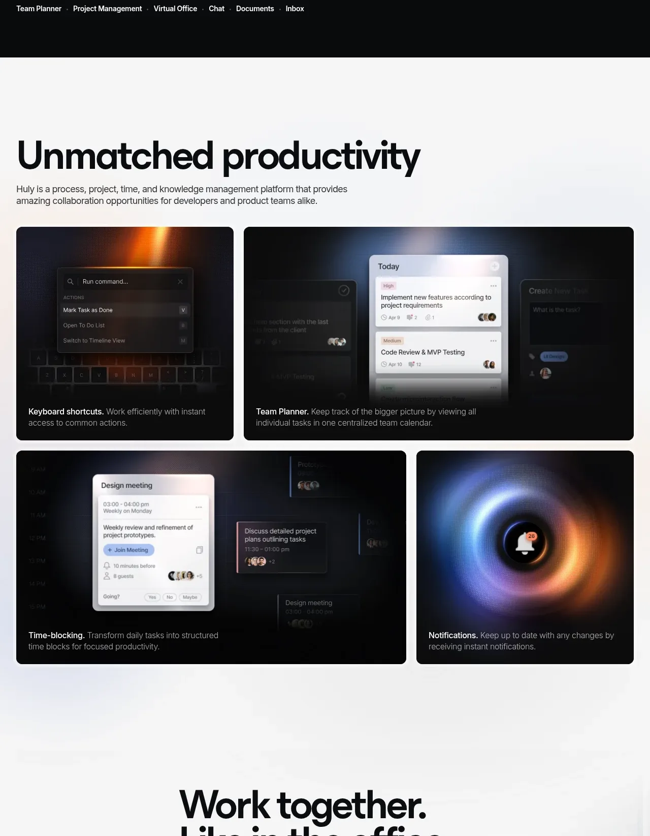
A bright product overview section introduces the platform, then uses an asymmetric grid of four dark image-led cards to communicate distinct productivity workflows.
Prompt preview
## Reference images

Study these alongside the description below: hierarchy, rhythm, spacing, colour. Build for the product you are asked about, using this design language.

- Component: https://kage-design-assets.t3.tigrisfiles.io/components/huly-io/19c62401-9349-4b6e-b026-941cb593ca56-1790434840-2.webp
- Full page it was cut from: https://kage-design-assets.t3.tigrisfiles.io/screenshots/huly-io/19c62401-9349-4b6e-b026-941cb593ca56-1790434806578-full.webp
- Component on Kage: https://kage.design/component/huly-feature-grid

## Before you start
Ask what the user's product does, which workflows matter most, and what visual language belongs to its brand. Then create an original version using those inputs.

Build a light feature-gallery section with a white or very pale cool-gray background (#f7f8fa). Start with a left-aligned max-width heading in near-black (#0b0d10), approximately 52–60px bold type, followed by a concise 15–17px gray introduction. Below it, create an asymmetric responsive grid: one smaller card beside one wider card on the first row, then one wider card beside one smaller card on the second row. Each card should be a dark near-black rounded rectangle (about 12px radius) with an original abstract product UI or texture as a background, a subtle vignette/gradient for legibility, and a short white title plus muted description pinned near the bottom. Maintain 14–16px gaps, consistent card padding around 16px, and varied card heights to create editorial rhythm. On mobile, collapse to one column while keeping the most important card first.

Never use the reference logo, product name, exact copy, illustrations, screenshots, or imagery.
More components

 Three-step process cards
godaylight.com · Feature grid
Three-step process cards
godaylight.com · Feature grid

 Use-case selector with vertical video preview
Spira Maxima · Feature grid
Use-case selector with vertical video preview
Spira Maxima · Feature grid

 Insights and enterprise model access
FastRouter.ai · Feature grid
Insights and enterprise model access
FastRouter.ai · Feature grid
 Solutions by organizational role
FastRouter.ai · Feature grid
Solutions by organizational role
FastRouter.ai · Feature grid
 Routing reliability and model collaboration
FastRouter.ai · Feature grid
Routing reliability and model collaboration
FastRouter.ai · Feature grid
 Goal-oriented product capabilities
FastRouter.ai · Feature grid
Goal-oriented product capabilities
FastRouter.ai · Feature grid