 kage
kage
huly.io
Design analysis
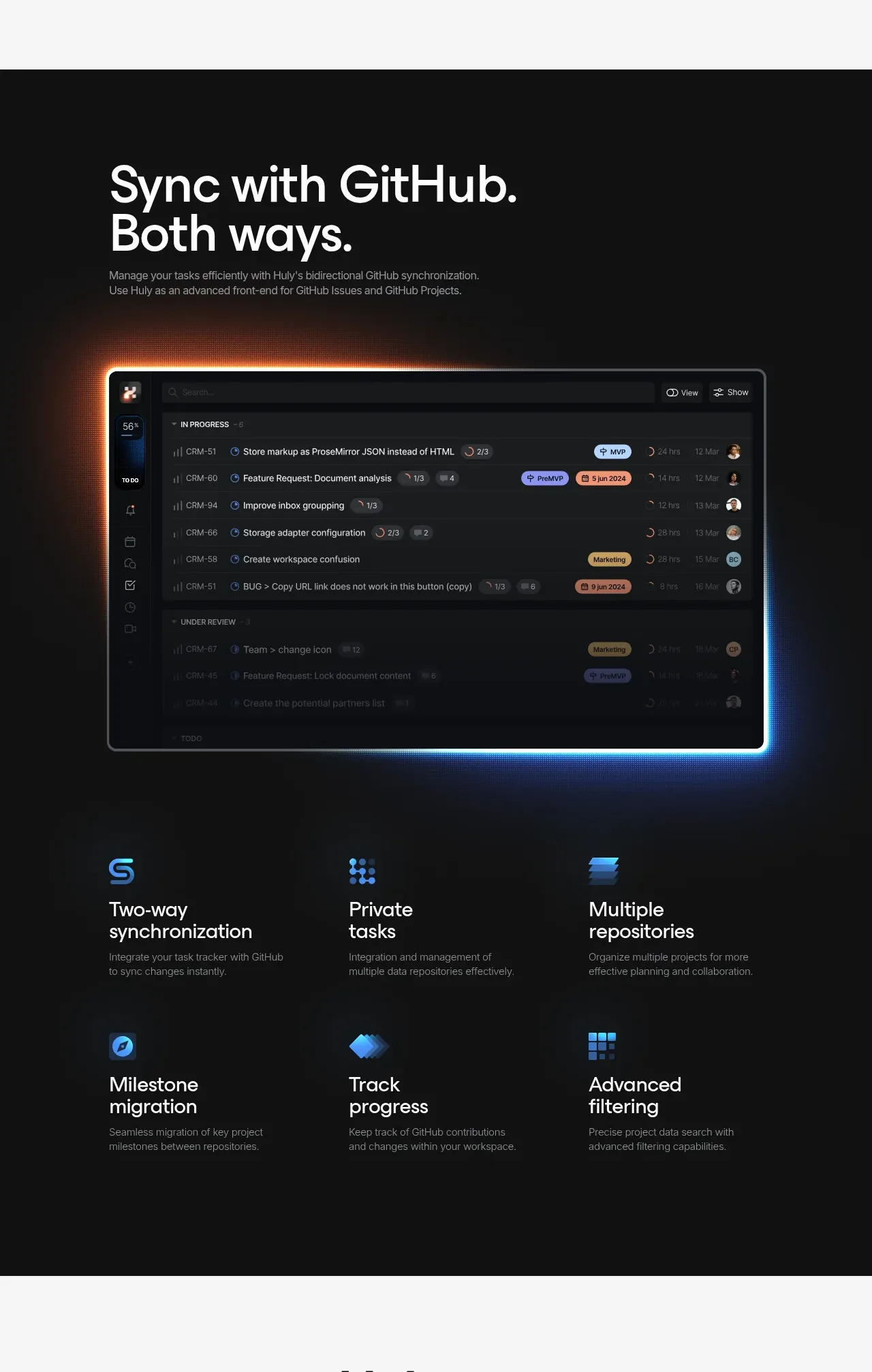
A dark integration section pairs a strong two-line title with a glowing software preview and a six-item, two-row feature grid.
Prompt preview
## Reference images

Study these alongside the description below: hierarchy, rhythm, spacing, colour. Build for the product you are asked about, using this design language.

- Component: https://kage-design-assets.t3.tigrisfiles.io/components/huly-io/19c62401-9349-4b6e-b026-941cb593ca56-1790434841-4.webp
- Full page it was cut from: https://kage-design-assets.t3.tigrisfiles.io/screenshots/huly-io/19c62401-9349-4b6e-b026-941cb593ca56-1790434806578-full.webp
- Component on Kage: https://kage.design/component/huly-feature-grid-2

## Before you start
Ask what integration the user's product provides, what users gain from it, and what brand colors should guide the treatment. Build an original interpretation.

Design a full-width dark integration section using #0a0c0f with subtle blue and warm-orange ambient glows around the main product preview. Use a constrained content width and a bold white two-line heading around 52–64px, followed by a small muted explanation. Place a wide rounded interface preview beneath the copy, framed with a thin translucent border and an understated cyan/orange glow. Below it, create a three-column by two-row feature grid. Each item begins with a small abstract blue icon, then a 22–25px white title and a 13–14px gray description. Keep the grid aligned to the same left and right edges as the preview, use 36–56px row spacing, and preserve clear hierarchy through whitespace rather than heavy dividers. On small screens, use one column and reduce the heading size.

Never use the reference logo, product name, exact copy, illustrations, screenshots, or imagery.
More components

 Three-step process cards
godaylight.com · Feature grid
Three-step process cards
godaylight.com · Feature grid

 Use-case selector with vertical video preview
Spira Maxima · Feature grid
Use-case selector with vertical video preview
Spira Maxima · Feature grid

 Insights and enterprise model access
FastRouter.ai · Feature grid
Insights and enterprise model access
FastRouter.ai · Feature grid
 Solutions by organizational role
FastRouter.ai · Feature grid
Solutions by organizational role
FastRouter.ai · Feature grid
 Routing reliability and model collaboration
FastRouter.ai · Feature grid
Routing reliability and model collaboration
FastRouter.ai · Feature grid
 Goal-oriented product capabilities
FastRouter.ai · Feature grid
Goal-oriented product capabilities
FastRouter.ai · Feature grid