 kage
kage
huly.io
Design analysis
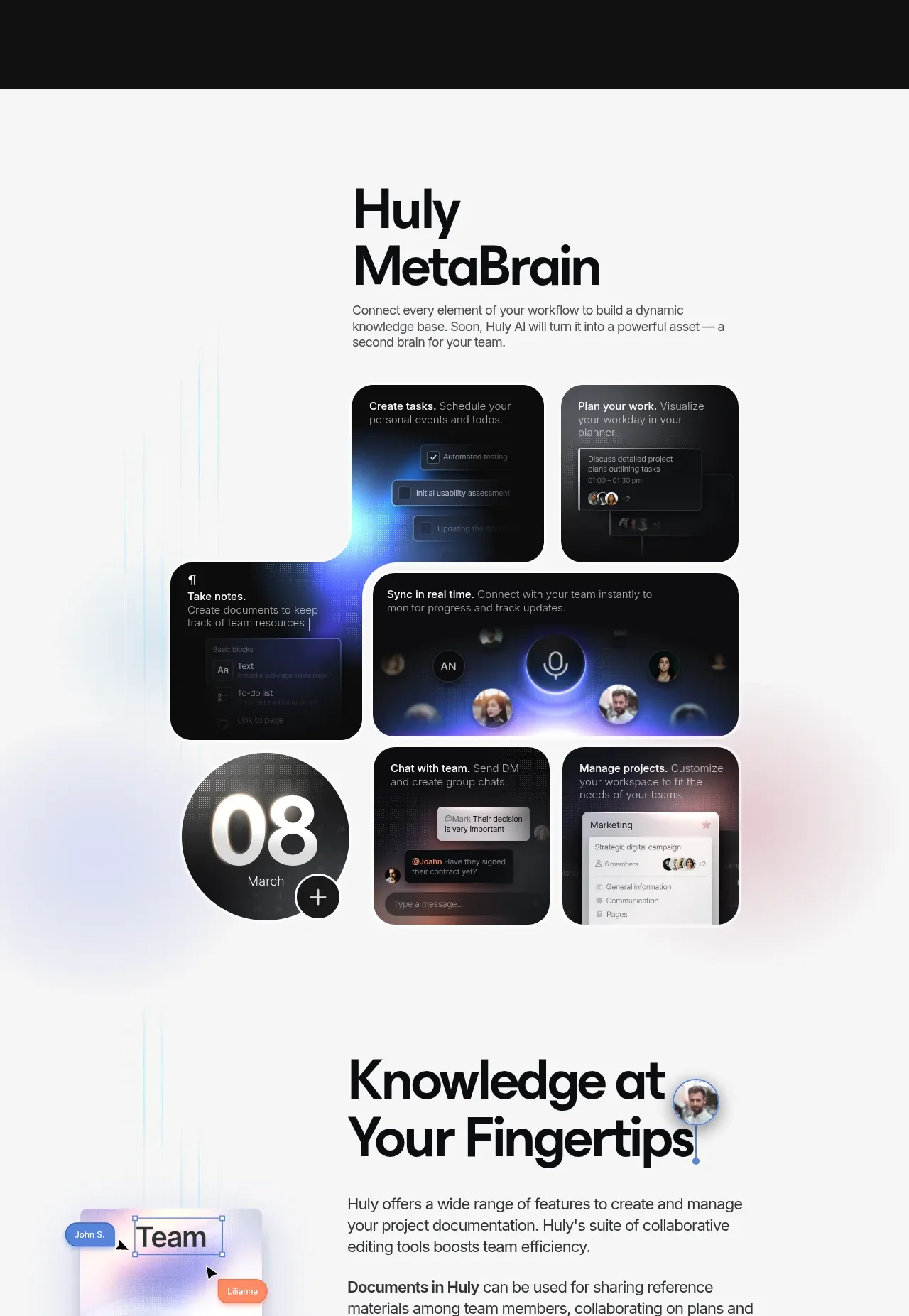
The light workspace section uses a centered editorial heading and a collage of rounded dark tiles to show multiple connected work modes at once.
Prompt preview
## Reference images

Study these alongside the description below: hierarchy, rhythm, spacing, colour. Build for the product you are asked about, using this design language.

- Component: https://kage-design-assets.t3.tigrisfiles.io/components/huly-io/19c62401-9349-4b6e-b026-941cb593ca56-1790434841-5.webp
- Full page it was cut from: https://kage-design-assets.t3.tigrisfiles.io/screenshots/huly-io/19c62401-9349-4b6e-b026-941cb593ca56-1790434806578-full.webp
- Component on Kage: https://kage.design/component/huly-feature-grid-3

## Before you start
Ask what connected workspace capabilities the user's product has and what brand system should shape the visual treatment. Apply the rules below with original content and assets.

Create a bright, spacious feature section with a white background (#fafbfc) and very subtle pastel cyan, lavender, and peach atmospheric gradients. Center a bold two-line heading around 52–60px in near-black, with a short 15–16px paragraph below. Under the introduction, build a responsive mosaic of rounded dark tiles rather than a uniform card grid: mix small tiles, a wide central tile, and a circular or distinctive visual tile. Use 12–16px radius, 14–18px gaps, dark surfaces around #151719, and soft blue/violet glows within selected tiles. Each tile should contain an original miniature workflow illustration, a short white label, and optional muted supporting text. Keep the mosaic balanced inside a max-width container and transform it into a simple two-column or one-column layout on mobile.

Never use the reference logo, product name, exact copy, illustrations, screenshots, or imagery.
More components

 Three-step process cards
godaylight.com · Feature grid
Three-step process cards
godaylight.com · Feature grid

 Use-case selector with vertical video preview
Spira Maxima · Feature grid
Use-case selector with vertical video preview
Spira Maxima · Feature grid

 Insights and enterprise model access
FastRouter.ai · Feature grid
Insights and enterprise model access
FastRouter.ai · Feature grid
 Solutions by organizational role
FastRouter.ai · Feature grid
Solutions by organizational role
FastRouter.ai · Feature grid
 Routing reliability and model collaboration
FastRouter.ai · Feature grid
Routing reliability and model collaboration
FastRouter.ai · Feature grid
 Goal-oriented product capabilities
FastRouter.ai · Feature grid
Goal-oriented product capabilities
FastRouter.ai · Feature grid