 kage
kage
huly.io
Design analysis
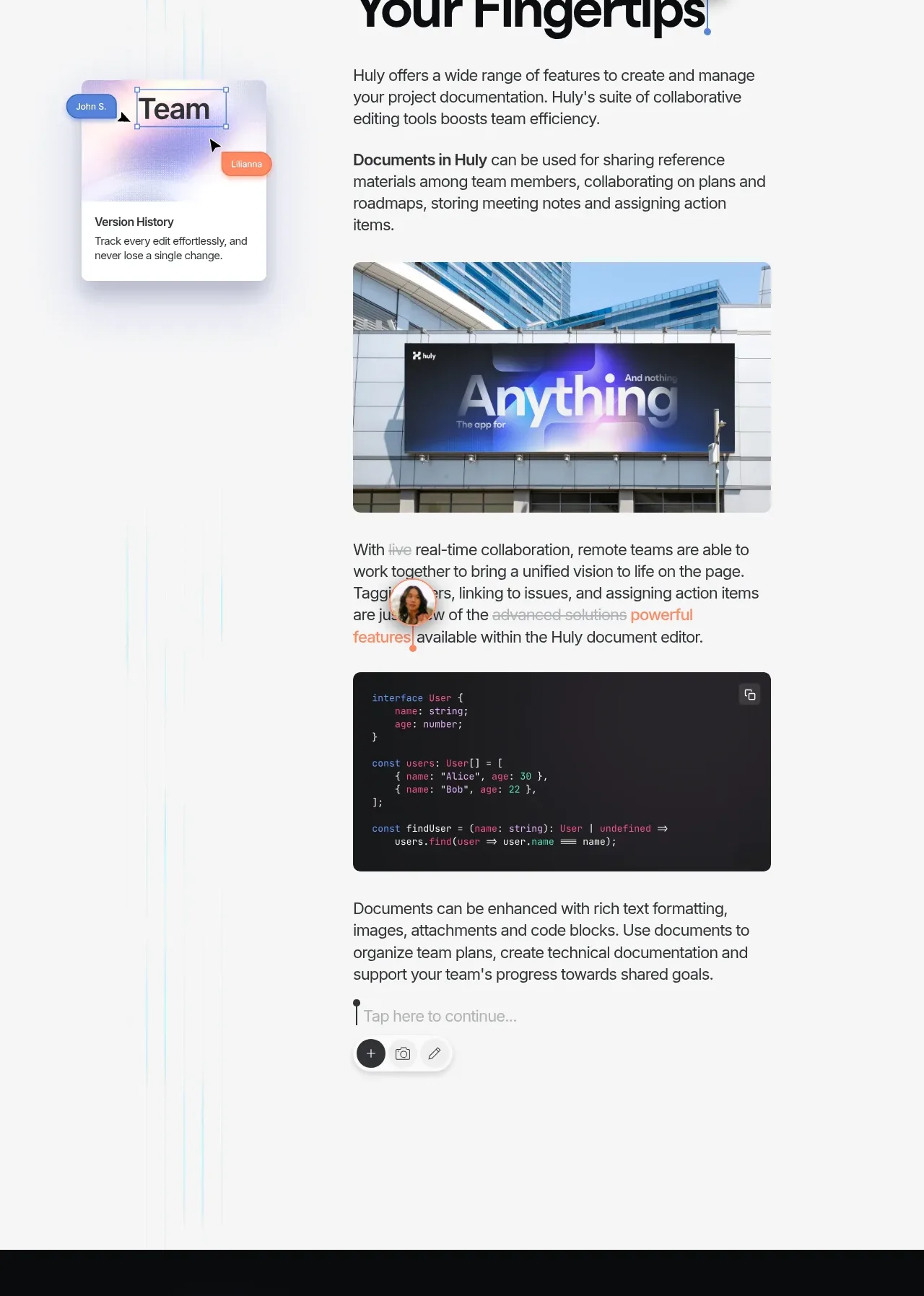
A documentation-focused section combines a floating collaboration annotation, a long text column, an editorial image, code block, and inline editing affordances.
Prompt preview
## Reference images

Study these alongside the description below: hierarchy, rhythm, spacing, colour. Build for the product you are asked about, using this design language.

- Component: https://kage-design-assets.t3.tigrisfiles.io/components/huly-io/19c62401-9349-4b6e-b026-941cb593ca56-1790434842-6.webp
- Full page it was cut from: https://kage-design-assets.t3.tigrisfiles.io/screenshots/huly-io/19c62401-9349-4b6e-b026-941cb593ca56-1790434806578-full.webp
- Component on Kage: https://kage.design/component/huly-feature-grid-4

## Before you start
Ask what knowledge, documentation, or content workflow the user's product supports and what its brand should communicate. Then use the layout principles to create original copy and visuals.

Build a light documentation showcase on an off-white background (#f8f9fa), with faint vertical cyan/lilac atmospheric lines at the edges. Use a two-column composition: a small floating annotation or collaborator card on the left, and a primary editorial column on the right. Start the main column with a large bold two-line heading around 48–58px, followed by several short paragraphs with 18px line-height and clear spacing. Include one wide rounded image or media panel, then a dark code block around #202124 with monospaced 13–14px syntax-colored text and a copy affordance. Finish with an inline editor cue such as a caret, placeholder, and compact pill-shaped toolbar. Use restrained shadows, 12px radii, black text, gray secondary text, and one warm accent color for emphasis. Keep the reading width comfortable and stack the side annotation below or above the article on mobile.

Never use the reference logo, product name, exact copy, illustrations, screenshots, or imagery.
More components

 Three-step process cards
godaylight.com · Feature grid
Three-step process cards
godaylight.com · Feature grid

 Use-case selector with vertical video preview
Spira Maxima · Feature grid
Use-case selector with vertical video preview
Spira Maxima · Feature grid

 Insights and enterprise model access
FastRouter.ai · Feature grid
Insights and enterprise model access
FastRouter.ai · Feature grid
 Solutions by organizational role
FastRouter.ai · Feature grid
Solutions by organizational role
FastRouter.ai · Feature grid
 Routing reliability and model collaboration
FastRouter.ai · Feature grid
Routing reliability and model collaboration
FastRouter.ai · Feature grid
 Goal-oriented product capabilities
FastRouter.ai · Feature grid
Goal-oriented product capabilities
FastRouter.ai · Feature grid