 kage
kage
huly.io
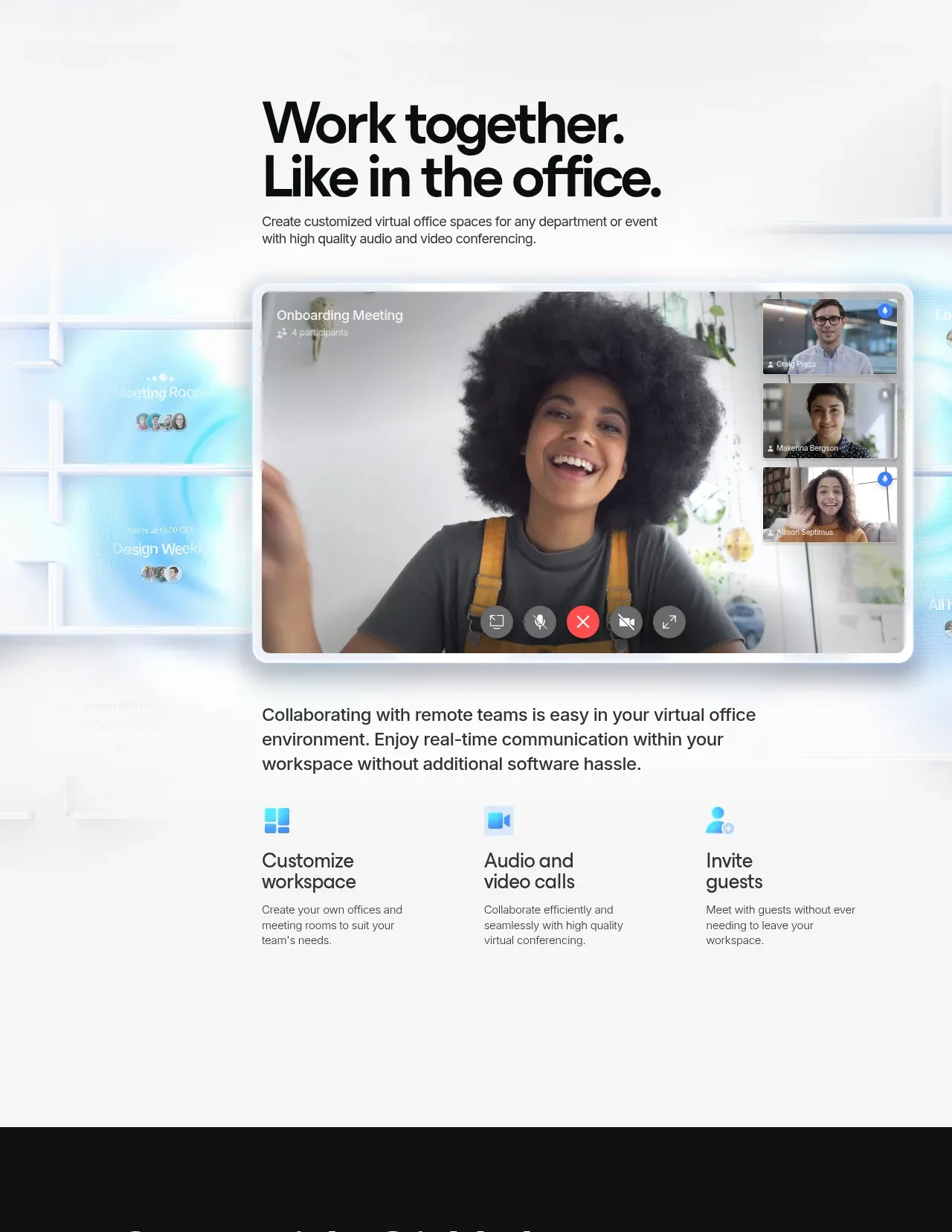
Design analysis
This section presents virtual-office collaboration with a centered heading, a large video-call visual, supporting copy, and three concise capability columns.
Prompt preview
## Reference images

Study these alongside the description below: hierarchy, rhythm, spacing, colour. Build for the product you are asked about, using this design language.

- Component: https://kage-design-assets.t3.tigrisfiles.io/components/huly-io/19c62401-9349-4b6e-b026-941cb593ca56-1790434840-3.webp
- Full page it was cut from: https://kage-design-assets.t3.tigrisfiles.io/screenshots/huly-io/19c62401-9349-4b6e-b026-941cb593ca56-1790434806578-full.webp
- Component on Kage: https://kage.design/component/huly-hero-2

## Before you start
Ask what kind of collaboration or communication experience the user's product offers, who uses it, and what its brand should feel like. Use that information to make an original section.

Create a spacious light collaboration section with a soft white background (#fafbfc) and barely visible cool-blue architectural or glass-like atmosphere. Center a compact content column for the heading, using a bold 48–60px sans-serif with tight line-height, then a short 15–16px supporting paragraph. Below, show a large rounded video-conferencing or collaborative-workspace visual spanning most of the content width; use a soft border, light shadow, and a subtle blue glow rather than a heavy frame. Under the visual, place a readable paragraph and a three-column feature row. Each feature has a small blue gradient icon, a 20–24px title, and a compact gray description. Use a consistent max width, generous vertical spacing, 16px column gaps, and responsive stacking on mobile. Keep the section calm and airy so the visual is the focal point.

Never use the reference logo, product name, exact copy, illustrations, screenshots, or imagery.
More components
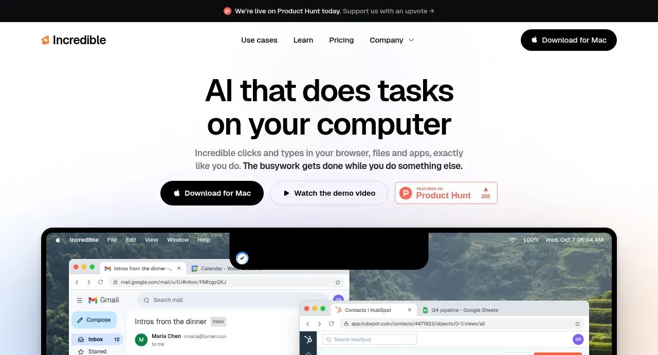
 AI workflow hero
Incredible · Hero
AI workflow hero
Incredible · Hero
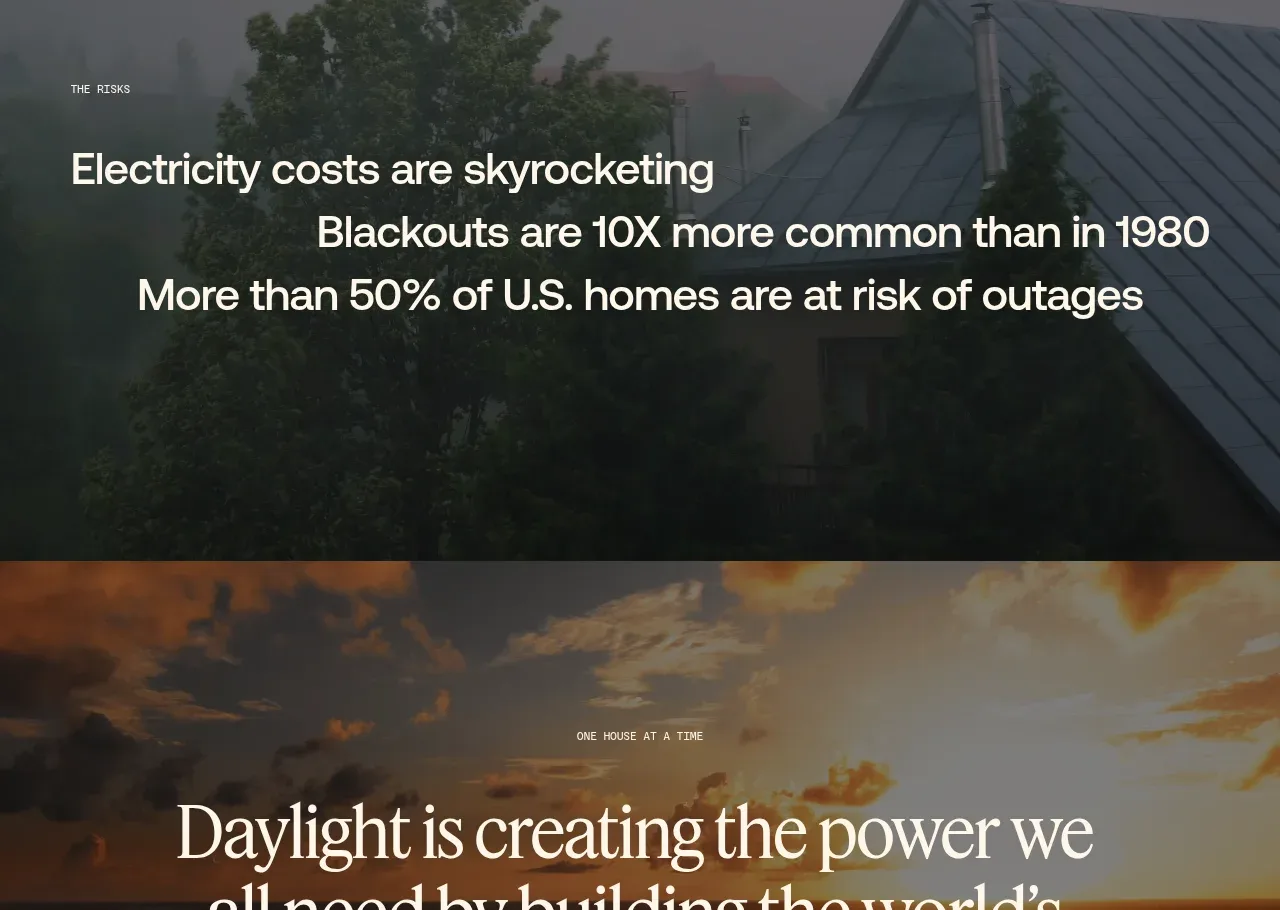
 Decentralized energy statement
godaylight.com · Hero
Decentralized energy statement
godaylight.com · Hero
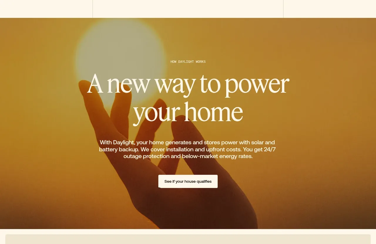 Warm mission statement panel
godaylight.com · Hero
Warm mission statement panel
godaylight.com · Hero
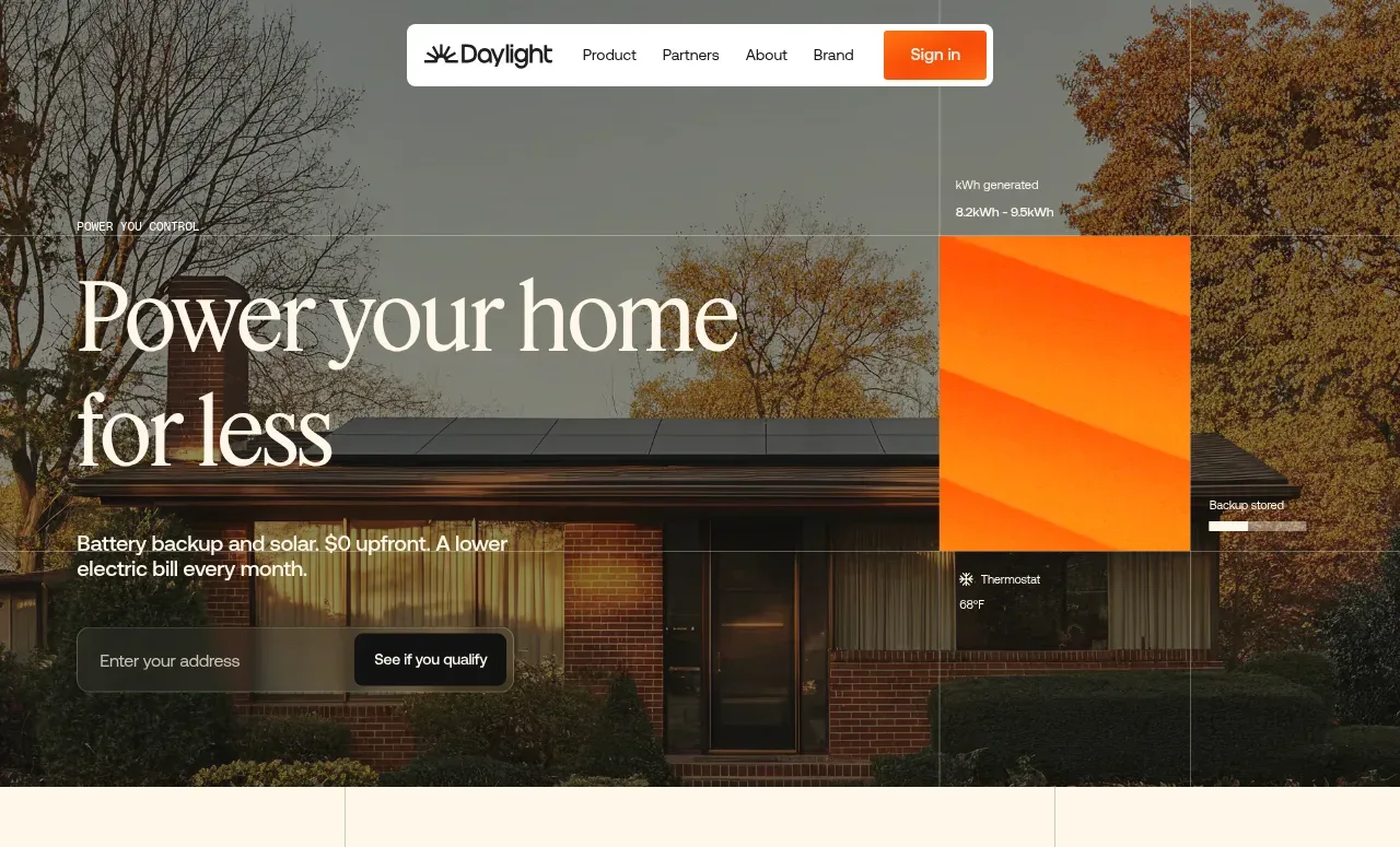 Photographic power-home hero
godaylight.com · Hero
Photographic power-home hero
godaylight.com · Hero
 Grid problem statement
godaylight.com · Hero
Grid problem statement
godaylight.com · Hero
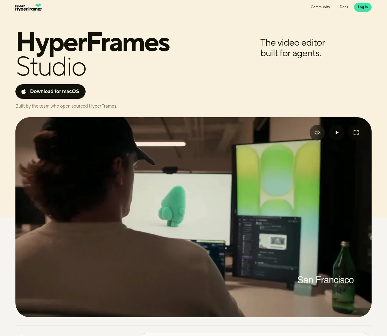
 Product hero with download action and video
HyperFrames Studio (Desktop) · Hero
Product hero with download action and video
HyperFrames Studio (Desktop) · Hero