kage
kage
polylane.com
Design analysis
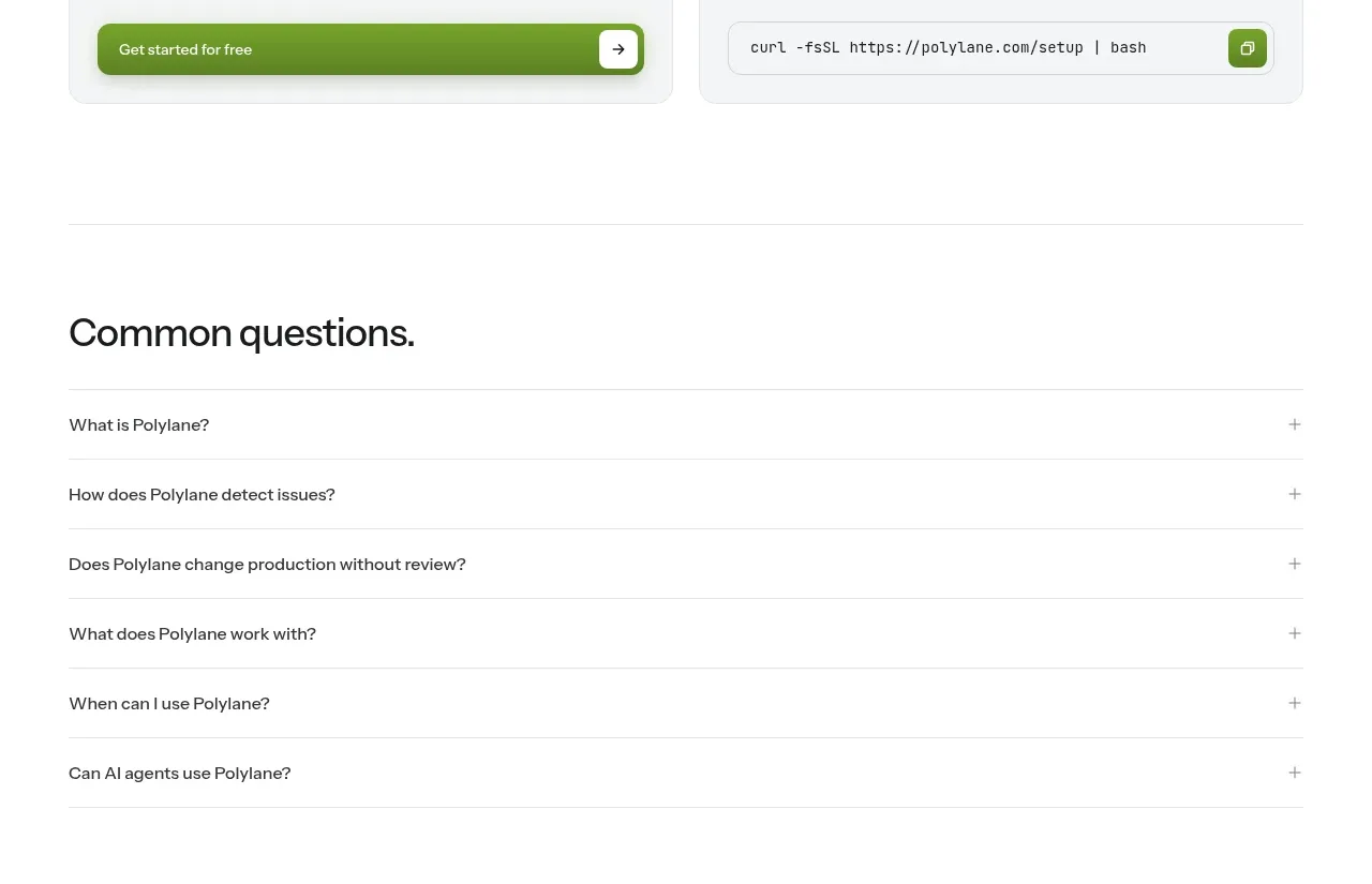
Two side-by-side onboarding cards make the next step concrete by separating visual product access from a command-line or technical path, each with its own action.
Prompt preview
## Reference images

Study these alongside the description below: hierarchy, rhythm, spacing, colour. Build for the product you are asked about, using this design language.

- Component: https://kage-design-assets.t3.tigrisfiles.io/components/polylane/638c7112-70a9-484e-b85d-ab255c3ac21a-1790920982-7.webp
- Full page it was cut from: https://kage-design-assets.t3.tigrisfiles.io/screenshots/polylane/638c7112-70a9-484e-b85d-ab255c3ac21a-1790920937285-full.webp
- Component on Kage: https://kage.design/component/polylane-card

## Before you start
Ask whether the user's product has multiple onboarding paths, who each path serves, and what the real first action is. Then design two or more original entry cards using the following principles.

Build a “getting started” section with a clear heading and a responsive two-column card grid. Each card should contain a soft framed preview area, a concise path title, one sentence of context, and one primary or secondary action. Give the cards equal visual weight while making the recommended route slightly more prominent through button treatment, not excessive decoration. Use predictable card anatomy and generous internal padding.

Use #F7F8F5 or #F5F6F2 card surfaces on white, #171717 text, #6A6A6A descriptions, green #73AA2A primary actions, and #E5E8E2 borders. Use 12–16px radius, 24px padding, 16–20px card gap, and preview panels with a soft tinted background. Make cards stack on mobile; ensure buttons and previews have meaningful accessible labels.

Never: use logos, product names, copy, illustrations or imagery from the reference.