 kage
kage
idlen.io
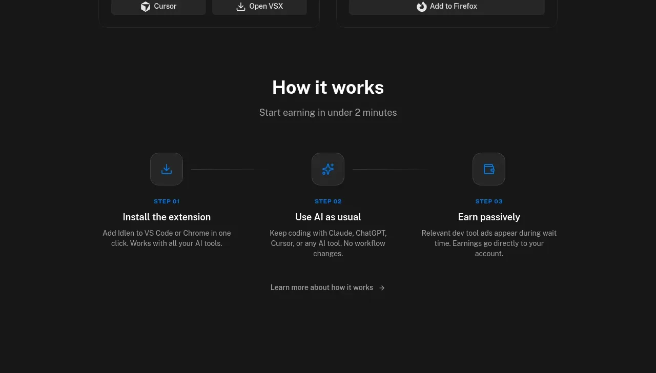
Design analysis
A centered “how it works” section explains the product in three numbered steps. Icons, short titles, brief descriptions, and a quiet follow-up link reduce the perceived setup effort.
Prompt preview
## Reference images

Study these alongside the description below: hierarchy, rhythm, spacing, colour. Build for the product you are asked about, using this design language.

- Component: https://kage-design-assets.t3.tigrisfiles.io/components/idlen/09112380-17fc-499b-a8d2-71eed663a053-1789538554-5.webp
- Full page it was cut from: https://kage-design-assets.t3.tigrisfiles.io/screenshots/idlen/09112380-17fc-499b-a8d2-71eed663a053-1789538482510-full.webp
- Component on Kage: https://kage.design/component/idlen-feature-grid-2

## Before you start
Ask what the user's product, audience, and brand are, then apply the principles below to that product rather than copying this reference.

Create a three-step onboarding section with a centered heading, short subtitle, and three evenly spaced steps connected by a very subtle horizontal line or alignment. Each step includes a rounded square icon tile, a small step number, concise title, and two-line explanation. Finish with a low-emphasis “learn more” link.

Design rules:
- Use a centered max-width 680px layout with equal columns and generous top/bottom padding.
- Use a 30–34px heading, 11px uppercase step labels, 16px titles, and 12–13px descriptions.
- Approximate colours: background #171717, heading #f4f4f4, muted #929292, tile #252525, icon blue #1686ff, connector #303030.
- Icon tiles should be 44–50px square with 10px radius and a thin border.
- Keep each step to one action and one outcome; use consistent vertical alignment.
- Stack steps vertically on mobile and replace the connector with spacing.

Never:
- Never use logos, product names, copy, illustrations, or imagery from the reference.
- Never use decorative illustrations where a clear action icon is enough.
- Never overload a step with multiple instructions.
More components

 Authentication product capabilities
tiun. · Feature grid
Authentication product capabilities
tiun. · Feature grid
 Customer data and user management
tiun. · Feature grid
Customer data and user management
tiun. · Feature grid
 Problem and unified solution narrative
tiun. · Feature grid
Problem and unified solution narrative
tiun. · Feature grid
 Integration and agent workflow
tiun. · Feature grid
Integration and agent workflow
tiun. · Feature grid
 Billing and checkout capabilities
tiun. · Feature grid
Billing and checkout capabilities
tiun. · Feature grid

 Receiving money channels
Payflip · Feature grid
Receiving money channels
Payflip · Feature grid