 kage
kage
idlen.io
Design analysis
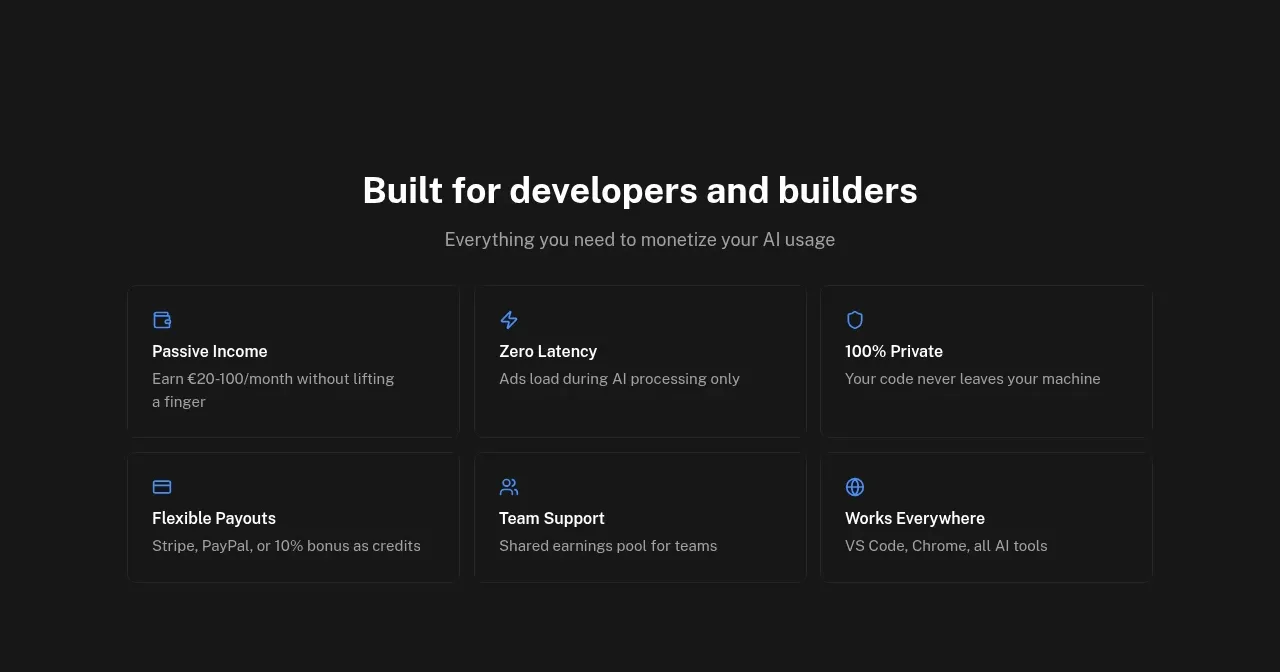
A concise six-card grid reframes the service as concrete product benefits: passive income, privacy, latency, payouts, support, and broad compatibility. Blue line icons provide lightweight categorisation.
Prompt preview
## Reference images

Study these alongside the description below: hierarchy, rhythm, spacing, colour. Build for the product you are asked about, using this design language.

- Component: https://kage-design-assets.t3.tigrisfiles.io/components/idlen/09112380-17fc-499b-a8d2-71eed663a053-1789538554-6.webp
- Full page it was cut from: https://kage-design-assets.t3.tigrisfiles.io/screenshots/idlen/09112380-17fc-499b-a8d2-71eed663a053-1789538482510-full.webp
- Component on Kage: https://kage.design/component/idlen-feature-grid-3

## Before you start
Ask what the user's product, audience, and brand are, then apply the principles below to that product rather than copying this reference.

Build a six-item benefits grid beneath a centered heading and subtitle. Use two rows of three compact bordered cards. Each card has a small blue outline icon, a bold benefit title, and one short sentence of supporting detail. Keep the cards dense enough to scan but with ample internal padding.

Design rules:
- Use a three-column grid in a max-width 720–820px container; allow two columns or one on smaller screens.
- Use a 30px heading, 14px card titles, and 12–13px descriptions.
- Approximate colours: #171717 background, #f4f4f4 text, #919191 descriptions, #242424 borders, #1686ff icons.
- Use 8px radius, 1px borders, 18–22px padding, and consistent card heights.
- Avoid gradients and imagery; the value comes from concise copy and repetition.
- Add a restrained hover state to the border and icon only.

Never:
- Never use logos, product names, copy, illustrations, or imagery from the reference.
- Never repeat the reference's benefit claims without evidence.
- Never use six unrelated features; preserve a coherent benefit hierarchy.
More components

 Authentication product capabilities
tiun. · Feature grid
Authentication product capabilities
tiun. · Feature grid
 Customer data and user management
tiun. · Feature grid
Customer data and user management
tiun. · Feature grid
 Problem and unified solution narrative
tiun. · Feature grid
Problem and unified solution narrative
tiun. · Feature grid
 Integration and agent workflow
tiun. · Feature grid
Integration and agent workflow
tiun. · Feature grid
 Billing and checkout capabilities
tiun. · Feature grid
Billing and checkout capabilities
tiun. · Feature grid

 Receiving money channels
Payflip · Feature grid
Receiving money channels
Payflip · Feature grid