 kage
ilha.app
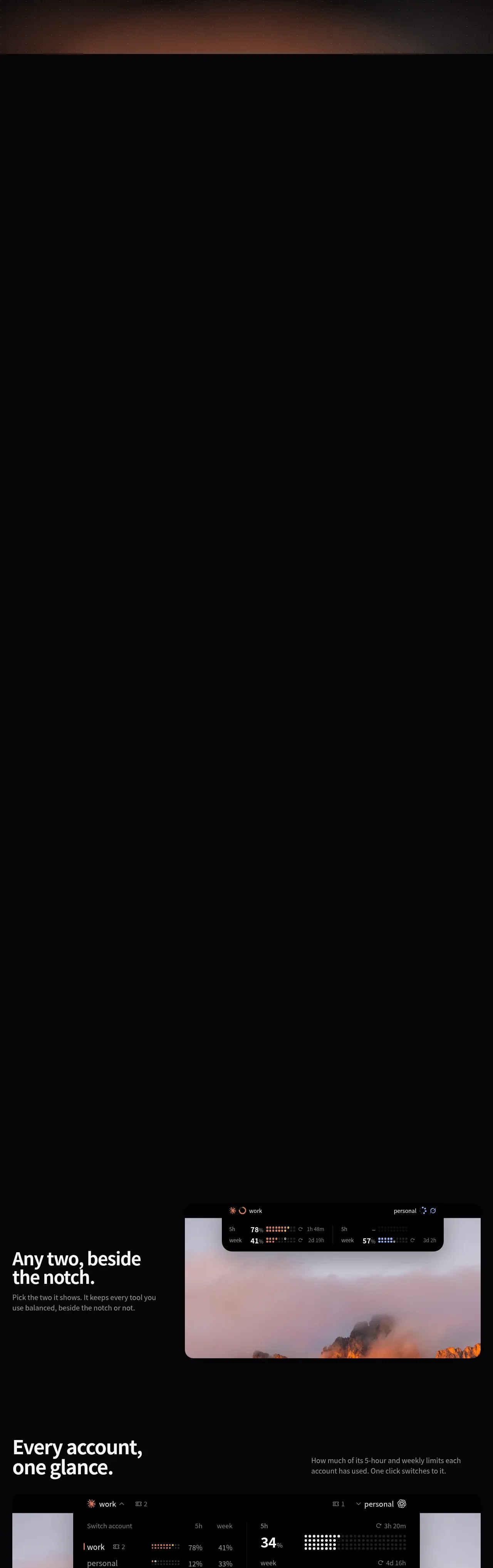
Design analysis
A long sequence of alternating product demonstrations explains switching, account visibility, cost tracking, reset banking, and privacy through oversized UI visuals and sparse copy.
Prompt preview
## Reference images

Study these alongside the description below: hierarchy, rhythm, spacing, colour. Build for the product you are asked about, using this design language.

- Component: https://kage-design-assets.t3.tigrisfiles.io/components/ilha/abf8b55c-66d5-414b-9583-571f1b47ea7e-1792648866-2.webp
- Full page it was cut from: https://kage-design-assets.t3.tigrisfiles.io/screenshots/ilha/abf8b55c-66d5-414b-9583-571f1b47ea7e-1792648836592-full.webp
- Component on Kage: https://kage.design/component/ilha-feature-grid

## Before you start
Ask what the user's product and brand are, then apply the principles below to that context rather than reproducing this reference.

Build a long-form feature section made of 4–5 vertically separated feature stories on a black background (#050607). Each story should be a generous horizontal band with a short, high-contrast heading (around 36–48px, bold), one concise paragraph in muted gray, and a large product UI mockup or visual demonstration. Alternate the composition: text left/visual right, then a full-width dashboard, then a full-width analytics chart, then visual left/text right. Use a 24px desktop gutter and max-width around 860px, with 120–180px vertical spacing between stories. Product visuals should use black panels (#030303), soft gray borders, large 16–24px corner radii, and restrained warm/cool status accents. Let visuals overlap or sit over abstract blurred landscape/gradient backdrops, but keep them subordinate to the UI. Demonstrations should communicate switching state, aggregated account status, historical cost/usage, and automatic reset handling without requiring dense prose. Make the section responsive: stack text and visual on mobile, reduce headline size, and preserve focal controls and data labels.

### Never
- Never use logos, product names, copy, illustrations, or imagery from the reference.
- Never duplicate the reference's exact dashboard, chart data, labels, or mountain imagery.
- Never turn every feature into an identical three-column card grid.
More components
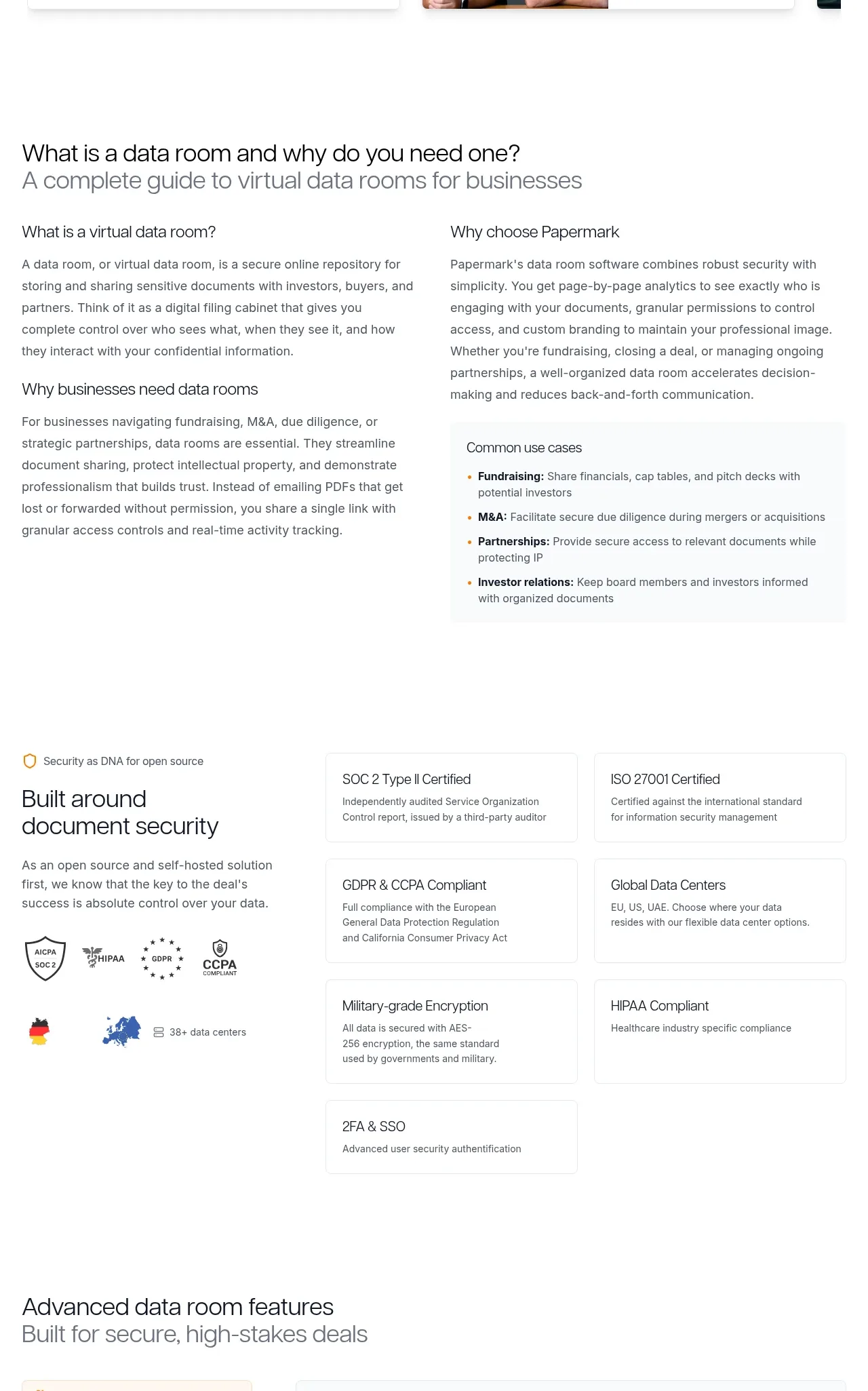
 Data-room education and security overview
Papermark Data Rooms · Feature grid
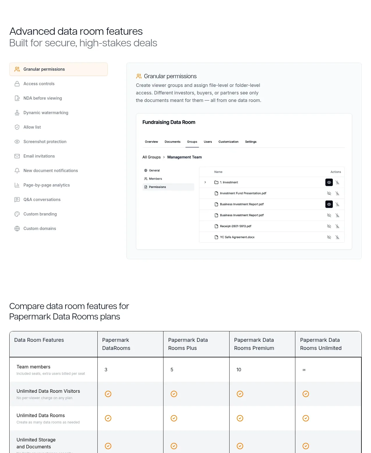 Advanced data-room features
Papermark Data Rooms · Feature grid
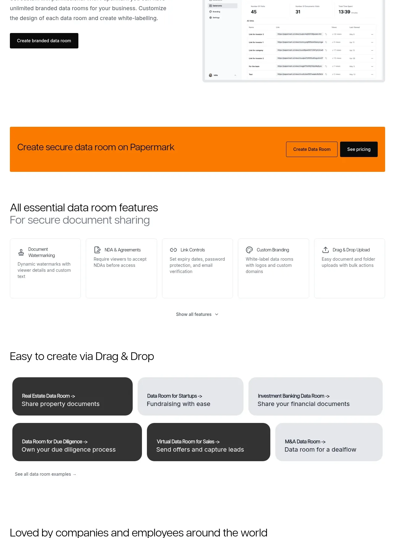 Workflow demonstrations
Papermark Data Rooms · Feature grid
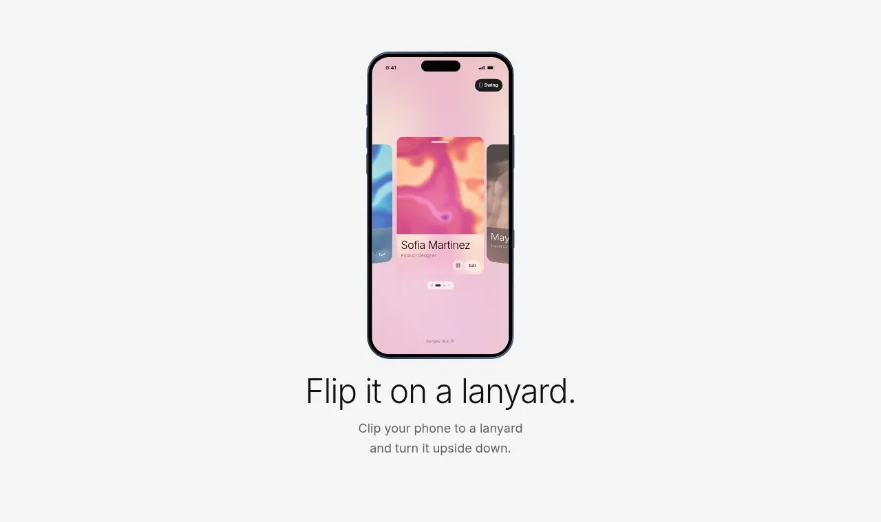
 Lanyard use-case feature
Badgey · Feature grid

 Problem statement
Clips by Plastic · Feature grid
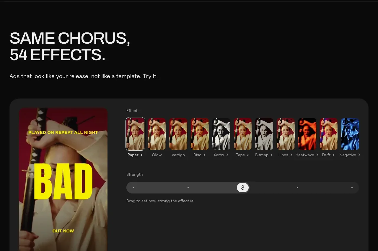 Effects and customization panel
Clips by Plastic · Feature grid