kage
ilha.app

Design analysis
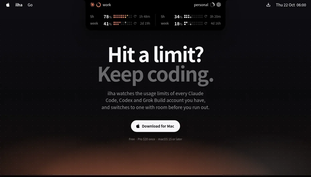
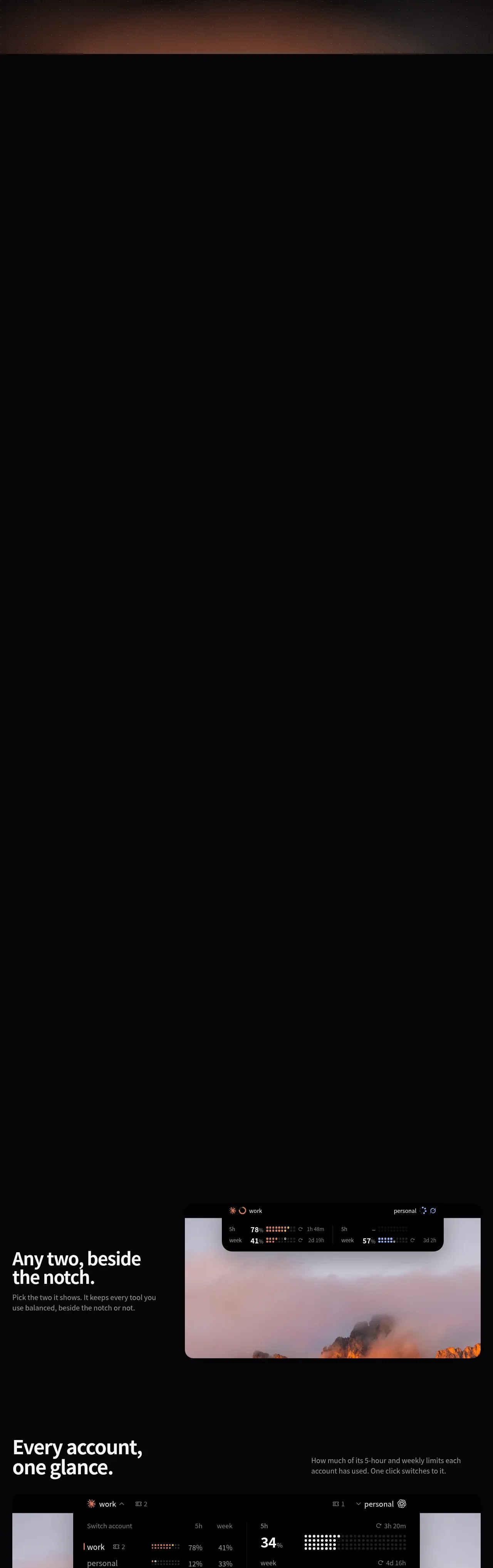
A dark landing page for a macOS notch widget that monitors AI coding CLI usage limits. It opens with a faux macOS menu bar and notch widget floating on near-black, then a huge two-line headline with a warm ember glow. The mid-page alternates left/right alternating feature blocks over a shared sunset-mountain wallpaper, with UI mockups rendered as glowing dot-matrix displays. A giant low-contrast privacy statement gives way to a two-card pricing block, an FAQ-like prose column, and a centered "Keep shipping" close.
Prompt preview
## Reference images

Study these alongside the description below: hierarchy, rhythm, spacing, colour. Build for the product you are asked about, using this design language.

- Full page: https://kage-design-assets.t3.tigrisfiles.io/screenshots/ilha/abf8b55c-66d5-414b-9583-571f1b47ea7e-1792648836592-full.webp
- Above the fold: https://kage-design-assets.t3.tigrisfiles.io/screenshots/ilha/abf8b55c-66d5-414b-9583-571f1b47ea7e-1792648830281.webp
- Design on Kage: https://kage.design/designs/ilha-landing-page

# Ilha-style dark landing page

## Before you start
Ask the user what product they are building, who it is for, and what brand assets (name, colours, type) they already have. Wait for the answers before writing anything. Everything below is a design language to apply to *their* product, not the reference.

## Page structure
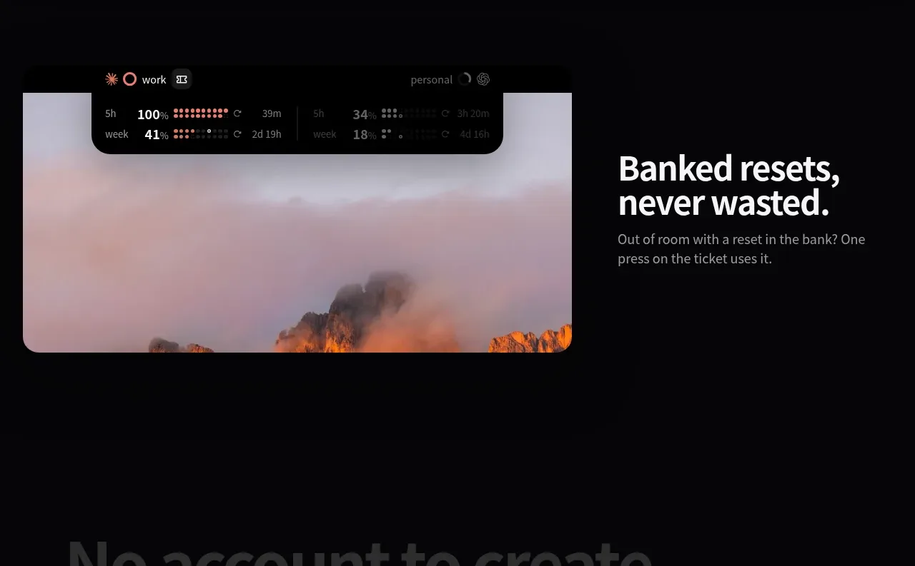
1. **Faux macOS menu bar + widget hero**: a black strip at the very top with a clock/date on the right and a floating dark notch widget showing two accounts with dot-matrix usage percentages. This doubles as the product demo before any copy.
2. **Hero**: centred two-line headline where line one is white and line two is dimmed grey ("Hit a limit?" / "Keep coding."), a short 3-line grey subhead, a single white pill CTA ("Download for Mac"), and a tiny grey footnote line. A warm orange/ember glow bleeds up from below the fold.
3. **Large dark breathing space**: a long near-black section (mostly product demo/animation space) — keep generous vertical whitespace so the hero has air.
4. **Alternating feature blocks** over a full-bleed sunset mountain wallpaper, each ~50/50 split:
   - Left text ("Any two, beside the notch."), right UI mockup of the notch widget.
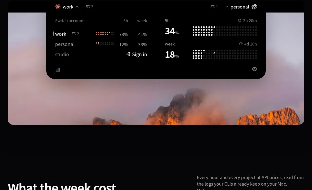
   - Left heading "Every account, one glance.", right explanatory caption; full-width mockup of an account-switching dropdown below.
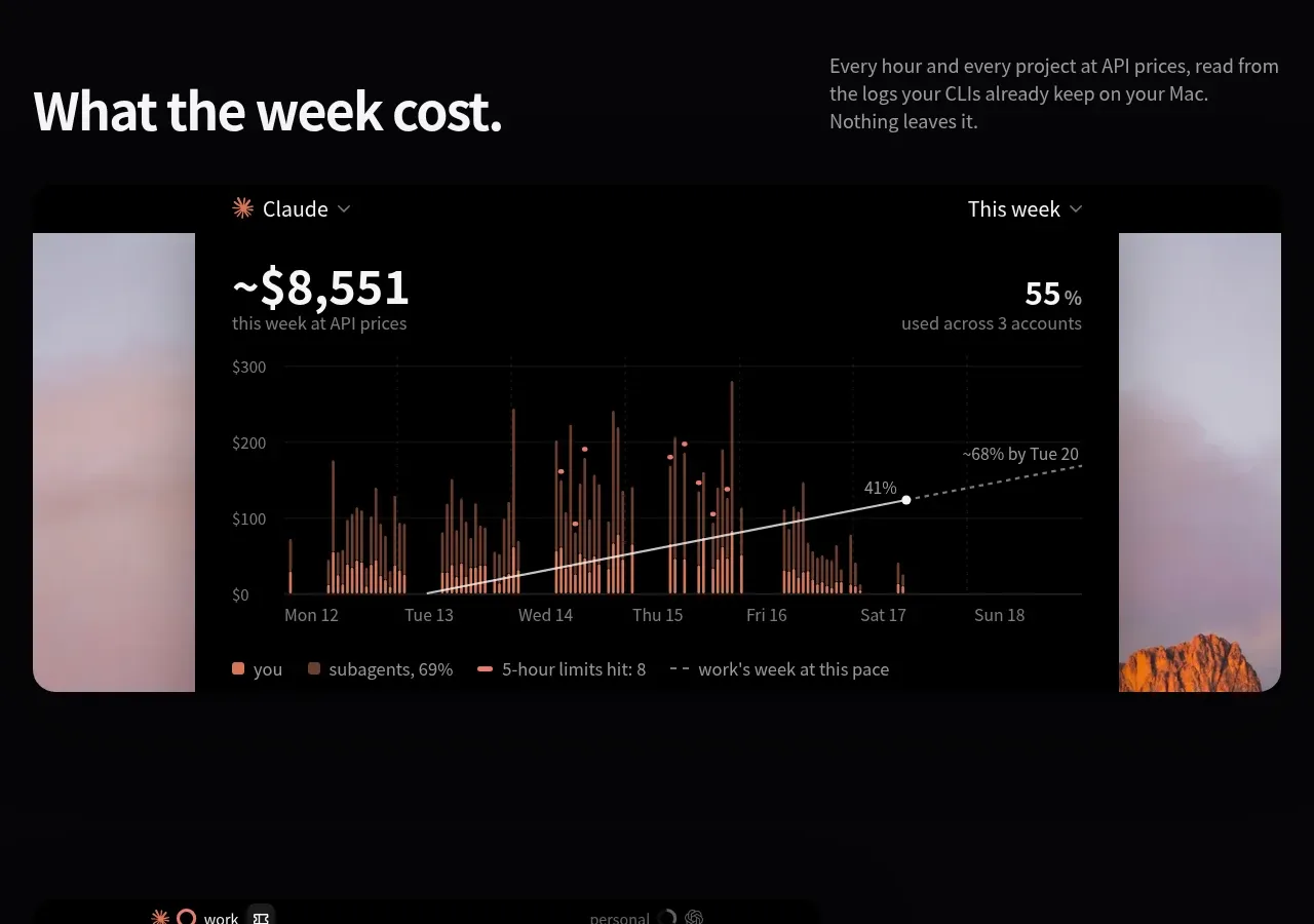
   - Left heading "What the week cost.", right caption about local-only data; full-width mockup of an analytics panel with a bar chart and dashed trend line.
   - Left mockup of widget at 100%, right heading "Banked resets, never wasted."
5. **Privacy statement**: enormous, low-contrast dark-grey display text, 5 lines, left-aligned, with one word highlighted in a warm tint ("Keychain."). No other elements — pure typography.
6. **Pricing**: heading "Free to watch. Pro to switch." with an intro paragraph, then two dark cards side by side — Free ($0) and Pro ($20) — the Pro card slightly lighter/elevated with a segmented Mac-count selector, price in very large type, a CTA button each, and a short icon feature list. A small prose FAQ column sits to the left explaining licensing, data handling and updates.
7. **Closing section**: centred app icon, giant "Keep shipping." headline, one grey line, repeat of the white Download pill, "macOS 15 or later" footnote.
8. **Footer**: three columns — logo + tagline + download button, on-page anchor links, system requirements — then a legal row with terms/privacy/refunds and a wallpaper-credit note.

## Design language
- Background is near-black (#0a0a0c to #111); sections are separated by whitespace, not borders. Section rhythm: huge dark space → alternating feature rows → typography interlude → pricing → close.
- Hierarchy: two-tone headlines (white first line, ~40%-opacity grey second line); feature headings ~40–48px semi-bold, captions 14–15px in ~60% grey, max-width ~34ch.
- Accent colour: warm ember orange (#c96a3a–#e08a4a range) used only for glows, data dots, chart bars and one highlighted word. No blues or gradients elsewhere.
- Data displays use dot-matrix / LED-style glyphs (percentage dots made of small squares) — a strong signature: render usage or metrics as dot clusters, not bars or spinners.
- Product mockups sit on dark rounded cards with subtle 1px light borders and slight elevation; charts use thin candlestick-like bars in orange with a white dashed trend line.
- Typography: a single geometric/grotesque sans family throughout; scale roughly 96px hero / 44px section / 15px body / 12px footnotes; body copy is short paragraphs, left-aligned in feature rows, centred in hero and close.
- One full-bleed photographic wallpaper (warm sunset mountains) grounds the middle feature section; UI mockups float on top of it. Do not use cold or busy photography.
- Motion: implied glows and hover affordances only; buttons are solid white pills with black text (primary) or subtle dark pills (secondary).
- Rounded corners: ~12–16px on cards and widgets; pills fully rounded.
- Pricing contrast: secondary card darker, primary card slightly elevated with a small segmented control; big numerals dominate, features are one-line icon + text rows.

## Never
- No logos, wordmarks, product names, copy, illustrations, photography or icon sets from the reference; never present the result as that product. Do not reuse the "Hit a limit? / Keep coding." or "Keep shipping." copy, the sunset wallpaper, or Claude/Codex references.