 kage
kage
illusions.app
Design analysis
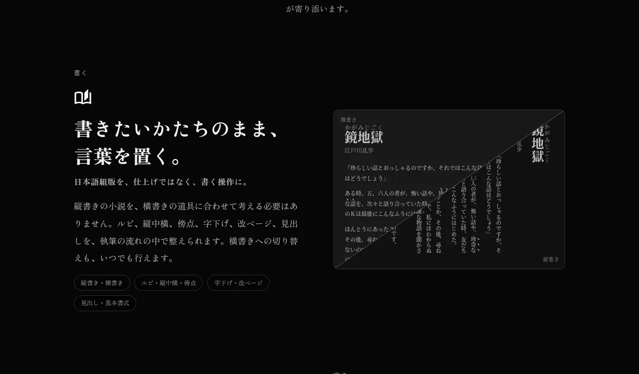
The first alternating capability block pairs a left-aligned writing benefit with a framed editor preview, using a small icon, large serif heading, explanatory text, and pill-like capability labels.
Prompt preview
## Reference images

Study these alongside the description below: hierarchy, rhythm, spacing, colour. Build for the product you are asked about, using this design language.

- Component: https://kage-design-assets.t3.tigrisfiles.io/components/illusions/1ba887fc-c00e-45d6-baad-b5fdc0d1f7c3-1789797655-3.webp
- Full page it was cut from: https://kage-design-assets.t3.tigrisfiles.io/screenshots/illusions/1ba887fc-c00e-45d6-baad-b5fdc0d1f7c3-1789797632145-full.webp
- Component on Kage: https://kage.design/component/illusions-feature-grid

## Before you start
Ask what the user's product is, who it serves, and what their brand voice and visual identity are. Apply the principles below to that product rather than reproducing this reference.

Create an alternating two-column feature section with a text column and a product-preview column. Use a centered max-width around 690px, 72–110px vertical padding, and a 48–72px column gap. The text column should have a small eyebrow and line icon, a 34–48px editorial serif heading, readable 16–18px body copy, and several compact capability chips. The preview should be a dark UI card with #202020–#292929 borders, 10–14px radius, layered typography, and realistic but generic interface content. Keep the first block text-left/visual-right; alternate in later blocks. Use #050505 page background, #f1ede7 text, #8e8982 secondary text, and very subtle separators. On narrow screens, stack text above visual.

Never: use logos, product names, copy, illustrations, or imagery from the reference.
More components

 AI-powered helpdesk feature section
intercom.com · Feature grid
AI-powered helpdesk feature section
intercom.com · Feature grid
 Integrations and ecosystem section
intercom.com · Feature grid
Integrations and ecosystem section
intercom.com · Feature grid
 AI agent capabilities section
intercom.com · Feature grid
AI agent capabilities section
intercom.com · Feature grid
 Unified support experience overview
intercom.com · Feature grid
Unified support experience overview
intercom.com · Feature grid

 Core invoicing capabilities
sendinvo.com · Feature grid
Core invoicing capabilities
sendinvo.com · Feature grid
 Audience and trade types
sendinvo.com · Feature grid
Audience and trade types
sendinvo.com · Feature grid