kage
kage
illusions.app

Design analysis
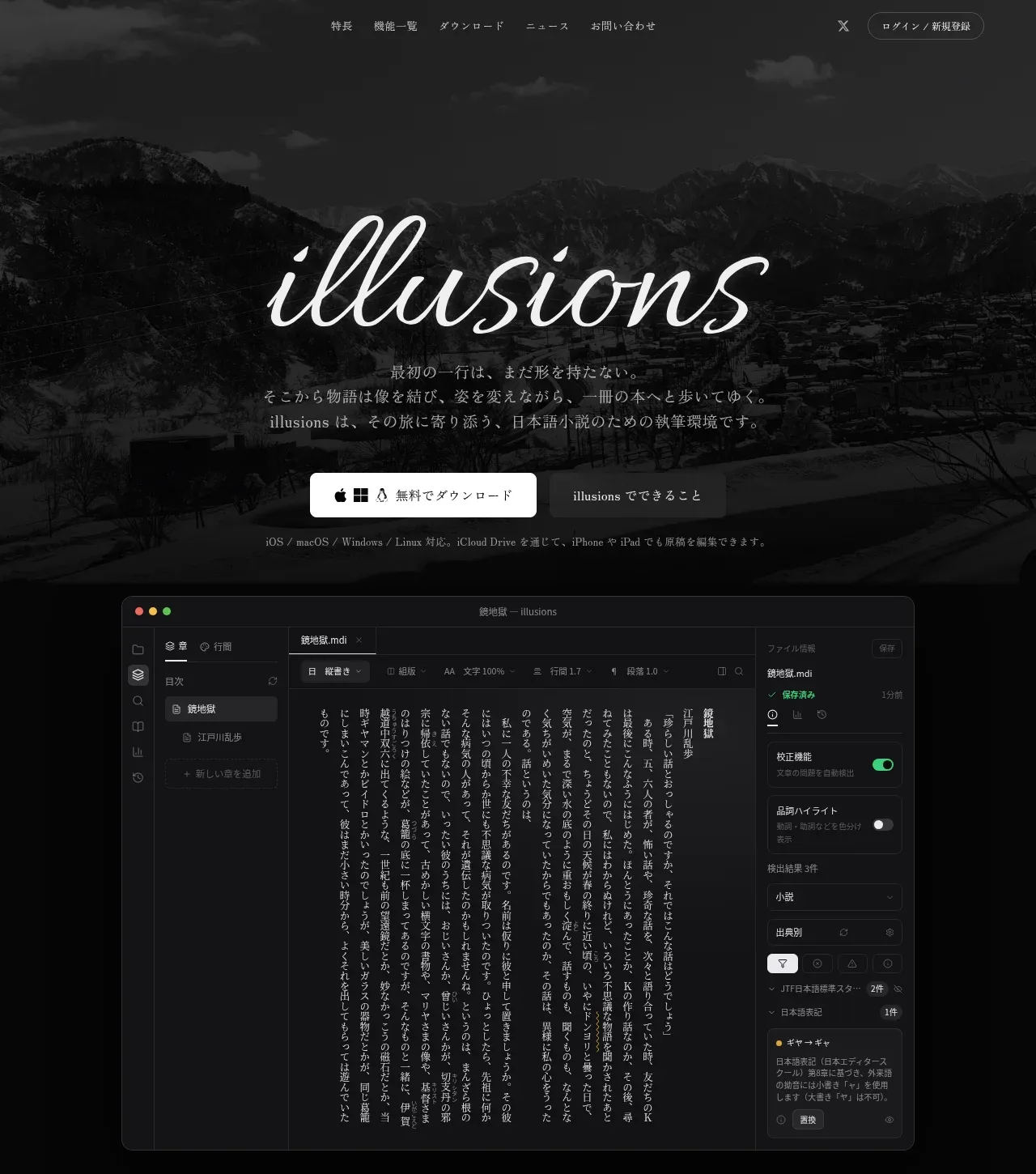
A near-monochrome dark landing page that lets atmospheric photography, a script wordmark and dense UI mockups carry the story. The hero pairs a moody mountain photo with a cursive logotype and short manifesto copy; below, alternating text/visual rows showcase editor, snapshot, project and correction features in realistic dark app frames, and the page closes with a dense grouped feature index. Restraint in colour (black, gray, one warm accent) keeps the focus on typography and craft.
Prompt preview
## Reference images

Study these alongside the description below: hierarchy, rhythm, spacing, colour. Build for the product you are asked about, using this design language.

- Full page: https://kage-design-assets.t3.tigrisfiles.io/screenshots/illusions/1ba887fc-c00e-45d6-baad-b5fdc0d1f7c3-1789797632145-full.webp
- Above the fold: https://kage-design-assets.t3.tigrisfiles.io/screenshots/illusions/1ba887fc-c00e-45d6-baad-b5fdc0d1f7c3-1789797628737.webp
- Design on Kage: https://kage.design/designs/illusions-landing-page

# Build a dark, literary product landing page

## Before you start
Ask the user: what product are you building, who is it for, what brand assets exist (name, colours, type, logo, photography)? Wait for the answers. Apply everything below to *their* product, not the reference.

## Page structure
1. **Top navigation** — slim, transparent-over-hero bar: a few quiet text links left/centre, a utility icon, and one small outlined pill CTA at the far right. Nothing loud.
2. **Hero** — full-bleed dark atmospheric photo (mountain/landscape, heavily darkened). Centred script/cursive wordmark at large display size, followed by 2–3 short lines of manifesto copy in a serif, then one white filled pill button (with platform icon) plus one secondary dark button, and a single line of small platform/compatibility text beneath.
3. **App screenshot stage** — immediately below the hero, a large realistic dark UI mockup (editor window with sidebar, document list, settings panel) floating on the page background, slightly overlapping the hero's dark zone.
4. **Section intro** — small centred eyebrow label + one bold serif headline + one short supporting paragraph. Sets the narrative before the feature rows.
5. **Alternating feature rows (×5)** — each row pairs a text block (tiny eyebrow verb, small icon, large serif headline, body paragraph, and a wrap of small outlined "chip" tags listing capabilities) with a realistic dark UI mockup card (vertical-text editor, snapshot/history list, project-wide search, correction guide panel, export/print-settings form). Alternate text-left/visual-right then text-right/visual-left. Generous vertical padding between rows.
6. **Summary band** — centred eyebrow + one strong serif headline + one line of copy, transitioning to the feature index.
7. **Dense feature index** — grouped columns of small rows: a bold category label, then icon + short feature name per line, in 4–5 columns, several groups stacked. Ends with one centred outlined button ("see all features").
8. **Footer / bottom zone** — quiet, dark, minimal links (not detailed in capture; keep restrained).

## Design language
- Palette: near-black background (#0d0d0c–#141412), slightly lighter panel surfaces (#1c1c1a), warm off-white text (#f2f0ea), mid-gray secondary text (#9a988f), one warm amber/red accent used sparingly for highlights. A green status colour for live indicators.
- Type: pair a cursive/script display face for the wordmark only, a high-contrast serif for headlines and body copy, and a clean sans for UI chips, labels and mockup internals. Headlines large (40–56px) but airy; body 15–17px with generous line height; eyebrows tiny (11–12px) letterspaced.
- Hierarchy: size + serif weight carries hierarchy; almost no colour hierarchy. Eyebrow verbs above each headline give narrative rhythm (write / read / build / correct / ship).
- Chips: small rounded-rect outlined tags (1px border, 6–8px radius, 12px text) for feature lists — a signature detail; reuse everywhere.
- Mockups: render realistic dark app windows with visible chrome (traffic lights, tabs, panels), consistent radius (~10–14px), thin borders (#2a2a28), no drop shadows beyond subtle elevation; keep mockup internals dense and believable.
- Rhythm: hero is cinematic and sparse; middle rows are wide, alternating two-column with big whitespace; the final index compresses into a dense multi-column grid — density increases as the page moves from story to reference.
- Interaction/motion: keep it calm — subtle hover brightening on buttons and chips, no big animation implied.
- Buttons: one white filled pill (dark text) as primary; outlined or dark-surface pills as secondary.

## Never
Never reuse the reference's name "illusions", its script wordmark, Japanese copy, mountain photography, or its icon set. Do not present the result as that product.
Components from this page
All components
 Minimal dark navigation
illusions · Navigation
Minimal dark navigation
illusions · Navigation
 Photographic editorial hero
illusions · Hero
Photographic editorial hero
illusions · Hero
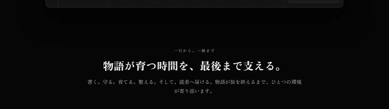 Editorial promise statement
illusions · Hero
Editorial promise statement
illusions · Hero
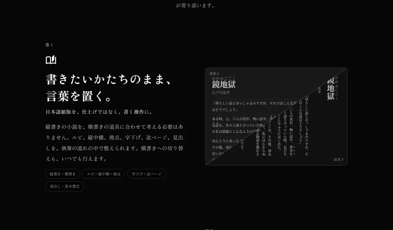 Writing workflow capabilities
illusions · Feature grid
Writing workflow capabilities
illusions · Feature grid
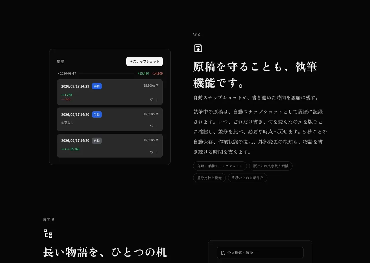 Protection and revision features
illusions · Feature grid
Protection and revision features
illusions · Feature grid
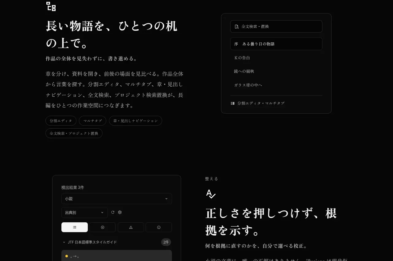 Structured long-form workspace
illusions · Feature grid
Structured long-form workspace
illusions · Feature grid
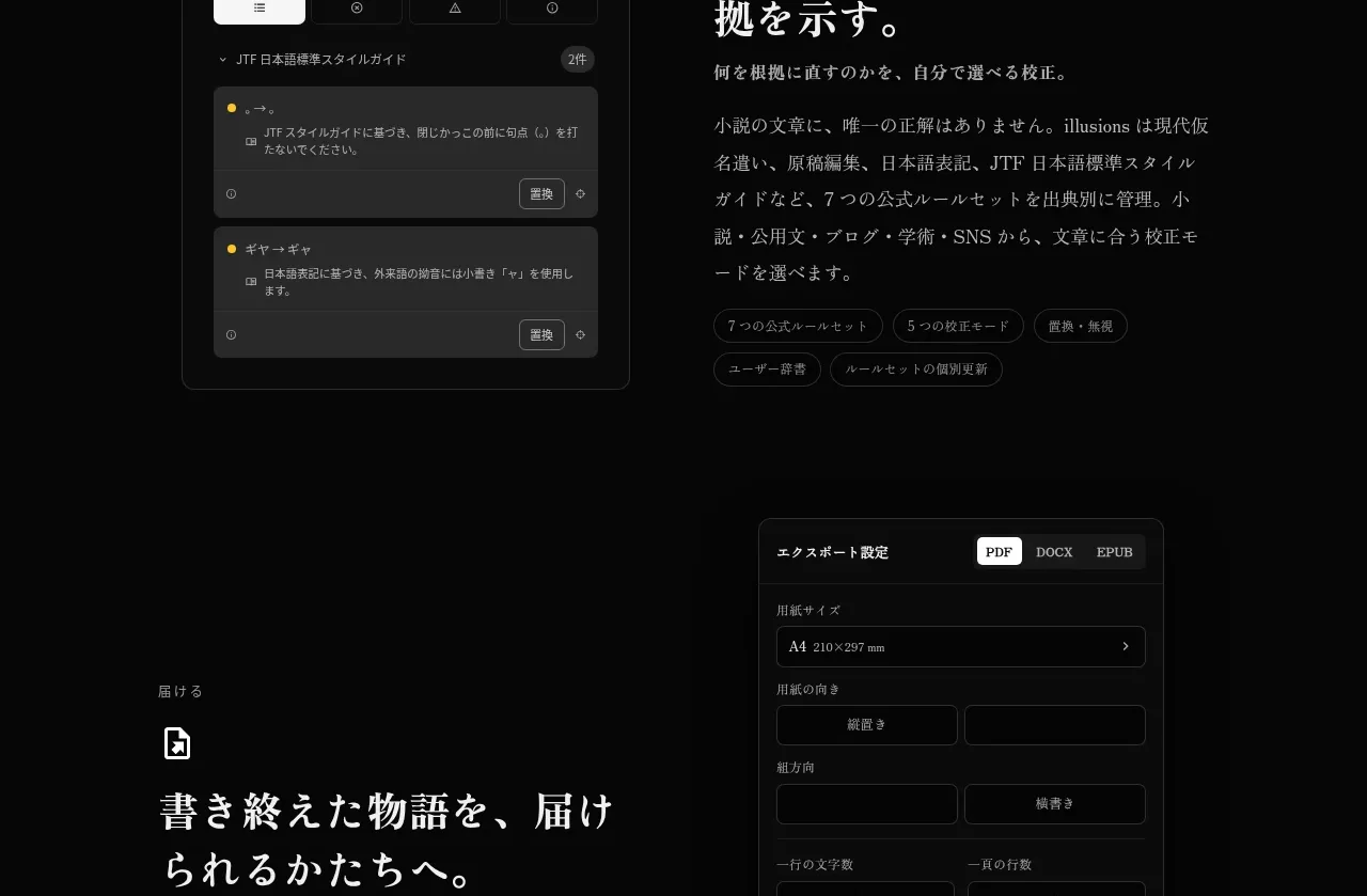 Research and correctness tools
illusions · Feature grid
Research and correctness tools
illusions · Feature grid
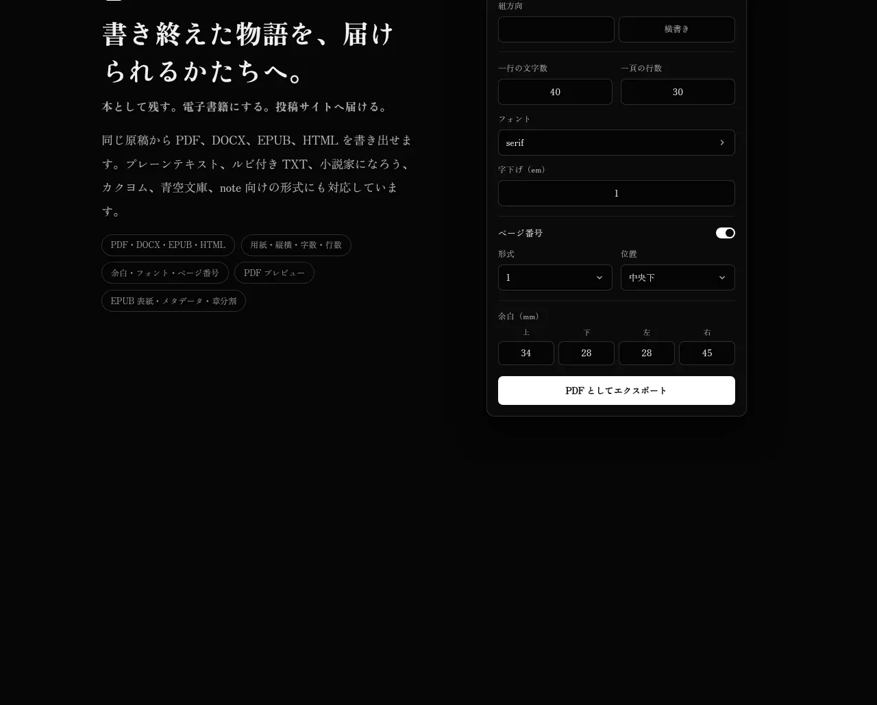 Export and delivery workflow
illusions · Feature grid
Export and delivery workflow
illusions · Feature grid
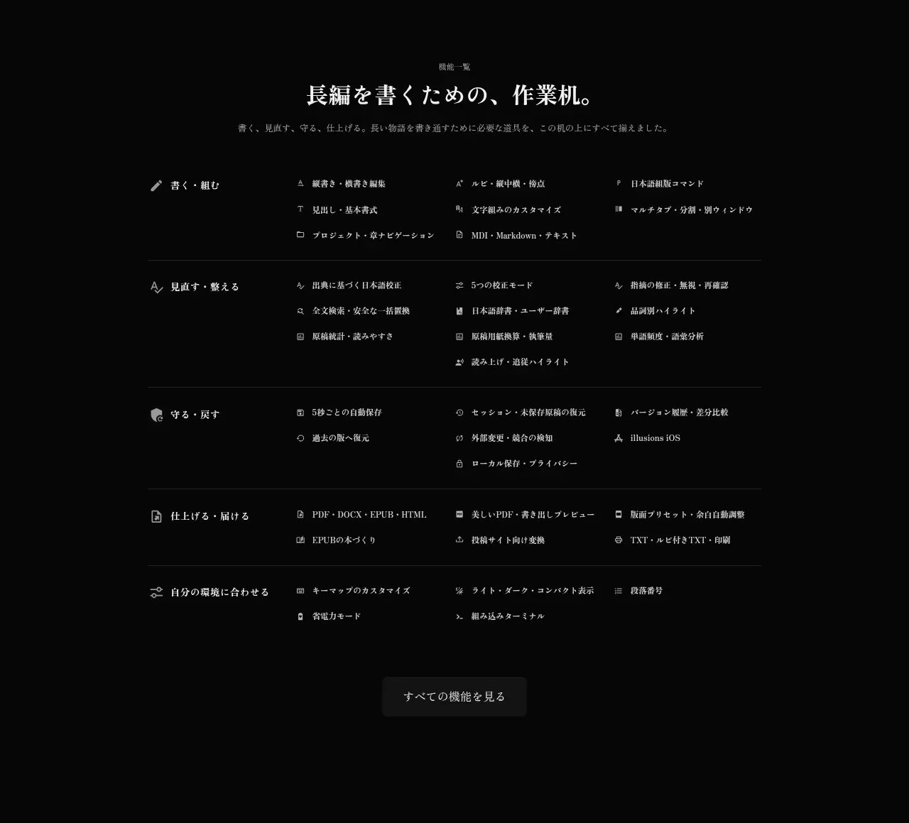 Complete capability directory
illusions · Feature grid
Complete capability directory
illusions · Feature grid