 kage
kage
illusions.app
Design analysis
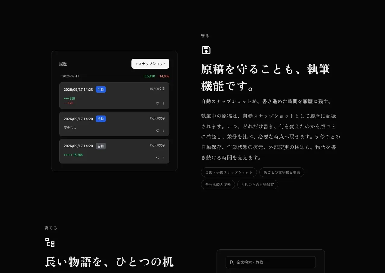
An alternating feature block explains safeguarding work through a history/snapshot interface, balancing a dense UI mockup on the left with editorial copy on the right.
Prompt preview
## Reference images

Study these alongside the description below: hierarchy, rhythm, spacing, colour. Build for the product you are asked about, using this design language.

- Component: https://kage-design-assets.t3.tigrisfiles.io/components/illusions/1ba887fc-c00e-45d6-baad-b5fdc0d1f7c3-1789797655-4.webp
- Full page it was cut from: https://kage-design-assets.t3.tigrisfiles.io/screenshots/illusions/1ba887fc-c00e-45d6-baad-b5fdc0d1f7c3-1789797632145-full.webp
- Component on Kage: https://kage.design/component/illusions-feature-grid-2

## Before you start
Ask what the user's product is, who it serves, and what their brand voice and visual identity are. Apply the principles below to that product rather than reproducing this reference.

Build a two-column capability section focused on trust, versioning, or recovery. Put a compact dark interface mockup on the left and editorial explanatory content on the right. The mockup should read as a believable history panel: stacked records, timestamps, status pills, tiny controls, and a clear surface hierarchy, but use invented data. Give it a #161616 background, #303030 border, 12px radius, and restrained green or blue status accents. The copy column needs a small eyebrow/icon, a large serif heading, 2–4 short paragraphs, and feature chips. Preserve a quiet, premium rhythm with 100px top/bottom padding and generous empty space. Stack columns on mobile.

Never: use logos, product names, copy, illustrations, or imagery from the reference.
More components

 AI-powered helpdesk feature section
intercom.com · Feature grid
AI-powered helpdesk feature section
intercom.com · Feature grid
 Integrations and ecosystem section
intercom.com · Feature grid
Integrations and ecosystem section
intercom.com · Feature grid
 AI agent capabilities section
intercom.com · Feature grid
AI agent capabilities section
intercom.com · Feature grid
 Unified support experience overview
intercom.com · Feature grid
Unified support experience overview
intercom.com · Feature grid

 Core invoicing capabilities
sendinvo.com · Feature grid
Core invoicing capabilities
sendinvo.com · Feature grid
 Audience and trade types
sendinvo.com · Feature grid
Audience and trade types
sendinvo.com · Feature grid