 kage
kage
illusions.app
Design analysis
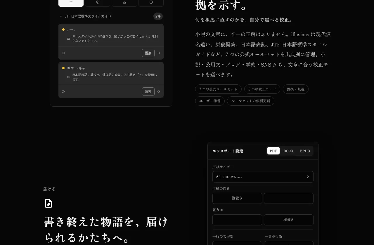
A reversed two-column section combines a search/result UI with copy about checking sources and improving accuracy, with small controls and result cards providing concrete product proof.
Prompt preview
## Reference images

Study these alongside the description below: hierarchy, rhythm, spacing, colour. Build for the product you are asked about, using this design language.

- Component: https://kage-design-assets.t3.tigrisfiles.io/components/illusions/1ba887fc-c00e-45d6-baad-b5fdc0d1f7c3-1789797656-6.webp
- Full page it was cut from: https://kage-design-assets.t3.tigrisfiles.io/screenshots/illusions/1ba887fc-c00e-45d6-baad-b5fdc0d1f7c3-1789797632145-full.webp
- Component on Kage: https://kage.design/component/illusions-feature-grid-4

## Before you start
Ask what the user's product is, who it serves, and what their brand voice and visual identity are. Apply the principles below to that product rather than reproducing this reference.

Create a two-column feature section for validation, research, or quality control. Put a dark search-and-results mockup on the left and explanatory copy on the right. The mockup should include a query field, segmented controls, result cards, small metadata, and one or two restrained accent indicators; keep all content generic and invented. Use a #111111 panel, #2b2b2b borders, 10–12px corners, and low-contrast dividers. The right column uses a tiny label/icon, an editorial serif heading, supporting paragraphs, and pill tags. Keep the page background #050505 and use warm-white #eeeae4 with gray #8d8983. Add clear hover/focus affordances to controls, while maintaining a mostly static presentation.

Never: use logos, product names, copy, illustrations, or imagery from the reference.
More components

 AI-powered helpdesk feature section
intercom.com · Feature grid
AI-powered helpdesk feature section
intercom.com · Feature grid
 Integrations and ecosystem section
intercom.com · Feature grid
Integrations and ecosystem section
intercom.com · Feature grid
 AI agent capabilities section
intercom.com · Feature grid
AI agent capabilities section
intercom.com · Feature grid
 Unified support experience overview
intercom.com · Feature grid
Unified support experience overview
intercom.com · Feature grid

 Core invoicing capabilities
sendinvo.com · Feature grid
Core invoicing capabilities
sendinvo.com · Feature grid
 Audience and trade types
sendinvo.com · Feature grid
Audience and trade types
sendinvo.com · Feature grid