 kage
kage
illusions.app
Design analysis
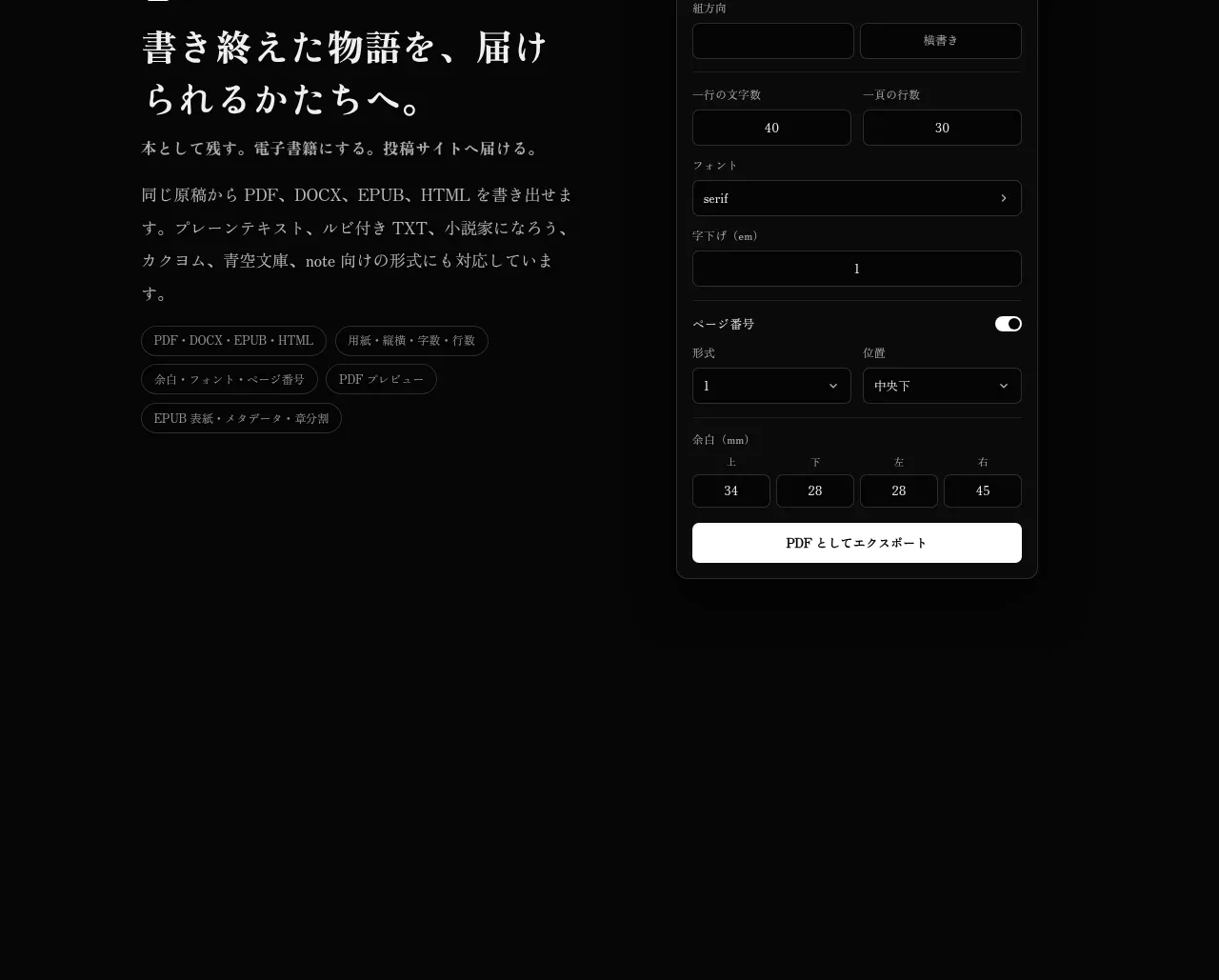
The final alternating capability section focuses on delivering finished work, pairing a left editorial explanation with a detailed export-settings panel on the right.
Prompt preview
## Reference images

Study these alongside the description below: hierarchy, rhythm, spacing, colour. Build for the product you are asked about, using this design language.

- Component: https://kage-design-assets.t3.tigrisfiles.io/components/illusions/1ba887fc-c00e-45d6-baad-b5fdc0d1f7c3-1789797656-7.webp
- Full page it was cut from: https://kage-design-assets.t3.tigrisfiles.io/screenshots/illusions/1ba887fc-c00e-45d6-baad-b5fdc0d1f7c3-1789797632145-full.webp
- Component on Kage: https://kage.design/component/illusions-feature-grid-5

## Before you start
Ask what the user's product is, who it serves, and what their brand voice and visual identity are. Apply the principles below to that product rather than reproducing this reference.

Build a delivery/export feature section with copy on the left and a detailed settings panel on the right. The copy should have a small eyebrow and icon, a large serif heading, supporting paragraphs, and capability chips. The panel should feel like a real compact form: format tabs, labeled selects, numeric fields, toggles, spacing controls, and one full-width light submit/export button. Use dark surfaces #101010 and #171717, #303030 borders, 10px radius, warm-white labels, muted gray helper text, and a single high-contrast action in #f1ede7 with dark text. Provide visible focus states and keyboard-friendly controls. On mobile, stack the panel below the explanation and make fields full width.

Never: use logos, product names, copy, illustrations, or imagery from the reference.
More components

 AI-powered helpdesk feature section
intercom.com · Feature grid
AI-powered helpdesk feature section
intercom.com · Feature grid
 Integrations and ecosystem section
intercom.com · Feature grid
Integrations and ecosystem section
intercom.com · Feature grid
 AI agent capabilities section
intercom.com · Feature grid
AI agent capabilities section
intercom.com · Feature grid
 Unified support experience overview
intercom.com · Feature grid
Unified support experience overview
intercom.com · Feature grid

 Core invoicing capabilities
sendinvo.com · Feature grid
Core invoicing capabilities
sendinvo.com · Feature grid
 Audience and trade types
sendinvo.com · Feature grid
Audience and trade types
sendinvo.com · Feature grid