 kage
kage
illusions.app
Design analysis
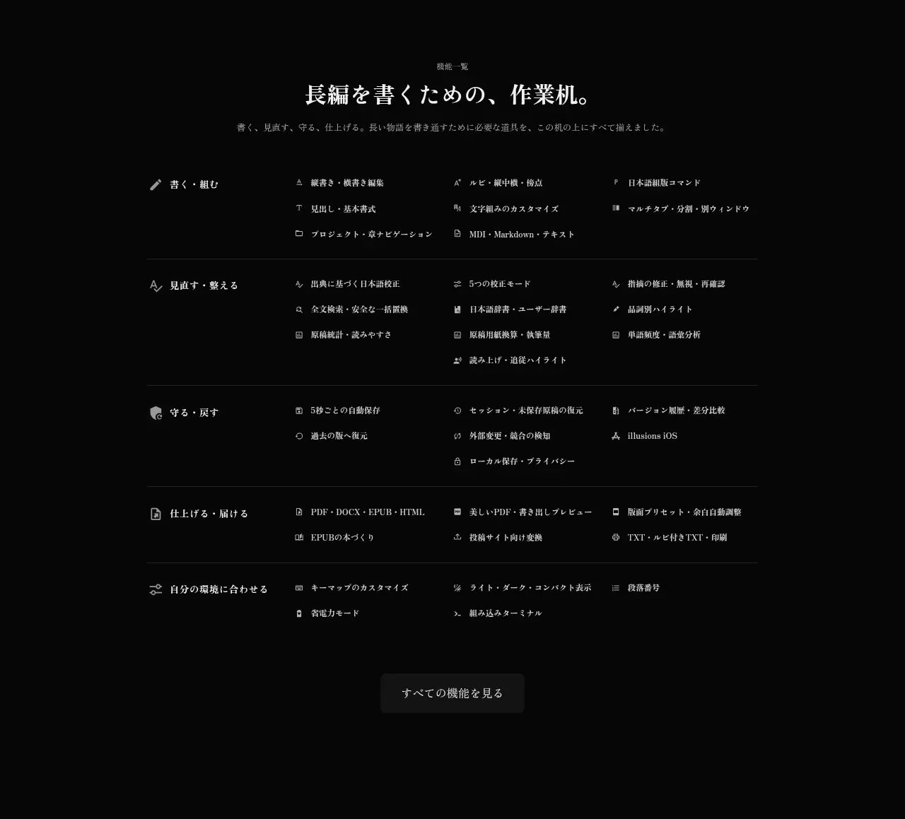
After a long breathing space, a centered directory summarizes the product's broader capabilities in grouped multi-column rows, followed by a single subdued all-features action.
Prompt preview
## Reference images

Study these alongside the description below: hierarchy, rhythm, spacing, colour. Build for the product you are asked about, using this design language.

- Component: https://kage-design-assets.t3.tigrisfiles.io/components/illusions/1ba887fc-c00e-45d6-baad-b5fdc0d1f7c3-1789797657-8.webp
- Full page it was cut from: https://kage-design-assets.t3.tigrisfiles.io/screenshots/illusions/1ba887fc-c00e-45d6-baad-b5fdc0d1f7c3-1789797632145-full.webp
- Component on Kage: https://kage.design/component/illusions-feature-grid-6

## Before you start
Ask what the user's product is, who it serves, and what their brand voice and visual identity are. Apply the principles below to that product rather than reproducing this reference.

Create a centered capability directory as a broad grouped feature grid. Start with a small eyebrow, an editorial headline, and one concise introduction. Below, arrange capability groups in a 3–4 column grid with clear group labels and compact rows containing small line icons and short labels. Separate major groups with thin #202020 rules and generous 28–44px row spacing. Keep the background #050505, primary text #e6e1da, secondary text #85817e, and icons in a subdued gray. Finish with one centered low-emphasis rectangular button, around 8px radius, inviting users to browse the complete set. The grid should collapse to two columns and then one column responsively.

Never: use logos, product names, copy, illustrations, or imagery from the reference.
More components

 AI-powered helpdesk feature section
intercom.com · Feature grid
AI-powered helpdesk feature section
intercom.com · Feature grid
 Integrations and ecosystem section
intercom.com · Feature grid
Integrations and ecosystem section
intercom.com · Feature grid
 AI agent capabilities section
intercom.com · Feature grid
AI agent capabilities section
intercom.com · Feature grid
 Unified support experience overview
intercom.com · Feature grid
Unified support experience overview
intercom.com · Feature grid

 Core invoicing capabilities
sendinvo.com · Feature grid
Core invoicing capabilities
sendinvo.com · Feature grid
 Audience and trade types
sendinvo.com · Feature grid
Audience and trade types
sendinvo.com · Feature grid