kage
kage
illusions.app
Design analysis
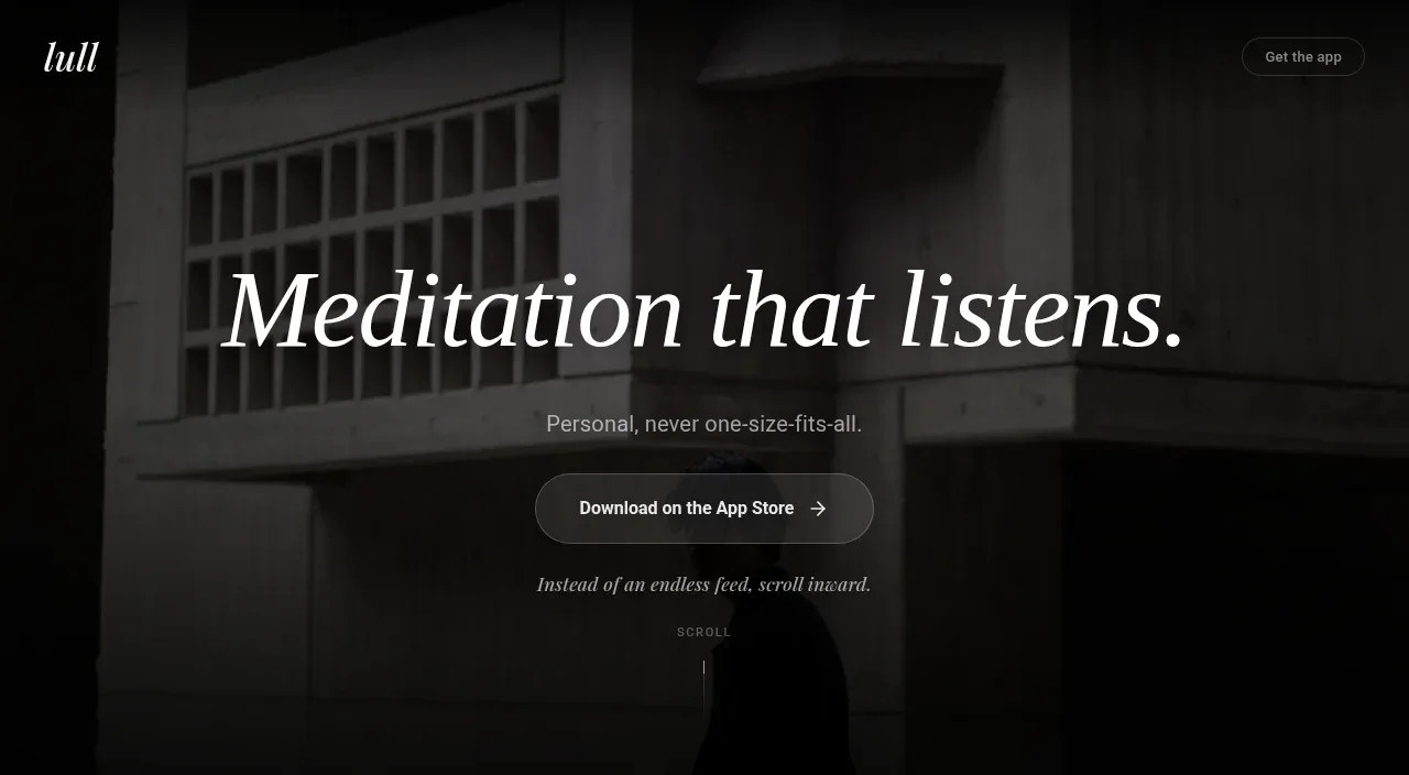
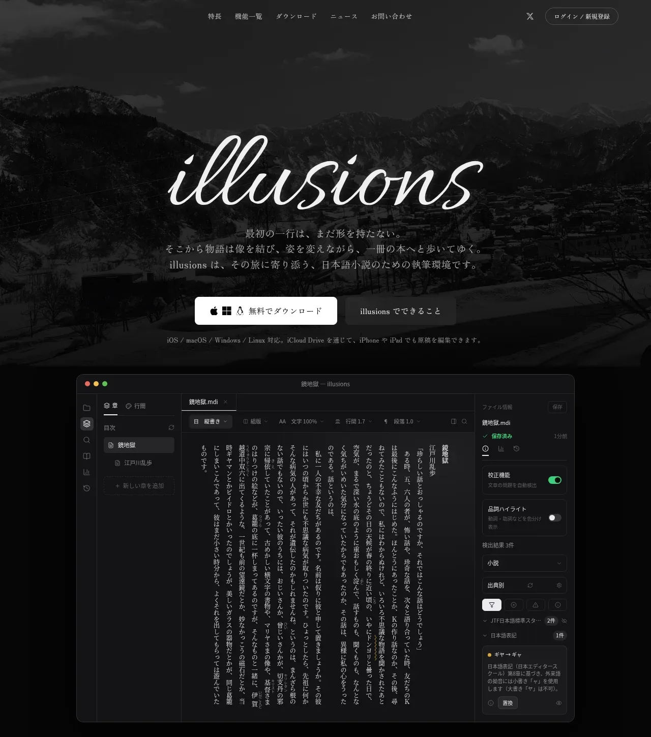
A full-width mountain photograph is heavily darkened behind a large script-like wordmark, Japanese positioning copy, download actions, and a large product screenshot that anchors the promise.
Prompt preview
## Reference images

Study these alongside the description below: hierarchy, rhythm, spacing, colour. Build for the product you are asked about, using this design language.

- Component: https://kage-design-assets.t3.tigrisfiles.io/components/illusions/1ba887fc-c00e-45d6-baad-b5fdc0d1f7c3-1789797655-1.webp
- Full page it was cut from: https://kage-design-assets.t3.tigrisfiles.io/screenshots/illusions/1ba887fc-c00e-45d6-baad-b5fdc0d1f7c3-1789797632145-full.webp
- Component on Kage: https://kage.design/component/illusions-hero

## Before you start
Ask what the user's product is, who it serves, and what their brand voice and visual identity are. Apply the principles below to that product rather than reproducing this reference.

Create a tall, immersive hero beneath the navigation. Use a full-bleed atmospheric background image with a near-black overlay around #050505 at roughly 65–80% opacity so foreground text remains readable. Center the hero content: an expressive oversized display title, a short supporting paragraph with relaxed line-height, a prominent light primary CTA beside a quieter secondary CTA, and a small compatibility note below. Place a large rounded product UI preview toward the lower part of the hero, with a subtle #2a2a2a border, faint shadow, and enough bottom padding to let it feel intentionally framed. Keep the hierarchy dramatic but sparse: title first, copy second, actions third, product proof last. Use warm white #f2eee8, muted gray #9a9690, and a restrained accent only for focus states. Ensure responsive behavior stacks actions and scales the preview without clipping.

Never: use logos, product names, copy, illustrations, or imagery from the reference.