kage
kage
illusions.app

Design analysis
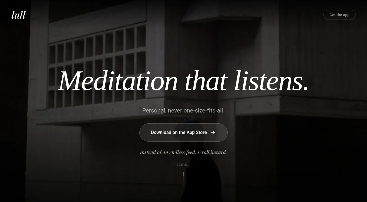
A compact centered transition section turns the product introduction into a memorable promise with an eyebrow, large Japanese headline, and one supporting sentence.
Prompt preview
## Reference images

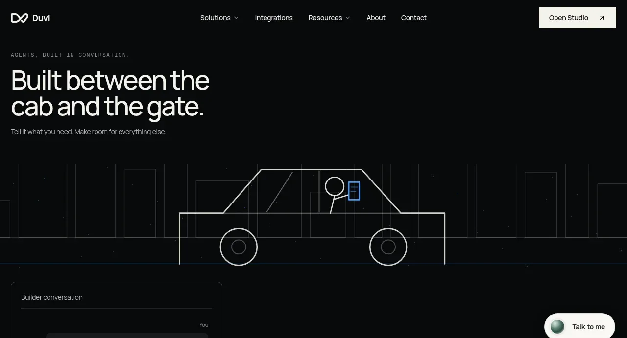
Study these alongside the description below: hierarchy, rhythm, spacing, colour. Build for the product you are asked about, using this design language.

- Component: https://kage-design-assets.t3.tigrisfiles.io/components/illusions/1ba887fc-c00e-45d6-baad-b5fdc0d1f7c3-1789797655-2.webp
- Full page it was cut from: https://kage-design-assets.t3.tigrisfiles.io/screenshots/illusions/1ba887fc-c00e-45d6-baad-b5fdc0d1f7c3-1789797632145-full.webp
- Component on Kage: https://kage.design/component/illusions-hero-2

## Before you start
Ask what the user's product is, who it serves, and what their brand voice and visual identity are. Apply the principles below to that product rather than reproducing this reference.

Build a centered statement band on a nearly black background #050505. Add a tiny muted eyebrow, a strong serif or editorial headline around 30–42px, and one or two lines of supporting copy below. Keep the content in a narrow max-width of roughly 620px, with generous vertical padding and no card container. Use warm white #eee9e2 for the headline and #85817c for the copy. Let the section act as a visual pause between the hero and detailed capabilities; avoid extra buttons unless the user's conversion goal requires one.

Never: use logos, product names, copy, illustrations, or imagery from the reference.