kage
kage
imagetoascii.art

Design analysis
A restrained three-column feature grid communicates practical capabilities with short, scannable descriptions and strong divider lines.
Prompt preview
## Reference images

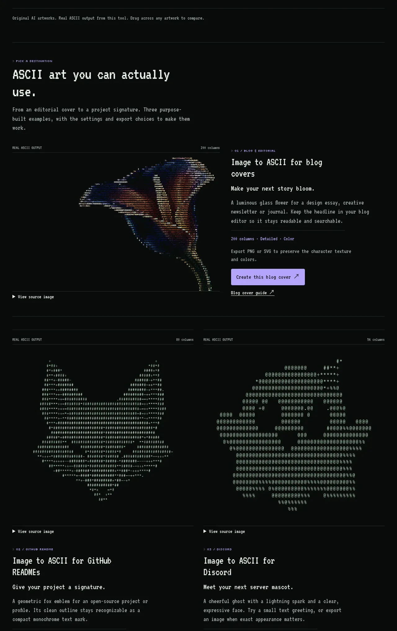
Study these alongside the description below: hierarchy, rhythm, spacing, colour. Build for the product you are asked about, using this design language.

- Component: https://kage-design-assets.t3.tigrisfiles.io/components/image-to-ascii/536947f7-3504-43cd-9692-a327ad82583f-1789452199-6.webp
- Full page it was cut from: https://kage-design-assets.t3.tigrisfiles.io/screenshots/image-to-ascii/536947f7-3504-43cd-9692-a327ad82583f-1789452107158-full.webp
- Component on Kage: https://kage.design/component/image-to-ascii-feature-grid-2

## Before you start
Ask which capabilities make the user's product meaningfully better than alternatives. Then express those capabilities with concise, outcome-focused feature cards.

Build a six-item feature grid in three columns on desktop and one column on mobile. Place a section heading and short intro above it, then use thin horizontal rules to separate rows. Each item needs a compact title and a two-line description; avoid icons unless the user's brand genuinely benefits from them. Use monospace or technical typography, #e5e6df headings, #929793 body text, and borders in #26302d. Keep cards flat and editorial with no large shadows, 28–36px internal spacing, and consistent baseline alignment. Include a subtle lavender focus/hover treatment.

Never: use logos, product names, copy, illustrations, or imagery from the reference.