kage
kage

Design analysis
A terminal-native marketing page where every element — nav, headings, metadata, even the giant hero title rendered as ASCII block characters — is set in one monospace family on near-black surfaces separated by hairline borders rather than shadows. A single lavender accent is spent sparingly on primary buttons, sliders, active preset chips and checkboxes, while colourful artwork does the emotional work in split before/after comparisons that recur in the hero, studio preview and every gallery card. Rhythm shifts down the page from an airy hero into a dense, genuinely functional tool workspace, then relaxes into editorial two-column sections, a 2×2 gallery grid, three long-form destination showcases and a tall FAQ accordion, each section closed by a small muted footnote line.
Prompt preview
## Reference images

Study these alongside the description below: hierarchy, rhythm, spacing, colour. Build for the product you are asked about, using this design language.

- Full page: https://kage-design-assets.t3.tigrisfiles.io/screenshots/image-to-ascii/536947f7-3504-43cd-9692-a327ad82583f-1789452107158-full.webp
- Above the fold: https://kage-design-assets.t3.tigrisfiles.io/screenshots/image-to-ascii/536947f7-3504-43cd-9692-a327ad82583f-1789452104583.webp
- Design on Kage: https://kage.design/designs/image-to-ascii-landing-page

## Before you start
Ask the user what they are building, who it is for, and what brand assets (name, colours, type) they already have, and wait for the answers. Everything below is a design language to apply to *their* product — never reproduce the reference site's name, copy or artwork.

## Page structure
Build a single dark landing page with these sections, top to bottom:

1. **Top nav** — left: small glyph mark plus a stacked two-line wordmark in mono caps. Right: six text links plus a compact language toggle (EN/FR-style). No background bar; it sits directly on the page black.
2. **Hero (two columns)** — left: a tiny gray eyebrow label prefixed with `/ `, a very large headline rendered in ASCII-block/character-art lettering, a two-sentence paragraph, then a primary filled button and a secondary outlined button (each with a `↗` glyph), then a muted one-line trust strip separated by `·` (free · no signup · private · formats). Right: a before/after split-compare panel — original image on the left of a draggable divider, converted output on the right — with a caption strip underneath reading `Original | 220 columns · preset name | ASCII`.
3. **Tool studio** — eyebrow (`/ THE STUDIO`), section heading ending in a period, with `01 Upload / 02 Refine / 03 Export` right-aligned on the same line. Below: a full-width upload panel (drag-and-drop copy, accepted formats, privacy note, three actions: primary file button + two ghost/sample buttons). Then a two-column workspace: left control panel (preset chips in a wrap grid, a disclosure row, a width slider with live numeric value, a style select, two checkboxes, a reset link), right live preview canvas with its own split-compare, expand button, caption `01 / artwork name`, prev/next/play controls and a `Use this style ↗` action. Close with a full-width collapsible bar labelled `Advanced tuning` with a muted hint on the right.
4. **Examples gallery** — heading + one-sentence intro, then a 2×2 grid of artwork cards. Each card: the same split-compare media with corner tags `Original` / `ASCII` and a draggable divider, a metadata line like `> 01 / SCULPTURE / 220 COL`, a short title ending in a period, a one-line description, and a `Try this artwork ↗` underlined link. End the section with a small muted disclaimer footnote.
5. **Destination showcases** — eyebrow `PICK A DESTINATION`, heading `ASCII art you can actually use.` and a short intro. Three stacked showcases (one editorial-colour example large on the left with text right; two monochrome examples in a two-column row): real sample output rendered as actual characters, spec chips (`280 columns · Detailed · Color`), advice sentence, a filled `Create this ↗` button and a guide link. Another muted footnote closes it.
6. **How-to steps** — left: heading + short paragraph; right: three numbered rows `01 / 02 / 03` with one-line instructions separated by hairlines.
7. **Features grid** — heading + intro, then a 3×2 grid of six features, each a bold small title plus a 1–2 sentence muted description, separated by hairlines not boxes.
8. **Advice callout** — one wide bordered card: a title, two sentences of practical advice, and two inline text links.
9. **Best settings** — left column: heading + paragraph; right: a two-column list of six recipe entries (name + one-liner), hairline-separated.
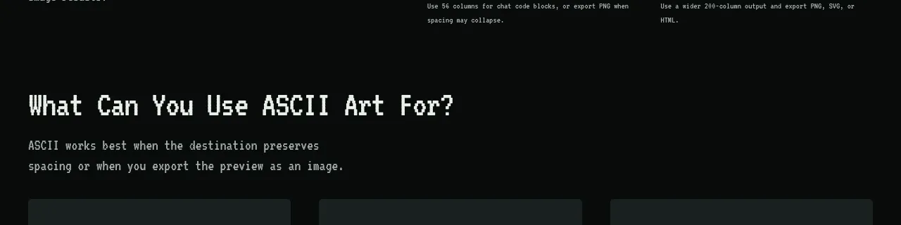
10. **Use cases** — heading + intro, then three cards each tagged with a pseudo-filename chip (`readme.ascii`) and a short description.
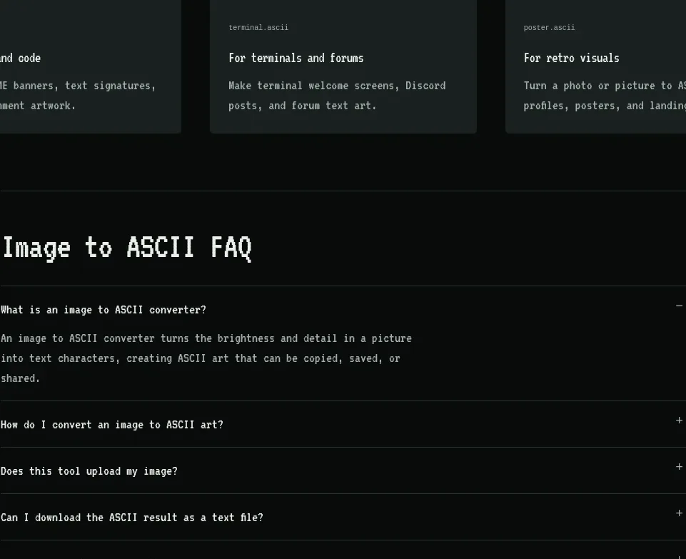
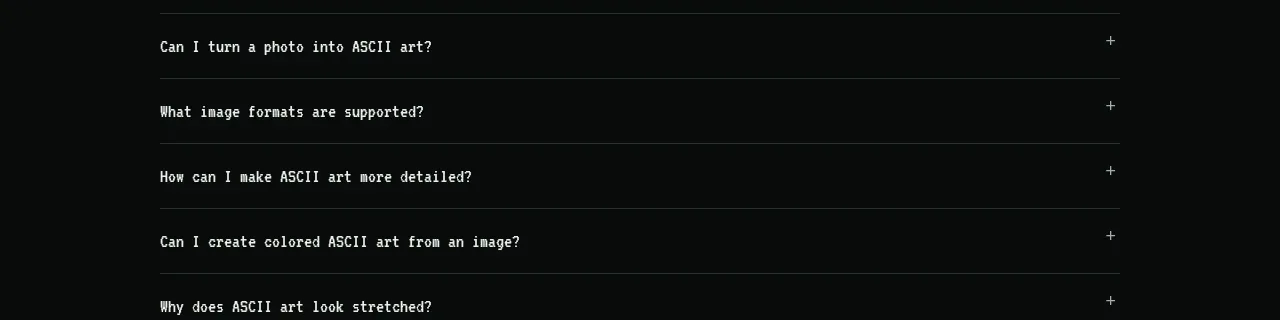
11. **FAQ** — centred heading, then a tall accordion: first item open showing its answer, the rest collapsed with `+`/`−` toggles on the right, hairline separators, generous row height.
12. **Footer** — left: one-sentence mission line in muted text; right: a row of small links separated by `·`.

## Design language
- **One monospace family everywhere.** Use a stack like `"JetBrains Mono", "IBM Plex Mono", ui-monospace, Menlo, monospace` for headings, body, buttons and labels. Hierarchy comes from size, weight and case, never from a second typeface.
- **Terminal voice as layout device.** Eyebrow labels are uppercase gray prefixed with `/ `; metadata lines are prefixed with `> `; headings end with a period; captions read like status lines (`01 / Chrome muse`). Reuse these patterns on any product.
- **Type scale:** hero ~72–96px (or ASCII-block lettering), section headings ~40–48px, card titles ~20–24px, body 13–15px, labels/eyebrows ~11px uppercase with +5% letter-spacing.
- **Colour:** page background `#0A0A0B`, raised cards `#141417` to `#17171A`, hairline borders `rgba(255,255,255,0.09)`, primary text `#EDEDEF`, muted text `#8B8B93`. One lavender accent `#B7A9F8` used only for primary buttons (with near-black text on it), slider fills, active chips, checkboxes and link hovers. Everything else is strictly monochrome; let colourful artwork provide the only other colour.
- **Depth without shadows.** No drop shadows; separate surfaces with 1px hairline borders and one step of background lightness. Radius is small and consistent: 8–10px cards, 6–8px buttons and chips.
- **Split-compare as signature interaction.** Wherever a before/after exists (hero, preview, gallery cards), use a draggable vertical divider with a small circular handle, corner labels `Original`/`ASCII`, and a spec caption strip. Apply the same pattern to any transform-style product (filters, compression, conversions).
- **Rhythm down the page:** airy hero → dense tool workspace → medium gallery grid → relaxed editorial two-column content → tall accordion. Close every major section with a one-line muted footnote to reset the eye.
- **Buttons:** primary = accent fill, dark text, radius 8px, `↗` glyph; secondary = 1px border, transparent fill, same geometry; tertiary = plain underlined text links with `↗`.
- **Motion:** instant slider drags, controls that update the preview live, hover states that brighten borders and text colour only. No parallax, no large fade-ins.
- **Icons:** thin inline glyphs only (arrows, play, plus/minus, drag handle); never decorative illustration outside the artwork samples.

## Never
- No reuse of the reference site's name, wordmark, logo, tagline, section headings, sample artworks (jellyfish, chrome statue, ghost, fox), FAQ copy or illustrations.
- Do not present the result as that product or imply affiliation; build the user's own product with their brand assets.
- Never fill the layout with stock photography or emoji in place of the monochrome-plus-accent system, and never add gradients, glows or shadows that break the flat hairline aesthetic.
Components from this page
All components
 Top navigation
Image to ASCII · Navigation
Top navigation
Image to ASCII · Navigation
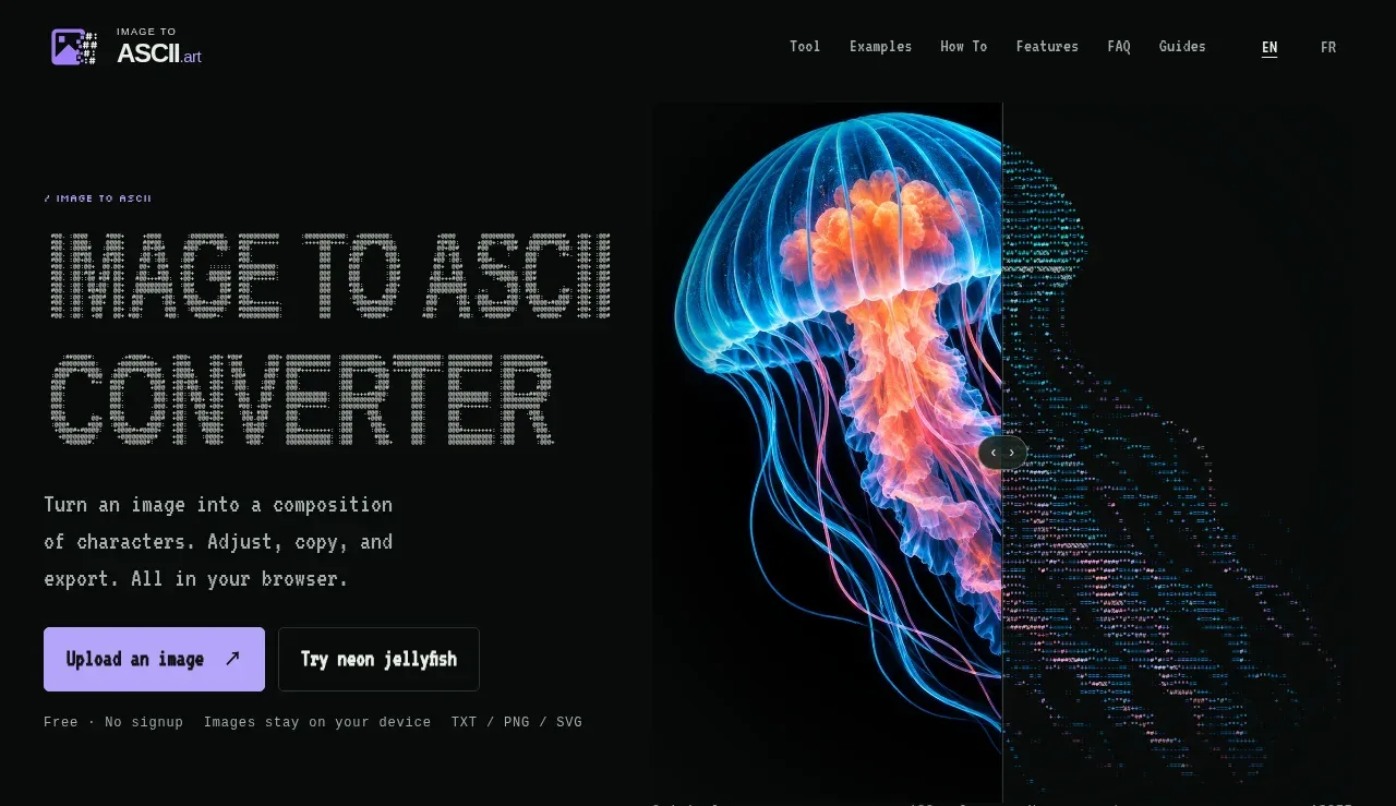 Image-to-ASCII converter hero
Image to ASCII · Hero
Image-to-ASCII converter hero
Image to ASCII · Hero
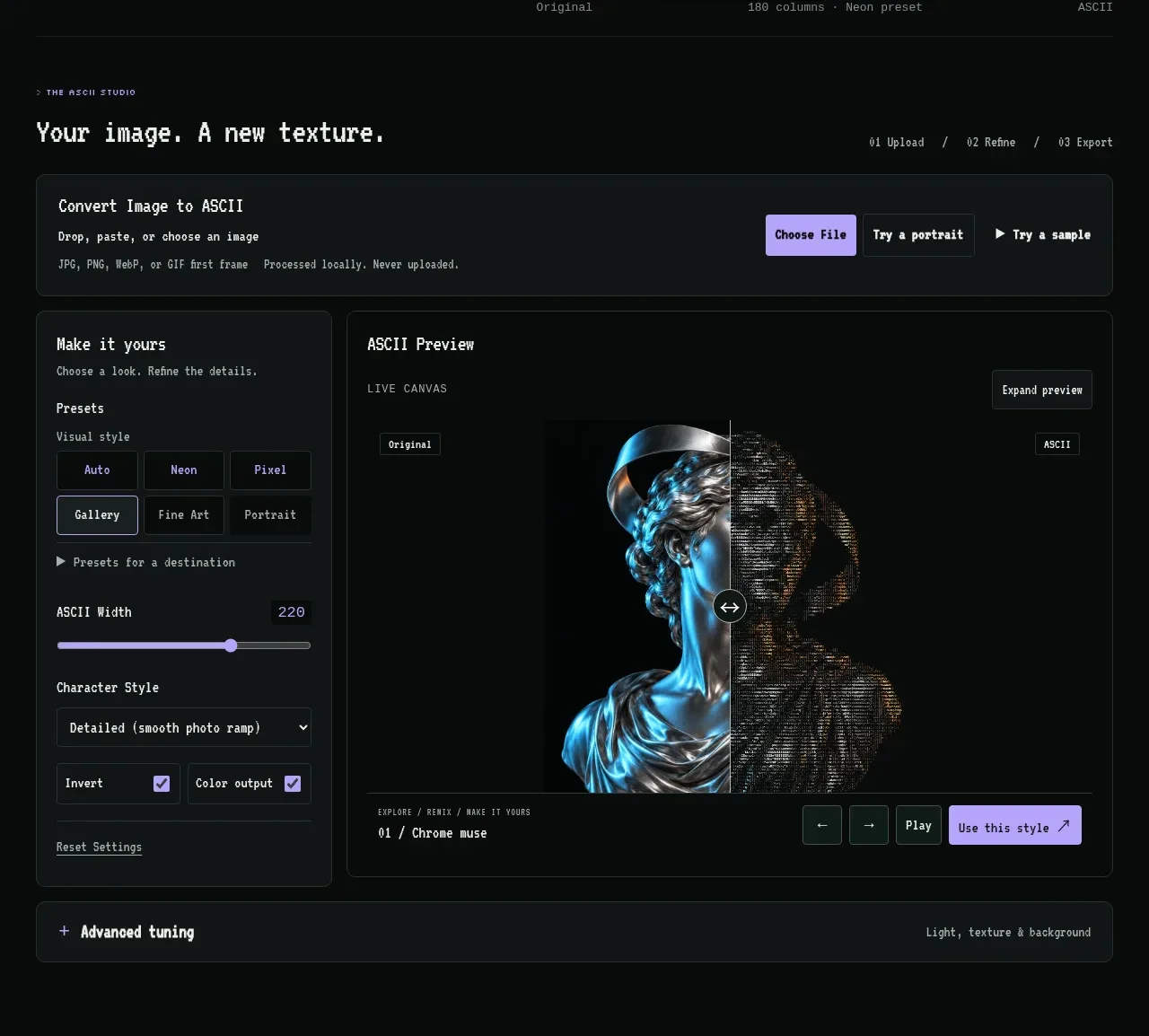 Converter workbench
Image to ASCII · Form
Converter workbench
Image to ASCII · Form
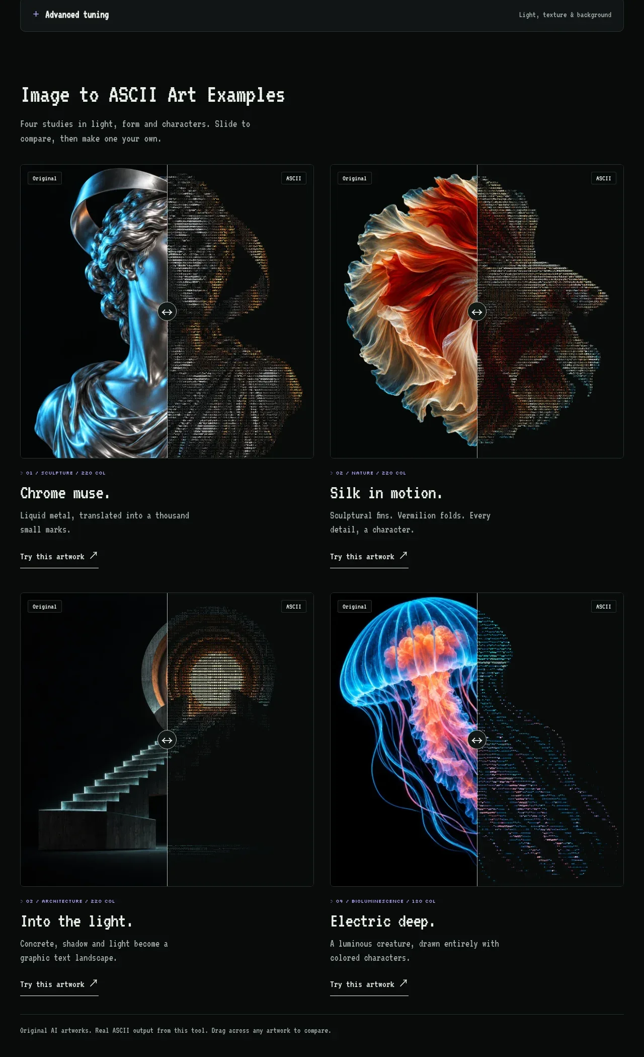 ASCII art examples
Image to ASCII · Gallery
ASCII art examples
Image to ASCII · Gallery
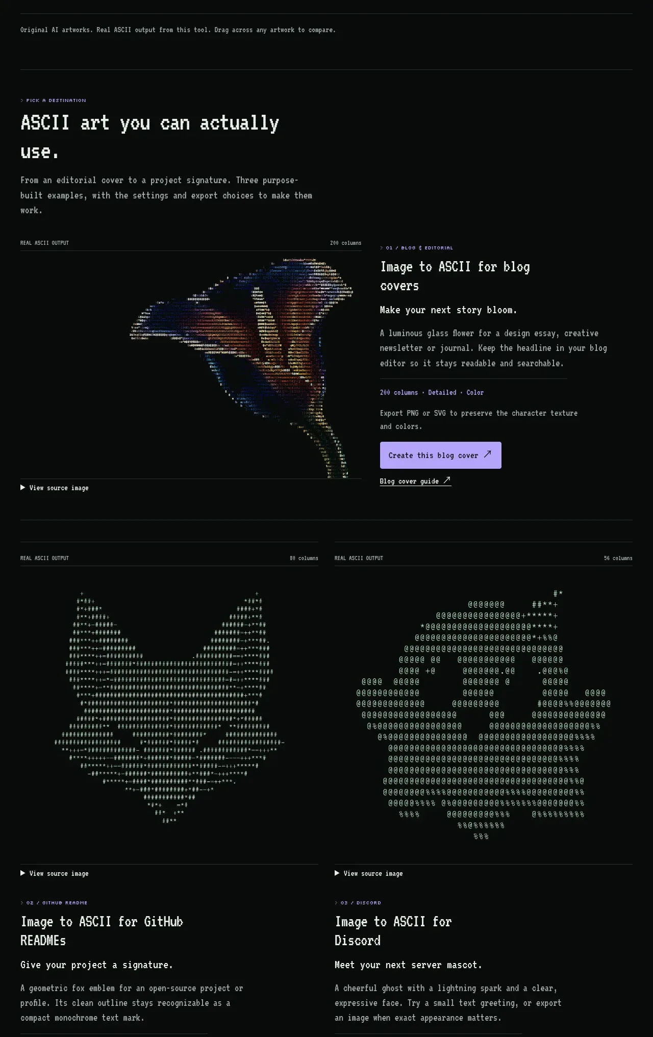 Destination examples
Image to ASCII · Feature grid
Destination examples
Image to ASCII · Feature grid
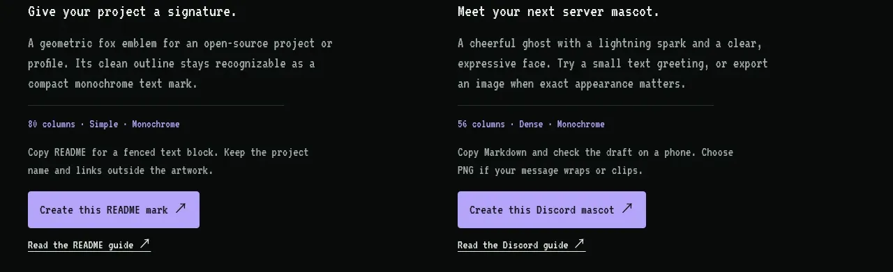 Conversion steps
Image to ASCII · Tabs & steps
Conversion steps
Image to ASCII · Tabs & steps
 Product features
Image to ASCII · Feature grid
Product features
Image to ASCII · Feature grid
 Readability guidance banner
Image to ASCII · Banner
Readability guidance banner
Image to ASCII · Banner
 Preset recipes
Image to ASCII · Feature grid
Preset recipes
Image to ASCII · Feature grid
 Use-case cards
Image to ASCII · Card
Use-case cards
Image to ASCII · Card
 Frequently asked questions
Image to ASCII · FAQ
Frequently asked questions
Image to ASCII · FAQ
 Site footer
Image to ASCII · Footer
Site footer
Image to ASCII · Footer